Bitcoin Logarithmic Trends: Analysis since each halving
stock
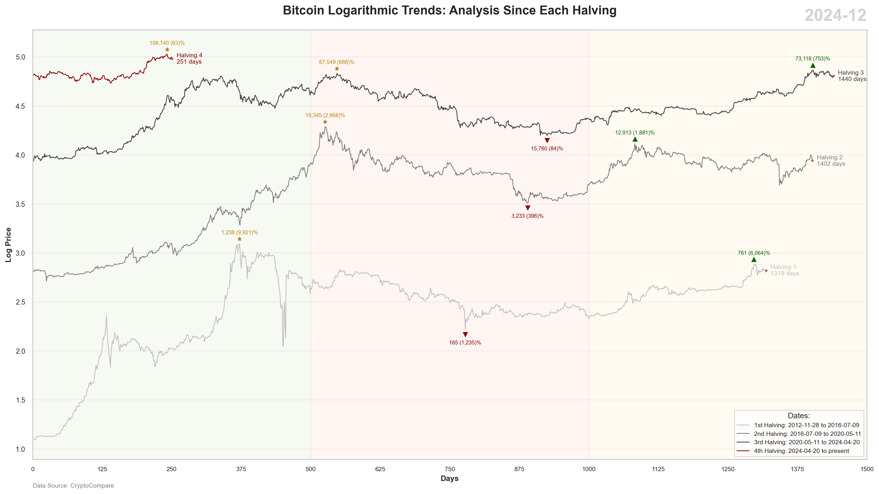
Bitcoin’s logarithmic trends track its price movements over time, with each halving event serving as a key point for analysis. Halvings reduce the supply of new Bitcoin, often leading to significant price changes.
Published
Dec 27, 2024
Keywords
Bitcoin
Summary
A plot that shows the logarithmic price of Bitcoin over each halving period.
Code
# Libraries# ==============================================================================import pandas as pdimport numpy as npimport seaborn as snsimport matplotlib.pyplot as pltimport requests# Get API Data# ==============================================================================# Create a df with final year datesdp = pd.DataFrame({'date': pd.date_range(start='2010-12-31', end='2024-12-31', freq='Y')})dp['to_ts'] = dp['date'].apply(lambda x: int(pd.to_datetime(x).timestamp()))# Create an empty listdataframes = []# Iterate API with each datefor to_ts in dp['to_ts']:# Build an URL with parameters and transform data url =f"https://min-api.cryptocompare.com/data/v2/histoday?fsym=BTC&tsym=USD&limit=365&toTs={to_ts}" response = requests.get(url) data = response.json().get("Data", {}).get("Data", []) df = pd.DataFrame([ {"symbol": "BTCUSD","date": pd.to_datetime(entry["time"], unit="s").date(),"open": entry["open"],"close": entry["close"],"low": entry["low"],"high": entry["high"],"volume": entry["volumeto"] }for entry in data ]) dataframes.append(df)# Combine all df into onebtc = pd.concat(dataframes, ignore_index=True)# DataSet 0 - Halving#================================================================================halving = {'halving': [0 , 1, 2, 3, 4],'date': ['2009-01-03', '2012-11-28', '2016-07-09', '2020-05-11', '2024-04-20'] }halving = pd.DataFrame(halving)halving['date'] = pd.to_datetime(halving['date'])# DataSet 1 - BTC Price# ==============================================================================# Prepare datasetbtc = btc.drop_duplicates()btc['date'] = pd.to_datetime(btc['date'])btc['year_month'] = btc['date'].dt.strftime('%Y-%m')btc = btc.set_index('date')btc = btc.asfreq('D').ffill()btc = btc.reset_index()btc.sort_values(by=['date'], inplace=True)btc = pd.merge(btc, halving, on='date', how='left')btc['halving'].fillna(method='ffill', inplace=True)btc['halving'].fillna(0, inplace=True)btc['halving'] = btc['halving'].astype(int)btc['first_close'] = btc.groupby('halving')['close'].transform('first')btc['increase'] = (btc['close'] - btc['first_close']) / btc['first_close'] *100btc['days'] = btc.groupby('halving').cumcount() +1btc['closelog'] = np.log10(btc['close'])btc = btc[btc['halving'] >=1]btc['daystotal'] = btc.groupby('symbol').cumcount() +1# Graph 1 - SEABORN# ==============================================================================# Font Styleplt.rcParams.update({'font.family': 'sans-serif', 'font.sans-serif': ['Open Sans'], 'font.size': 10})# Colors Backgroundregions = [ (0, 500, '#6B8E23'), # Green (500, 1000, '#FF4500'), # Red (1000, 1500, '#FFA500') # Orange ] # Colors Palette Lineslines = {0: '#E0E0E0', # Very Light Grey1: '#C0C0C0', # Light Grey2: '#808080', # Medium Grey3: '#404040', # Dark Grey4: '#8B0000'# Red}# Seaborn to plot a graphsns.set(style="whitegrid", rc={"grid.color": "0.95", "axes.grid.axis": "y"})plt.figure(figsize=(16, 9))sns.lineplot(x='days', y='closelog', hue='halving', data=btc, markers=True, palette=lines, linewidth=1)# Add region colors in the backgroundfor start, end, color in regions: plt.axvspan(start, end, color=color, alpha=0.05)# Title and axisplt.title('Bitcoin Logarithmic Trends: Analysis Since Each Halving', fontsize=16, fontweight='bold', pad=20)plt.xlabel('Days', fontsize=10, fontweight='bold')plt.ylabel('Log Price', fontsize=10, fontweight='bold')plt.xlim(0, 1500)plt.xticks(range(0, 1501, 125), fontsize=9)plt.tick_params(axis='both', labelsize=8)plt.yticks(fontsize=9)# Custom legendlegend = plt.legend(title="Halving", loc='lower right', fontsize=8, title_fontsize='10')new_title ='Dates:'legend.set_title(new_title)new_labels = ['1st Halving: 2012-11-28 to 2016-07-09', '2nd Halving: 2016-07-09 to 2020-05-11', '3rd Halving: 2020-05-11 to 2024-04-20', '4th Halving: 2024-04-20 to present'] # Adjust the number of labels according to your datafor text, new_label inzip(legend.texts, new_labels): text.set_text(new_label)# Maximo First 750 daysbtc1 = btc[(btc['days'] >=0) & (btc['days'] <=750)]for halving, group in btc1.groupby('halving'): max_value = group['closelog'].max() max_row = group[group['closelog'] == max_value].iloc[0] plt.plot(max_row['days'], max_row['closelog'] +0.05, marker='*', color='darkgoldenrod', markersize=5) plt.text(max_row['days'], max_row['closelog'] +0.1, f'{max_row["close"]:,.0f} ({max_row["increase"]:,.0f})%', fontsize=7, ha='center', color='darkgoldenrod')# Min Between 500 and 1000 daysbtc2 = btc[(btc['days'] >=500) & (btc['days'] <=1000)]for halving, group in btc2.groupby('halving'): min_value = group['closelog'].min() min_row = group[group['closelog'] == min_value].iloc[0] plt.plot(min_row['days'], min_row['closelog'] -0.05, marker='v', color='darkred', markersize=5) plt.text(min_row['days'], min_row['closelog'] -0.15, f'{min_row["close"]:,.0f} ({min_row["increase"]:,.0f})%', fontsize=7, ha='center', color='darkred')# Max After 750 days btc3 = btc[(btc['days'] >=750) & (btc['days'] <=1500)]for halving, group in btc3.groupby('halving'): max_value = group['closelog'].max() max_row = group[group['closelog'] == max_value].iloc[0] plt.plot(max_row['days'], max_row['closelog'] +0.05, marker='^', color='darkgreen', markersize=5) plt.text(max_row['days'], max_row['closelog'] +0.1, f'{max_row["close"]:,.0f} ({max_row["increase"]:,.0f})%', fontsize=7, ha='center', color='darkgreen')# Custom Last Dotsmax_vals = btc.groupby('halving').agg({'closelog': 'last', 'days': 'max'}).reset_index()for index, row in max_vals.iterrows(): plt.plot(row['days'], row['closelog'], 'ro', markersize=2)# Custom Line labelsfor halving, group in btc.groupby('halving'): last_point = group.iloc[-1] x = last_point['days'] y = last_point['closelog'] max_days = group['days'].max() plt.text(x +8, y, f'Halving {halving}\n{max_days} days', color=lines[halving], fontsize=8, ha='left', va='center')# Add Year Labelcurrent_year_month = btc['year_month'].max() plt.text(1, 1.05, f'{current_year_month}', transform=plt.gca().transAxes, fontsize=22, ha='right', va='top', fontweight='bold', color='#D3D3D3')# Add Data Sourceplt.text(0, -0.065, 'Data Source: CryptoCompare', transform=plt.gca().transAxes, fontsize=8, color='gray')# Adjust layoutplt.tight_layout()# Print it!plt.show()