Distribution of Global GDP: Visualizing Income Mountains
economy
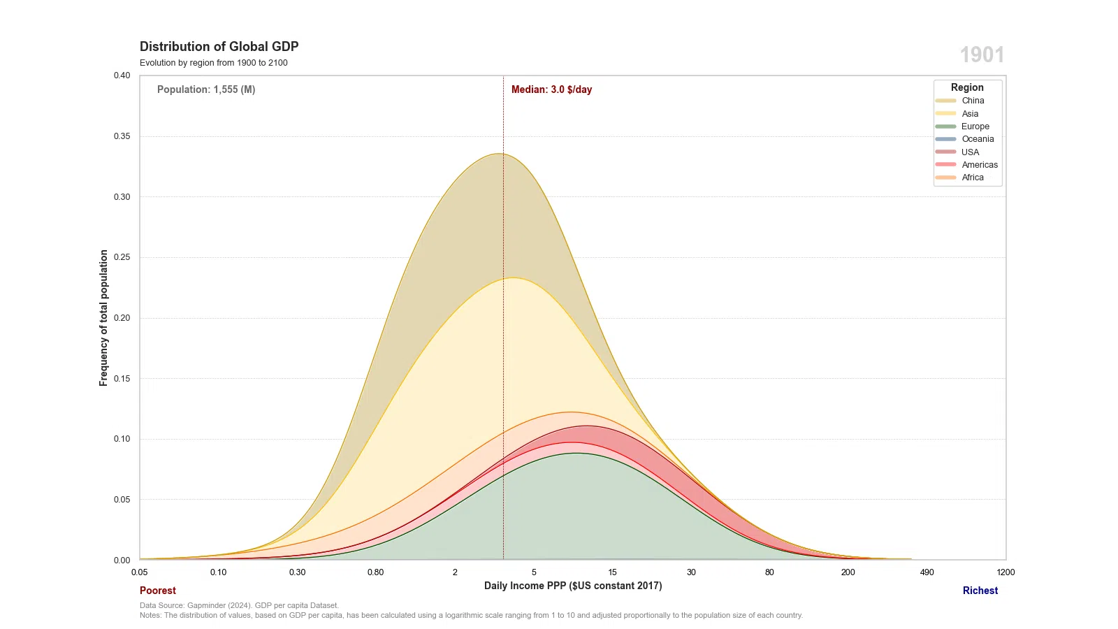
Explores the global distribution of GDP, representing income disparities as visual mountains to highlight the contrast between wealthy and less wealthy regions.
Published
Jan 25, 2025
Keywords
Daily Income
Summary
A plot that shows the evolution of Daily Income based on GDP per Capita ($US constant 2017) from 1900 to 2100.
Code
# Libraries# =====================================================================import requestsimport pandas as pdimport numpy as npimport seaborn as snsimport matplotlib.pyplot as pltimport matplotlib.animation as animationimport matplotlib.ticker as tickerfrom matplotlib.lines import Line2D# Data Extraction (Countries)# =====================================================================# Extract JSON and bring data to a dataframeurl ='https://raw.githubusercontent.com/guillemmaya92/world_map/main/Dim_Country.json'response = requests.get(url)data = response.json()df = pd.DataFrame(data)df = pd.DataFrame.from_dict(data, orient='index').reset_index()df_countries = df.rename(columns={'index': 'iso3'})# Data Extraction (GAPMINDER)# ====================================================================# URL Githuburlgap ='https://raw.githubusercontent.com/guillemmaya92/world_map/refs/heads/main/gapminder-gdp.csv'dfgap = pd.read_csv(urlgap, delimiter=';')# Transform iso3 to upper and divide populationdfgap['iso3'] = dfgap['iso3'].str.upper()dfgap['pop'] = dfgap['pop'] //1000000# Filter yearsdfgap = dfgap[dfgap['year'] >1900]# Data Manipulation# ====================================================================# Copy Dataframedf = dfgap.copy()# Create a listdfs = []# Interpolate monthly datafor iso3 in df['iso3'].unique(): temp_df = df[df['iso3'] == iso3].copy() temp_df['date'] = pd.to_datetime(temp_df['year'], format='%Y') temp_df = temp_df[['date', 'pop', 'gdpc']] temp_df = temp_df.set_index('date').resample('ME').mean().interpolate(method='linear').reset_index() temp_df['iso3'] = iso3 temp_df['year'] = temp_df['date'].dt.year dfs.append(temp_df)# Concat dataframes df = pd.concat(dfs, ignore_index=True)# Merge queriesdf = df.merge(df_countries, how='left', left_on='iso3', right_on='iso3')df = df[['iso3', 'Country', 'Region', 'year', 'date', 'pop', 'gdpc']]df = df[df['Region'].notna()]# Expand dataframe with populationcolumns = df.columnsdf = np.repeat(df.values, df['pop'].astype(int), axis=0)df = pd.DataFrame(df, columns=columns)# Function to create a new distributiondef distribution(df): average = df['gdpc'].mean() inequality = np.geomspace(1, 10, len(df)) df['gdpcd'] = inequality * (average / np.mean(inequality))return dfdf = df.groupby(['iso3', 'year', 'date']).apply(distribution).reset_index(drop=True)# Logarithmic distributiondf['gdpcdl'] = np.log(df['gdpcd'])# Logarithmic distributiondf['Region'] = np.where(df['iso3'] =='CHN', 'China', df['Region'])df['Region'] = np.where(df['iso3'] =='USA', 'USA', df['Region'])print(df)# Data Visualization# =====================================================================# Seaborn figure stylesns.set(style="whitegrid")# Create a palettefig, ax = plt.subplots(figsize=(16, 9))def update(year): ax.clear() df_filtered = df[df['date'] == year]# Calculate mean value max_value = df_filtered['gdpcdl'].max() mean_value = df_filtered['gdpcdl'].median() mean_value_r = df_filtered['gdpcd'].median() //365 population =len(df_filtered) year = df_filtered['date'].min()# Custom palette area custom_area = {'China': '#e3d6b1','Asia': '#fff3d0','Europe': '#ccdccd','Oceania': '#90a8b7','USA': '#f09c9c','Americas': '#fdcccc','Africa': '#ffe3ce' }# Custom palette line custom_line = {'China': '#cc9d0e','Asia': '#FFC107','Europe': '#004d00','Oceania': '#003366','USA': '#a60707','Americas': '#FF0000','Africa': '#FF6F00' }# Region Order order_region = ['China', 'Asia', 'Africa', 'USA', 'Americas', 'Europe', 'Oceania'] # Create kdeplot area and lines sns.kdeplot(data=df_filtered, x="gdpcdl", hue="Region", bw_adjust=2.5, hue_order=order_region, multiple="stack", alpha=1, palette=custom_area, fill=True, linewidth=1, linestyle='-', ax=ax) sns.kdeplot(data=df_filtered, x="gdpcdl", hue="Region", bw_adjust=2.5, hue_order=order_region, multiple="stack", alpha=1, palette=custom_line, fill=False, linewidth=1, linestyle='-', ax=ax)# Configuration grid and labels ax.text(0, 1.05, 'Distribution of Global GDP', fontsize=13, fontweight='bold', ha='left', transform=plt.gca().transAxes) ax.text(0, 1.02, 'Evolution by region from 1980 to 2030', fontsize=9, color='#262626', ha='left', transform=plt.gca().transAxes) ax.set_xlabel('Daily Income PPP ($US constant 2017)', fontsize=10, fontweight='bold') ax.set_ylabel('Frequency of total population', fontsize=10, fontweight='bold') ax.tick_params(axis='x', labelsize=9) ax.tick_params(axis='y', labelsize=9) ax.grid(axis='x') ax.grid(axis='y', linestyle='--', linewidth=0.5, color='lightgray') ax.set_ylim(0, 0.4) ax.set_xlim(3, 13)# Functions to round axisdef round_to_nearest(value, step=0.05):return np.floor(value / step) * stepdef round_to_nearest_1(value, step=0.25):returnint(np.round(value / step) * step)def round_to_nearest_5(value, step=5):returnint(np.round(value / step) * step)def round_to_nearest_10(value, step=10):returnint(np.round(value / step) * step)def round_to_nearest_50(value, step=50):returnint(np.round(value / step) * step)# Inverse logarhitmic xticklabels xticks = np.linspace(3, 13, num=12) ax.set_xticks(xticks) ax.set_xticklabels([# Condition 1f'{round_to_nearest(np.exp(tick) /365) :.2f}'if np.exp(tick) /365<1else# Condition 2f'{round_to_nearest_1(np.exp(tick) /365)}'if np.exp(tick) /365<5else# Condition 3f'{round_to_nearest_5(np.exp(tick) /365)}'if np.exp(tick) /365<100else# Condition 4f'{round_to_nearest_10(np.exp(tick) /365)}'if np.exp(tick) /365<500else# Condition 5f'{round_to_nearest_50(np.exp(tick) /365)}'if np.exp(tick) /365<10000else# Condition 6f'{int(np.exp(tick) /365)}'for tick in xticks ])# Black color to xticklabelsfor label in ax.get_xticklabels(): label.set_color('black')# Median line ax.axvline(mean_value, color='darkred', linestyle='--', linewidth=0.5) ax.text( x=mean_value + (max_value *0.01), y=ax.get_ylim()[1] *0.98, s=f'Median: {mean_value_r:,.1f} $/day', color='darkred', verticalalignment='top', horizontalalignment='left', fontsize=10, weight='bold')# Population label ax.text(0.02,0.98, s=f'Population: {population:,.0f} (M)', transform=ax.transAxes, color='dimgrey', verticalalignment='top', horizontalalignment='left', fontsize=10, weight='bold')# Add Year label formatted_date = year.strftime('%Y') ax.text(1, 1.06, f'{formatted_date}', transform=ax.transAxes, fontsize=22, ha='right', va='top', fontweight='bold', color='#D3D3D3')# Add a custom legend legend_elements = [Line2D([0], [0], color=color, lw=4, label=region, alpha=0.4) for region, color in custom_line.items()] legend = ax.legend(handles=legend_elements, title='Region', title_fontsize='10', fontsize='9', loc='upper right') plt.setp(legend.get_title(), fontweight='bold')# Add label "poorest" and "richest" plt.text(0, -0.065, 'Poorest', transform=ax.transAxes, fontsize=10, fontweight='bold', color='darkred', ha='left', va='center') plt.text(0.95, -0.065, 'Richest', transform=ax.transAxes, fontsize=10, fontweight='bold', color='darkblue', va='center')# Add Data Source plt.text(0, -0.1, 'Data Source: Gapminder (2024). GDP per capita Dataset.', transform=plt.gca().transAxes, fontsize=8, color='gray')# Add Notes plt.text(0, -0.12, 'Notes: The distribution of values, based on GDP per capita, has been calculated using a logarithmic scale ranging from 1 to 10 and adjusted proportionally to the population size of each country.', transform=plt.gca().transAxes, fontsize=8, color='gray')# Configurate animationyears =sorted(df['date'].unique())ani = animation.FuncAnimation(fig, update, frames=years, repeat=False, interval=50, blit=False)# Save the animation :)ani.save('C:/Users/guillem.maya/Downloads/FIG_GDP_Capita_Distribution_PPP_KDEPLOT_GAPMINDER.webp', writer='imagemagick', fps=80)# Print it!plt.show()