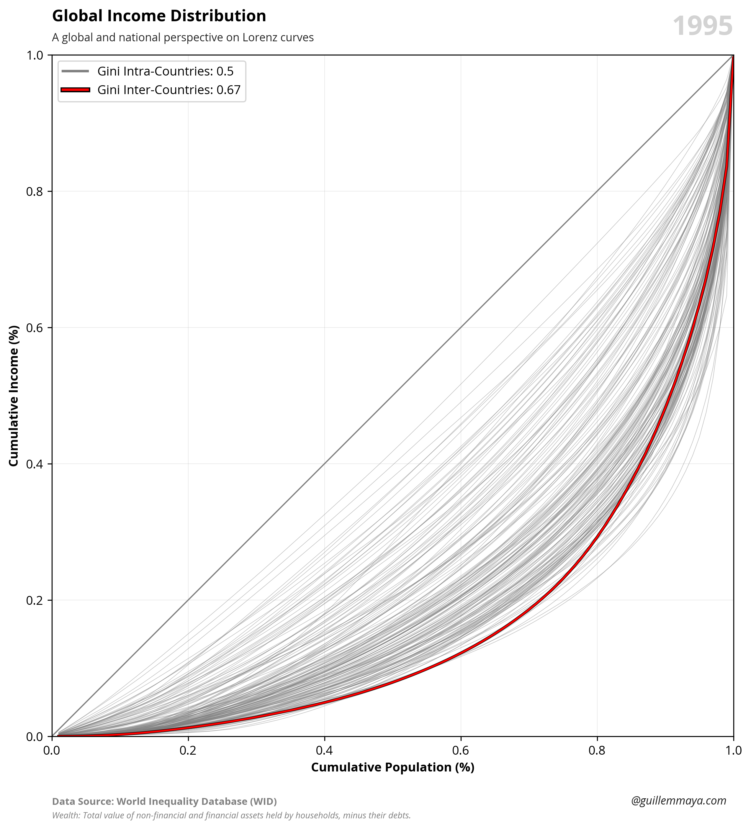
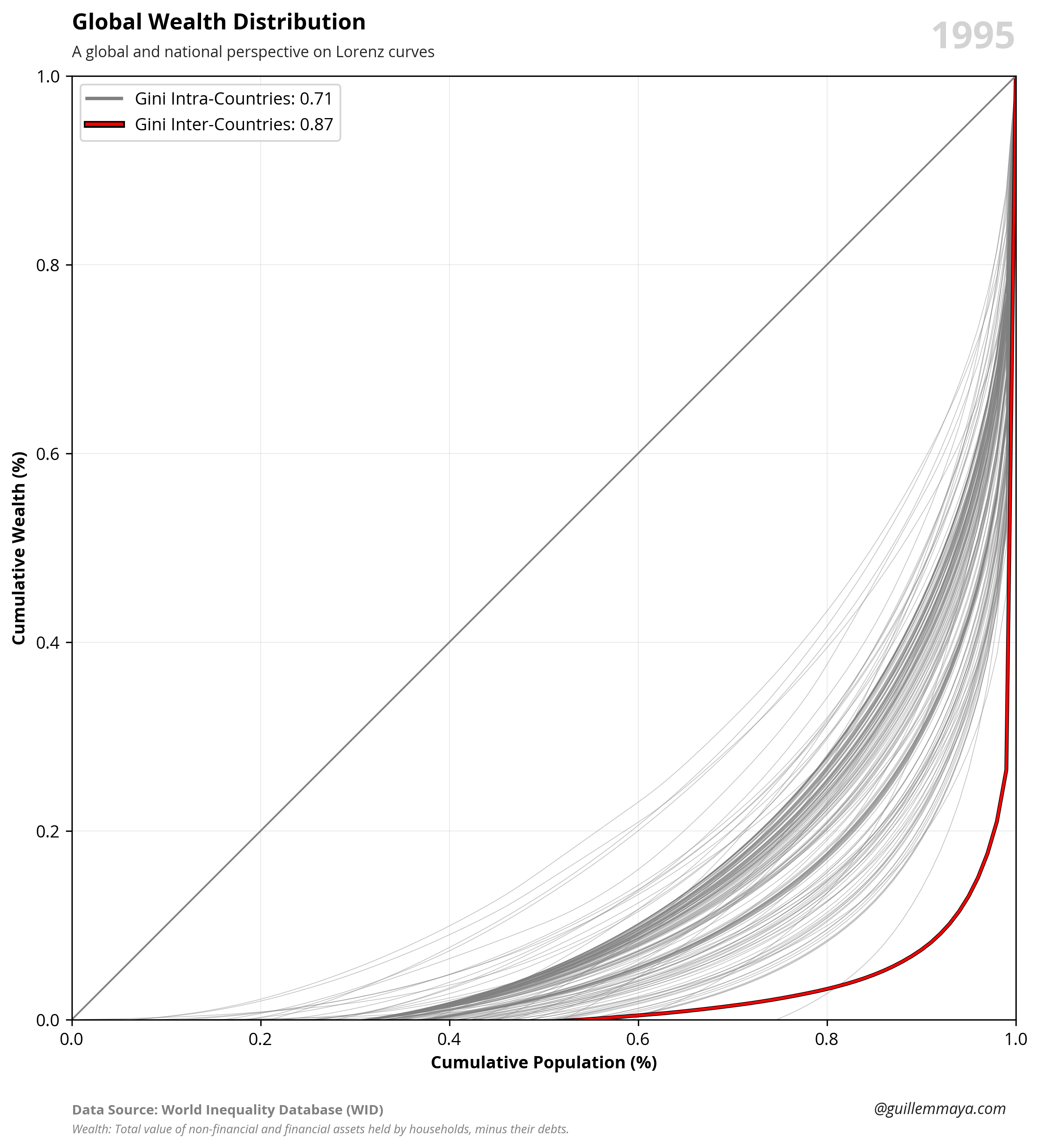
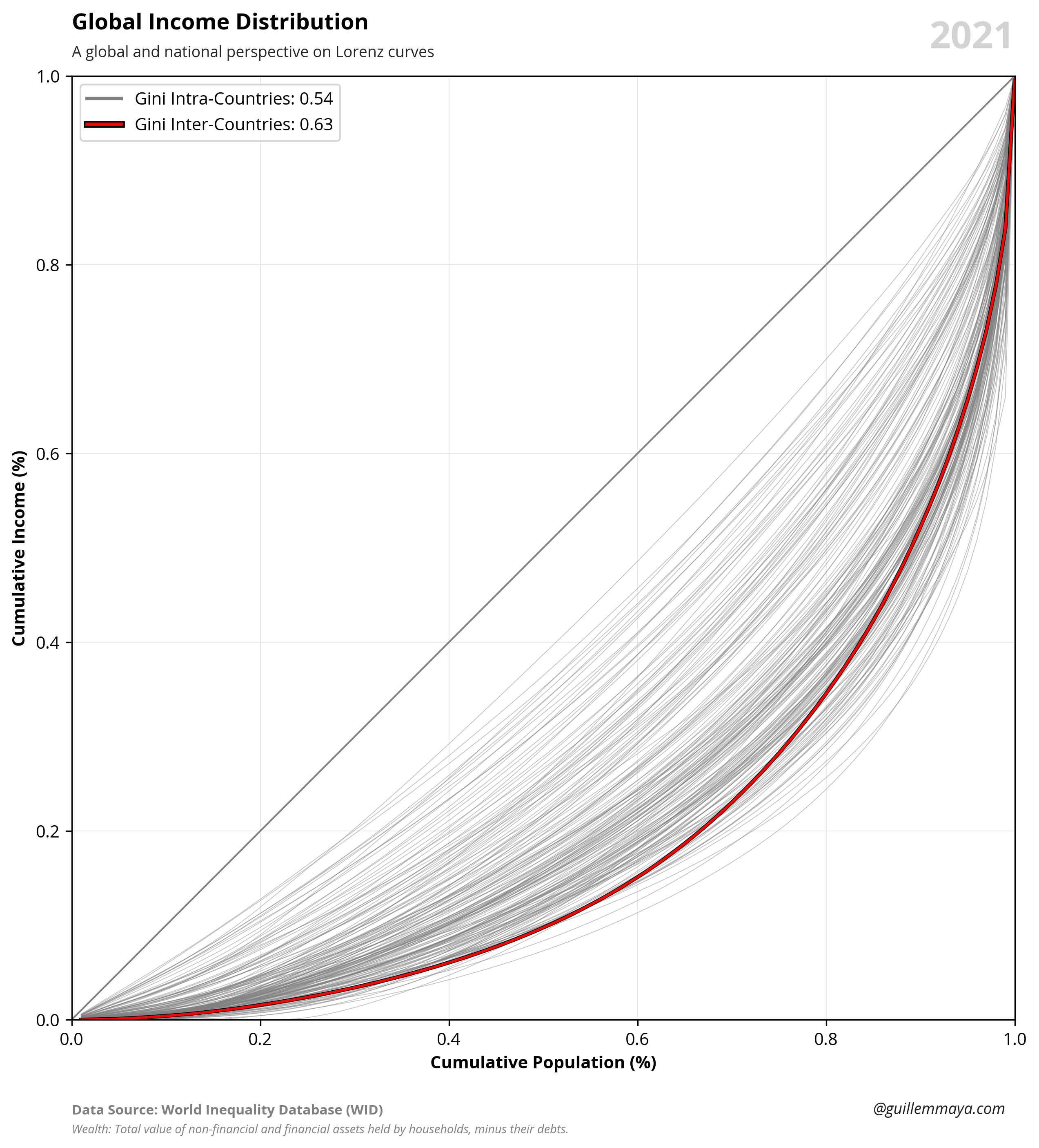
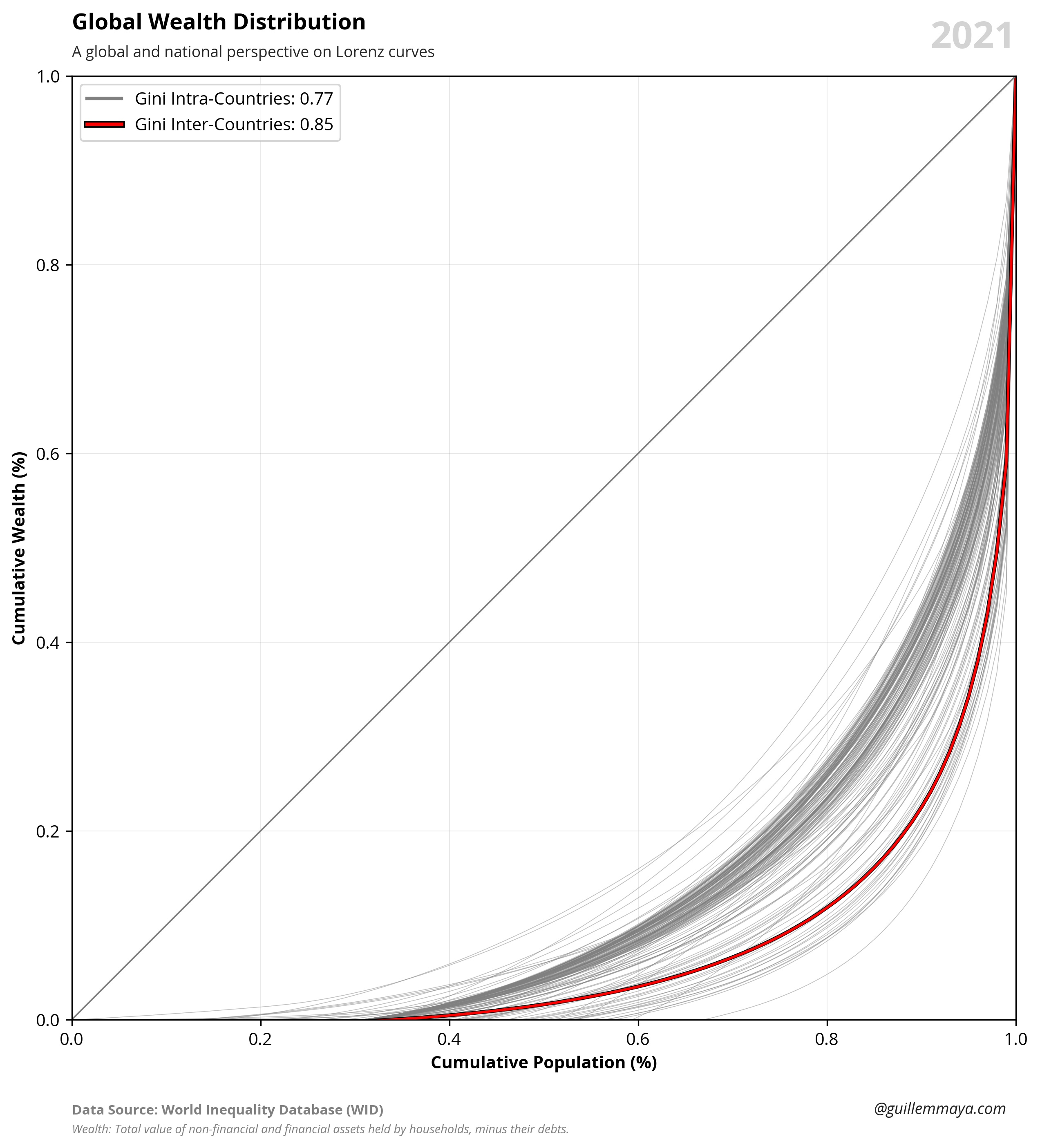
The charts show the distribution of income and wealth among countries and globally.
Published
May 18, 2025
Keywords
lorenz curves
Summary
This is a global graphical representation of income and wealth for the years 1995 and 2021. Illustrating the dynamics of inequality by comparing Gini indices through Lorenz curves, both within (intra-country) and between (inter-country) nations.
Code
# Libraries# ===================================================import requestsimport pandas as pdimport numpy as npimport seaborn as snsimport matplotlib.pyplot as pltimport matplotlib.lines as mlinesimport matplotlib.patheffects as patheffects# Parameters# =====================================================================# Select between Income/Wealthselection ='Income'year =2021# Data Extraction (Countries)# =====================================================================# Extract JSON and bring data to a dataframeurl ='https://raw.githubusercontent.com/guillemmaya92/world_map/main/Dim_Country.json'response = requests.get(url)data = response.json()df = pd.DataFrame(data)df = pd.DataFrame.from_dict(data, orient='index').reset_index()df_countries = df.rename(columns={'index': 'ISO3'})# Data Extraction (Percentages)# ===================================================# URL GitHuburl ="https://raw.githubusercontent.com/guillemmaya92/Python/main/Data/WID_Percentiles.parquet"# Extract data from parquetdf = pd.read_parquet(url, engine='pyarrow')# Filter yeardf = df[df['year'] == year]# Data Extraction (Values)# ===================================================# URL GitHuburl ="https://raw.githubusercontent.com/guillemmaya92/Python/main/Data/WID_Values.parquet"# Extract data from parquetdfv = pd.read_parquet(url, engine='pyarrow')# Filter yeardfv = dfv[dfv['year'] == year]# Extract world valuesgincomew = dfv.loc[dfv['country'] =='WO', 'gincome'].iloc[0]gwealthw = dfv.loc[dfv['country'] =='WO', 'gwealth'].iloc[0]# Extract countries weighted average valuesdfincome = dfv[dfv['country'].isin(df_countries['ISO2']) & dfv['gincome'].notnull() & dfv['population'].notnull()]dfwealth = dfv[dfv['country'].isin(df_countries['ISO2']) & dfv['gwealth'].notnull() & dfv['population'].notnull()]gincomec = np.average(dfincome['gincome'], weights= dfincome['population'])gwealthc = np.average(dfwealth['gwealth'], weights= dfwealth['population'])# Dynamic valueginiw =round(gwealthw, 2) if selection =='Wealth'elseround(gincomew, 2)ginic=round(gwealthc, 2) if selection =='Wealth'elseround(gincomec, 2)# Data Manipulation# ===================================================# Calculate cummulativedf['percentile'] = df['percentile'] /100df['income'] = df['income'] /100df['wealth'] = df['wealth'] /100df['income_cum'] = df.groupby(['country'])['income'].cumsum() / df.groupby(['country'])['income'].transform('sum')df['wealth_cum'] = df.groupby(['country'])['wealth'].cumsum() / df.groupby(['country'])['wealth'].transform('sum')df['value_cum'] = df['income_cum'] if selection =='Income'else df['wealth_cum']# Countriesdfc = df.merge(df_countries, how='left', left_on='country', right_on='ISO2')dfc = dfc[dfc['Region'].notna()]dfc = dfc[['country', 'percentile', 'value_cum']]# Worlddfw = df[df['country'] =="WO"]dfw = dfw[['country', 'percentile', 'value_cum']]dfw['country'] ='Inter-Countries'print(df)# Data Visualization# ===================================================# Font Styleplt.rcParams.update({'font.family': 'sans-serif', 'font.sans-serif': ['Open Sans'], 'font.size': 10})plt.figure(figsize=(10, 10))# Basic Grey Plot Linessns.lineplot( data=dfc, x="percentile", y="value_cum", hue="country", linewidth=0.4, alpha=0.5, palette=['#808080']).legend_.remove()# Black Shadow Plot Linessns.lineplot( data=dfw, x="percentile", y="value_cum", hue="country", linewidth=2.25, alpha=1, palette=['black']).legend_.remove()# Color Plot Linessns.lineplot( data=dfw, x="percentile", y="value_cum", hue="country", linewidth=1.5, alpha=1, palette=['#FF0000']).legend_.remove()# Add Inequality linesplt.plot([0, 1], [0, 1], color="gray", linestyle="-", linewidth=1)# Configuración del gráficoplt.text(0, 1.05, f'Global {selection} Distribution', fontsize=13, fontweight='bold', ha='left', transform=plt.gca().transAxes)plt.text(0, 1.02, 'A global and national perspective on Lorenz curves', fontsize=9, color='#262626', ha='left', transform=plt.gca().transAxes)plt.xlabel('Cumulative Population (%)', fontsize=10, fontweight='bold')plt.ylabel(f'Cumulative {selection} (%)', fontsize=10, fontweight='bold')plt.xlim(0, 1)plt.ylim(0, 1)# Adjust grid and layoutplt.grid(True, linestyle='-', color='grey', linewidth=0.08)plt.gca().set_aspect('equal', adjustable='box')# Add Data Sourceplt.text(0, -0.1, 'Data Source: World Inequality Database (WID)', transform=plt.gca().transAxes, fontsize=8, fontweight='bold', color='gray')# Variable notesnoteincome ='Income: Post-tax national income is the sum of primary incomes over all sectors (private and public), minus taxes.'notewealth ='Wealth: Total value of non-financial and financial assets held by households, minus their debts.'note = noteincome if selection =='income'else notewealth# Add Notesplt.text(0, -0.12, note, transform=plt.gca().transAxes, fontsize=7, fontstyle='italic', color='gray')# Add Authorplt.text(0.85, -0.1, '@guillemmaya.com', transform=plt.gca().transAxes, fontsize=9, fontstyle='italic', color='#212121')# Add Year labelformatted_date = yearplt.text(1, 1.06, f'{formatted_date}', transform=plt.gca().transAxes, fontsize=22, ha='right', va='top', fontweight='bold', color='#D3D3D3')# Create custom linesintra_line = mlines.Line2D([], [], color='#808080', label=f'Gini Intra-Countries: {ginic}', linewidth=2)inter_line = mlines.Line2D([], [], color='#FF0000', label=f'Gini Inter-Countries: {giniw}', linewidth=2)inter_line.set_path_effects([patheffects.withStroke(linewidth=4, foreground='black')])inter_circle = mlines.Line2D([], [], marker='o', color='w', markerfacecolor='#FF0000', markeredgecolor='black', markersize=8, label='Inter-Countries', linewidth=0)# Add custom legendplt.legend(handles=[intra_line, inter_line])# Save the figureplt.savefig('C:/Users/guill/Desktop/FIG_WID_Global_Lorenz_Curves.png', format='png', dpi=300, bbox_inches='tight')# Show the plot!plt.show()