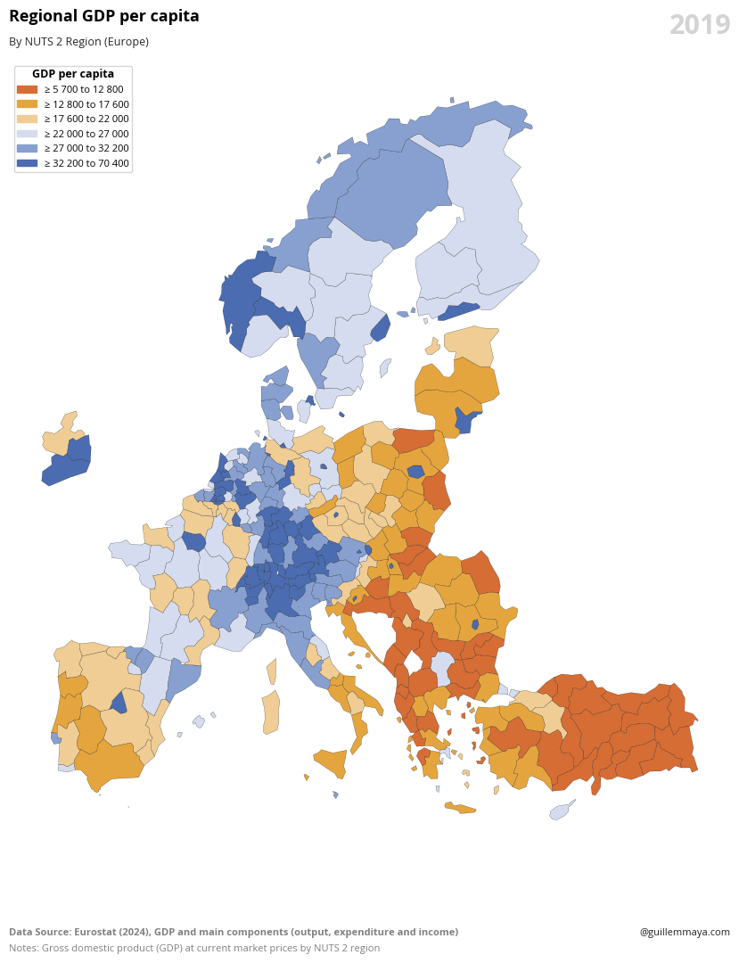
The chart displays regional GDP per capita adjusted for purchasing power standards (PPS) at the NUTS 2 level, highlighting economic disparities across European regions.
Code
# Libraries# ======================================import eurostatimport pandas as pdimport geopandas as gpdimport matplotlib.pyplot as pltimport matplotlib.colors as mcolorsimport matplotlib.patches as mpatches# EUROSTAT Data# ======================================# Get Data from Eurostatdataset = eurostat.get_data_df('TGS00005')df = pd.DataFrame(dataset)# Select and rename columnsdf = df[['geo\TIME_PERIOD', '2019']]df = df.rename(columns={'geo\\TIME_PERIOD': 'geo'})# GEOPANDAS Data# ======================================# Read GEOJSON filegeojson_url ="https://gisco-services.ec.europa.eu/distribution/v2/nuts/geojson/NUTS_RG_60M_2021_4326_LEVL_2.geojson"gdf = gpd.read_file(geojson_url)# Merge dataframesgdf = gdf.merge(df, left_on='NUTS_ID', right_on='geo')# Filter french islandsgdf = gdf[~gdf['NUTS_ID'].str.startswith('FRY')]gdf = gdf[~gdf['NUTS_ID'].str.startswith('ES70')]gdf = gdf[~gdf['NUTS_ID'].str.startswith('PT20')]gdf = gdf[~gdf['NUTS_ID'].str.startswith('PT30')]# STATIC Map# ======================================# Font Styleplt.rcParams.update({'font.family': 'sans-serif', 'font.sans-serif': ['Open Sans'], 'font.size': 10})# Create figurefig, ax = plt.subplots(1, 1, figsize=(12, 12))# Define palette rangeranges = [7000, 16000, 22000, 27000, 32000, 38000, 80000]colors = ['#d66d35', '#e5a53e', '#efcd94', '#d5dcef', '#88a0d0', '#4b6cb0'] # Colores específicos para cada rangolabels = ['≥ 5 700 to 12 800','≥ 12 800 to 17 600','≥ 17 600 to 22 000','≥ 22 000 to 27 000','≥ 27 000 to 32 200','≥ 32 200 to 70 400']# Plot Mapgdf.plot( column='2019', ax=ax, legend=False, cmap=mcolors.ListedColormap(colors), linewidth=0.15, edgecolor='black', norm=mcolors.BoundaryNorm(boundaries=ranges, ncolors=len(colors)))# Custom Legendpatches = [mpatches.Patch(color=color, label=label) for color, label inzip(colors, labels)]legend = ax.legend( handles=patches, loc='upper left', fontsize=8, title="GDP per capita", title_fontsize=9, labelspacing=0.5, borderpad=0.3)legend.get_title().set_fontweight('bold')plt.subplots_adjust(right=0.8)# Configurationplt.text(0, 1.05, 'Regional GDP per capita', fontsize=13, fontweight='bold', ha='left', transform=plt.gca().transAxes)plt.text(0, 1.02, 'By NUTS 2 Region (Europe)', fontsize=9, color='#262626', ha='left', transform=plt.gca().transAxes)ax.set_axis_off()# Add Year labelformatted_date =2019ax.text(1, 1.06, f'{formatted_date}', transform=ax.transAxes, fontsize=22, ha='right', va='top', fontweight='bold', color='#D3D3D3')# Add Data Sourceplt.text(0, -0.1, 'Data Source: Eurostat (2024), GDP and main components (output, expenditure and income)', transform=plt.gca().transAxes, fontsize=8, fontweight ='bold', color='gray')# Add Notesplt.text(0, -0.12, 'Notes: Gross domestic product (GDP) at current market prices by NUTS 2 region', transform=plt.gca().transAxes, fontsize=8, color='gray')# Add authorplt.text(1, -0.1, '@guillemmaya.com', transform=plt.gca().transAxes, fontsize=8, color='#212121', ha='right')# Save it!plt.savefig('C:/Users/guill/Downloads/FIG_EUROSTAT_Map_GDP.png', format='png', bbox_inches='tight')# Plot it!plt.show()