Capital is Back: From Labor to Capital in the Modern Economy
economy
python
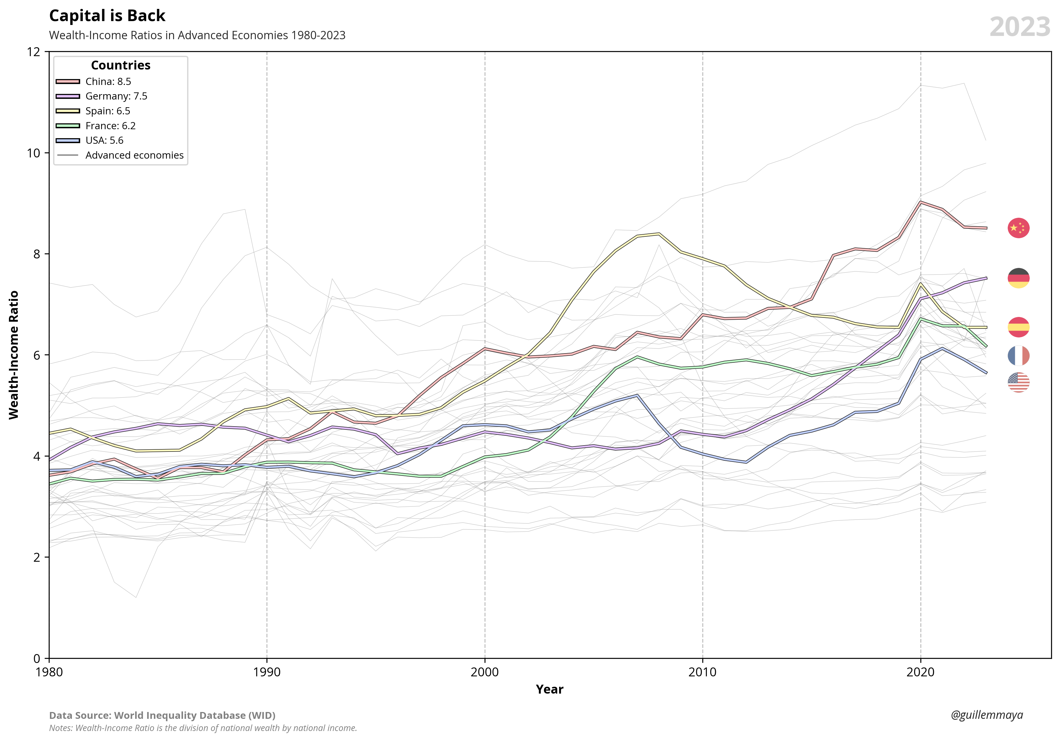
Wealth-Income Ratios in Advanced Economies 1980-2023
Published
Aug 14, 2025
Keywords
wealth-income
Summary
The chart illustration the evolution of thel wealth-income ratio from 1980 to 2023 highlights the interplay between wealth accumulation and income generation over last five decades. It reveals a clear upward trend, reflecting the disproportionate growth of wealth relative to income, particularly in recent decades. This relationship is largely determined by the growth of the economy relative to the growth of capital. When capital grows at a faster rate than the economy, wealth concentrates disproportionately, amplifying disparities and altering the balance of economic power.
Code
# Libraries# ===================================================import osimport requestsimport pandas as pdimport seaborn as snsimport matplotlib.pyplot as pltimport matplotlib.image as mpimgfrom matplotlib.offsetbox import OffsetImage, AnnotationBboxfrom matplotlib.ticker import FuncFormatterfrom io import BytesIO# Extract Data (Countries)# ===================================================# Extract JSON to dataframeurl ='https://raw.githubusercontent.com/guillemmaya92/world_map/main/Dim_Country.json'response = requests.get(url)data = response.json()df = pd.DataFrame(data)df = pd.DataFrame.from_dict(data, orient='index').reset_index()df_countries = df.rename(columns={'index': 'ISO3'})# Extract Data (WID)# ===================================================# Extract PARQUET to dataframeurl ="https://raw.githubusercontent.com/guillemmaya92/Analytics/master/Data/WID_Values.parquet"df = pd.read_parquet(url, engine="pyarrow")# Transform Data# ===================================================# Filter nulls and countriesdf = df[df['wiratio'].notna()]df = pd.merge(df, df_countries, left_on='country', right_on='ISO2', how='inner')# Rename columnsdf = df.rename( columns={'Country_Abr': 'country_name','wiratio': 'beta' } )# Filter countries have data post 1980dfx = df.loc[df['year'] ==1980, 'country']df = df[df['country'].isin(dfx)]df = df[df['year'] >=1980]df = df[df['Analytical'] =='Advanced Economies']# Dataframe countriesdfc = df[df['country'].isin(['CN', 'US', 'DE', 'ES', 'JP', 'IN'])]# Select columns and orderdf = df[['year', 'country', 'country_name', 'beta']]print(df)# Visualization Data# ===================================================# Font Styleplt.rcParams.update({'font.family': 'sans-serif', 'font.sans-serif': ['Franklin Gothic'], 'font.size': 9})sns.set(style="white", palette="muted")# Create color dictionaire palette = {'CN': '#C00000', 'US': '#153D64', 'IN': '#E97132', 'DE': '#3C7D22', 'ES': '#ECB100', 'JP': "#782170"}# Create line plotsfig, ax = plt.subplots(figsize=(8, 6))sns.lineplot(data=df, x='year', y='beta', hue='country', linewidth=0.3, alpha=0.5, palette=["#A4A4A4"], legend=False, ax=ax)sns.lineplot(data=dfc, x='year', y='beta', hue='country', linewidth=1.5, palette=palette, legend=False, ax=ax)# Add title and subtitlefig.add_artist(plt.Line2D([0.12, 0.12], [0.86, 0.97], linewidth=6, color='#203764', solid_capstyle='butt'))plt.text(0.02, 1.14, f'Capital is back', fontsize=16, fontweight='bold', ha='left', transform=plt.gca().transAxes)plt.text(0.02, 1.09, f'Wealth-Income Ratios in Advanced Economies 1980-2023', fontsize=11, color='#262626', ha='left', transform=plt.gca().transAxes)plt.text(0.02, 1.05, f'(total wealth divided by annual income)', fontsize=9, color='#262626', ha='left', transform=plt.gca().transAxes)# Custom plotplt.xlabel('')plt.ylabel('Wealth-Income Ratio (%)', fontsize=10, fontweight='bold')formatter = FuncFormatter(lambda y, _: '{:,.0f}%'.format(y *100))plt.gca().yaxis.set_major_formatter(formatter)plt.grid(axis='x', alpha=0.7, linestyle=':')plt.ylim(0, 12)plt.xlim(1980, 2026)plt.xticks(range(1980, 2026, 10))plt.tick_params(axis='both', labelsize=9)plt.tight_layout()# Delete spinesax = plt.gca()ax.spines['top'].set_visible(False)ax.spines['right'].set_visible(False)ax.spines['bottom'].set(color='gray', linewidth=1)ax.spines['left'].set_linewidth(False)# Add Data Sourceplt.text(0, -0.12, 'Data Source:', transform=plt.gca().transAxes, fontsize=8, fontweight='bold', color='gray')space =" "*23plt.text(0, -0.12, space +'World Inequality Database', transform=plt.gca().transAxes, fontsize=8, color='gray')# Add Data Sourceplt.text(0, -0.15, 'Notes:', transform=plt.gca().transAxes, fontsize=8, fontweight='bold', color='gray')space =" "*12plt.text(0, -0.15, space +'Wealth-Income Ratio is the division of national wealth by national income.', transform=plt.gca().transAxes, fontsize=8, color='gray')# Add Year labelformatted_date =2023plt.text(1.07, 1.15, f'{formatted_date}', transform=plt.gca().transAxes, fontsize=20, ha='right', va='top', fontweight='bold', color='#D3D3D3')# Define flagsflag_urls = {'CN': 'https://raw.githubusercontent.com/matahombres/CSS-Country-Flags-Rounded/master/flags/CN.png','US': 'https://raw.githubusercontent.com/matahombres/CSS-Country-Flags-Rounded/master/flags/US.png','ES': 'https://raw.githubusercontent.com/matahombres/CSS-Country-Flags-Rounded/master/flags/ES.png','DE': 'https://raw.githubusercontent.com/matahombres/CSS-Country-Flags-Rounded/master/flags/DE.png','JP': 'https://raw.githubusercontent.com/matahombres/CSS-Country-Flags-Rounded/master/flags/JP.png'}flags = {country: mpimg.imread(BytesIO(requests.get(url).content)) for country, url in flag_urls.items()}# Custom offsets to move flagsy_offsets = {'ES': 0.1,'FR': -0.1,'US': -0.15,'CN': 0.0,'JP': 0.1}# Iterate over each countryfor country in dfc['country'].unique():# Get country data country_data = dfc[dfc['country'] == country] last_point = country_data[country_data['year'] == country_data['year'].max()].iloc[0] x = last_point['year'] y = last_point['beta'] + y_offsets.get(country, 0.0) country_name = last_point['country_name'] value = last_point['beta'] *100# Add flag flag_img = flags[country] imagebox = OffsetImage(flag_img, zoom=0.021, resample=True, alpha=0.8) ab = AnnotationBbox(imagebox, (x +0.5, y), frameon=False, box_alignment=(0, 0.5)) ax.add_artist(ab)# Add country name name_x = x +2 text_name = ax.text(name_x, y, country_name, fontsize=8, va='center', ha='left', color=palette[country])# Canvas to measure large text, Get bbox name texto (px), Convert bbox to coordenates fig.canvas.draw() bbox_name = text_name.get_window_extent() inv = ax.transData.inverted() bbox_data = inv.transform([(bbox_name.x0, bbox_name.y0), (bbox_name.x1, bbox_name.y1)]) width_data = bbox_data[1][0] - bbox_data[0][0]# Position beta after name label_x = name_x + width_data +0.5 label =f"({value:,.0f}%)" ax.text(label_x, y, label, fontsize=8, va='center', ha='left', fontweight='bold', color=palette[country])# Adjust layoutplt.tight_layout()# Save it...download_folder = os.path.join(os.path.expanduser("~"), "Downloads")filename = os.path.join(download_folder, f"FIG_WID_Beta_Evolution")plt.savefig(filename, dpi=300, bbox_inches='tight')# Show plotplt.show()