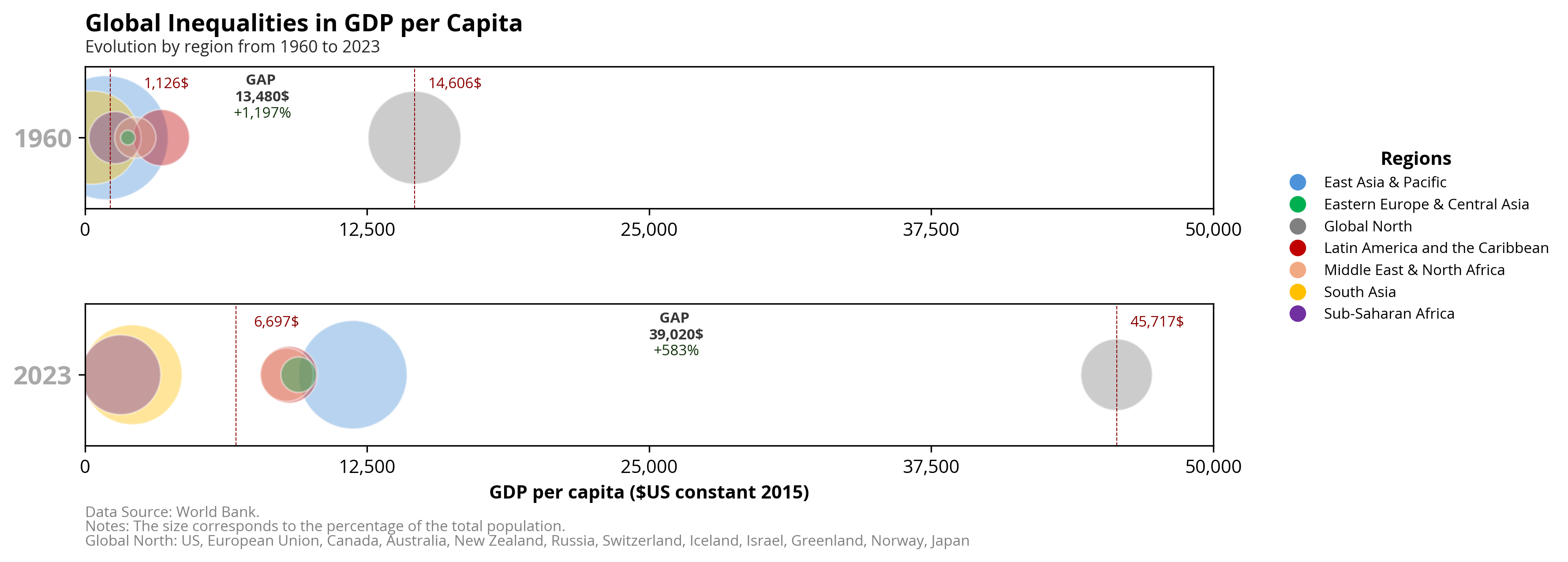
Absolute inequalities in GDP per capita between the Global North and the rest of the world’s regions.
Published
Nov 3, 2025
Keywords
wealth-income
Summary
Absolute inequalities in GDP per capita between the Global North and other regions of the world highlight the significant economic divide that persists globally. These disparities emphasize the concrete differences in wealth, living standards, and access to essential resources, underscoring the structural imbalance in global development.
Code
# Libraries# =====================================================================import requestsimport wbgapi as wbimport pandas as pdimport numpy as npimport matplotlib.pyplot as pltimport matplotlib.ticker as ticker# Data Extraction (Countries)# =====================================================================# Extract JSON and bring data to a dataframeurl ='https://raw.githubusercontent.com/guillemmaya92/world_map/main/Dim_Country.json'response = requests.get(url)data = response.json()df = pd.DataFrame(data)df = pd.DataFrame.from_dict(data, orient='index').reset_index()df_countries = df.rename(columns={'index': 'ISO3'})# Data Extraction - WBD (1960-1980)# ========================================================# To use the built-in plotting methodindicator = ['NY.GDP.PCAP.KD', 'SP.POP.TOTL']countries = df_countries['ISO3'].tolist()data_range = ['1960', '2023']data = wb.data.DataFrame(indicator, countries, data_range, numericTimeKeys=True, labels=False, columns='series').reset_index()df_wb = data.rename(columns={'economy': 'ISO3','time': 'year','SP.POP.TOTL': 'pop','NY.GDP.PCAP.KD': 'gdpc'})# Filter nulls and create totaldf_wb = df_wb[~df_wb['gdpc'].isna()]df_wb['gdpt'] = df_wb['gdpc'] * df_wb['pop']# Data Manipulation# =====================================================================# Merge queriesdf = df_wb.merge(df_countries, how='left', left_on='ISO3', right_on='ISO3')df = df[['Analytical2', 'year', 'pop', 'gdpt']]df = df.rename(columns={'Analytical2': 'group'})df = df[df['group'].notna()]# Summarizing Groupsdfg = df.copy()dfg['group'] = np.where(dfg['group'] =='Global North', 'Global North', 'Rest World')dfg = dfg.groupby(['group', 'year'])[['pop', 'gdpt']].sum().reset_index()dfg['gdpc'] = dfg['gdpt'] / dfg['pop']dfg['gdpcdif'] = dfg['gdpc'] - dfg.groupby('group')['gdpc'].shift()# Summarizing Analyticaldf = df.groupby(['group', 'year'])[['pop', 'gdpt']].sum().reset_index()df['gdpc'] = df['gdpt'] / df['pop']# Porcentualdf['pop%'] = df['pop'] / df.groupby('year')['pop'].transform('sum')df = df.sort_values(by=['pop%', 'year'], ascending=[False, True])# Data Visualization# =====================================================================# Font Styleplt.rcParams.update({'font.family': 'sans-serif', 'font.sans-serif': ['Open Sans'], 'font.size': 10})# Filter dataframesdf_1960 = df[df['year'] ==1960]df_2023 = df[df['year'] ==2023]# Valuesrw60 = dfg.loc[(dfg['group'] =='Rest World') & (dfg['year'] ==1960), 'gdpc'].values[0]gn60 = dfg.loc[(dfg['group'] =='Global North') & (dfg['year'] ==1960), 'gdpc'].values[0]rw23 = dfg.loc[(dfg['group'] =='Rest World') & (dfg['year'] ==2023), 'gdpc'].values[0]gn23 = dfg.loc[(dfg['group'] =='Global North') & (dfg['year'] ==2023), 'gdpc'].values[0]# Colorsgroup_colors = {'East Asia & Pacific': '#4D93D9','Eastern Europe & Central Asia': '#00B050','Global North': '#808080','Latin America and the Caribbean': '#C00000','Middle East & North Africa': '#F1A983','South Asia': '#FFC000','Sub-Saharan Africa': '#7030A0'}# Define ticksxticks = np.linspace(0, 50000, 5)# Create figure and suplotsfig, axes = plt.subplots(2, 1, figsize=(12, 5))# First plot (1960)axes[0].scatter(df_1960['gdpc'], df_1960['year'], s=df_1960['pop%'] *12000, alpha=0.4, c=df_1960['group'].map(group_colors), edgecolors='w')axes[0].set_yticks([1960])axes[0].set_xlim(0, 50000)axes[0].set_xticks(xticks)axes[0].xaxis.set_major_formatter(ticker.FuncFormatter(lambda x, pos: f'{x:,.0f}'))axes[0].axvline(x=rw60, color='darkred', linewidth=0.5, linestyle='--', label=f'GDPC Global North 1960: {rw60}')axes[0].axvline(x=gn60, color='darkred', linewidth=0.5, linestyle='--', label=f'GDPC Global North 1960: {gn60}')axes[0].text(rw60 +2500, 1960+70, f'{rw60:,.0f}$', color='darkred', fontsize=8, va='bottom', ha='center', rotation=0)axes[0].text(gn60 +1800, 1960+70, f'{gn60:,.0f}$', color='darkred', fontsize=8, va='bottom', ha='center', rotation=0)axes[0].text((gn60-rw60)/2+rw60, 1960+50, f'GAP \n{gn60-rw60:,.0f}$', color='#373737', fontsize=8, fontweight='bold', va='bottom', ha='center', rotation=0)axes[0].text((gn60-rw60)/2+rw60, 1960+25, f'+{(gn60-rw60)/rw60*100:,.0f}%', color='#12330b', fontsize=8, va='bottom', ha='center', rotation=0)# Second plot (2023)axes[1].scatter(df_2023['gdpc'], df_2023['year'], s=df_2023['pop%'] *12000, alpha=0.4, c=df_2023['group'].map(group_colors), edgecolors='w')axes[1].set_xlabel('GDP per capita ($US constant 2015)', fontsize=10, fontweight='bold')axes[1].set_yticks([2023])axes[1].set_xlim(0, 50000) axes[1].set_xticks(xticks)axes[1].xaxis.set_major_formatter(ticker.FuncFormatter(lambda x, pos: f'{x:,.0f}'))axes[1].axvline(x=rw23, color='darkred', linewidth=0.5, linestyle='--', label=f'GDPC Global North 1960: {rw23}')axes[1].axvline(x=gn23, color='darkred', linewidth=0.5, linestyle='--', label=f'GDPC Global North 1960: {gn23}')axes[1].text(rw23 +1800, 2023+70, f'{rw23:,.0f}$', color='darkred', fontsize=8, va='bottom', ha='center', rotation=0)axes[1].text(gn23 +1800, 2023+70, f'{gn23:,.0f}$', color='darkred', fontsize=8, va='bottom', ha='center', rotation=0)axes[1].text((gn23-rw23)/2+rw23, 2023+50, f'GAP \n{gn23-rw23:,.0f}$', color='#373737', fontsize=8, fontweight='bold', va='bottom', ha='center', rotation=0)axes[1].text((gn23-rw23)/2+rw23, 2023+25, f'+{(gn23-rw23)/rw23*100:,.0f}%', color='#12330b', fontsize=8, va='bottom', ha='center', rotation=0)# Configurationyticklabels_1960 = axes[0].get_yticklabels()yticklabels_1960[0].set_fontweight('bold')yticklabels_1960[0].set_fontsize(14)yticklabels_1960[0].set_color('darkgrey')axes[0].set_yticklabels(yticklabels_1960)yticklabels_2023 = axes[1].get_yticklabels()yticklabels_2023[0].set_fontweight('bold')yticklabels_2023[0].set_fontsize(14)yticklabels_2023[0].set_color('darkgrey')axes[1].set_yticklabels(yticklabels_2023)# Grid and labelsaxes[0].text(0, 1.25, 'Global Inequalities in GDP per Capita', fontsize=13, fontweight='bold', ha='left', transform=axes[0].transAxes)axes[0].text(0, 1.1, 'Evolution by region from 1960 to 2023', fontsize=9, color='#262626', ha='left', transform=axes[0].transAxes)# Add custom legendhandles = [plt.Line2D([0], [0], marker='o', color='w', markerfacecolor=color, markersize=10) for color in group_colors.values()]labels =list(group_colors.keys())legend = axes[0].legend(handles, labels, title="Regions", bbox_to_anchor=(1.05, 0.5), loc='upper left', frameon=False, fontsize='8', title_fontsize='10')plt.setp(legend.get_title(), fontweight='bold')# Add Data Sourceaxes[1].text(0, -0.5, 'Data Source: World Bank.', transform=plt.gca().transAxes, fontsize=8, color='gray')# Add Notesaxes[1].text(0, -0.6, 'Notes: The size corresponds to the percentage of the total population.', transform=plt.gca().transAxes, fontsize=8, color='gray')# Add Global Northaxes[1].text(0, -0.7, 'Global North: US, European Union, Canada, Australia, New Zealand, Russia, Switzerland, Iceland, Israel, Greenland, Norway, Japan', transform=plt.gca().transAxes, fontsize=8, color='gray')# Adjusting plot...plt.tight_layout()plt.savefig("C:/Users/guill/Downloads/FIG_WORLDBANK_Global_North.png", dpi=300, bbox_inches='tight') # Print it!plt.show()