Where is the income/wealth distribution concentrated?
economy
python
An analysis of where income and wealth distribution is concentrated across different population segments.
Published
Feb 21, 2026
Keywords
income, wealth
Summary
This study analyzes income and wealth distribution data sourced from the World Inequality Database (WID), segmented by country. It highlights the concentration of wealth and income within different nations, providing insights into global economic disparities.
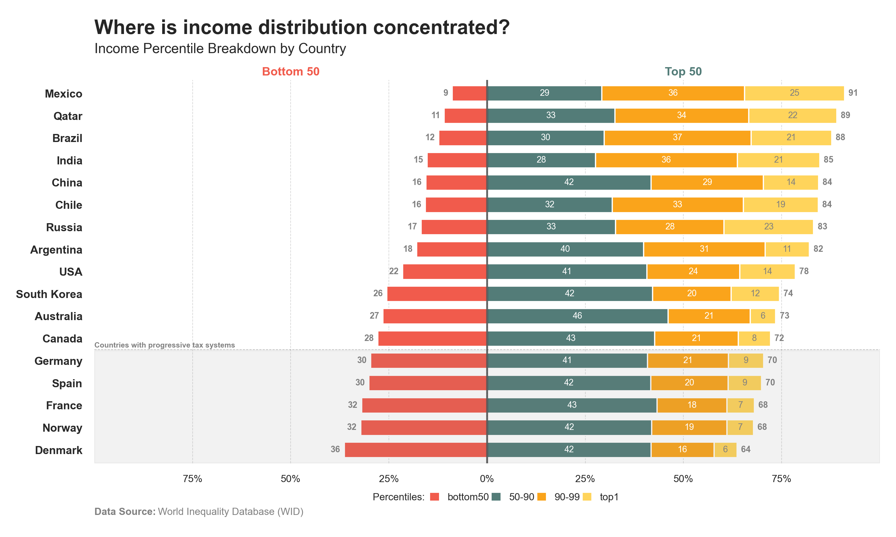
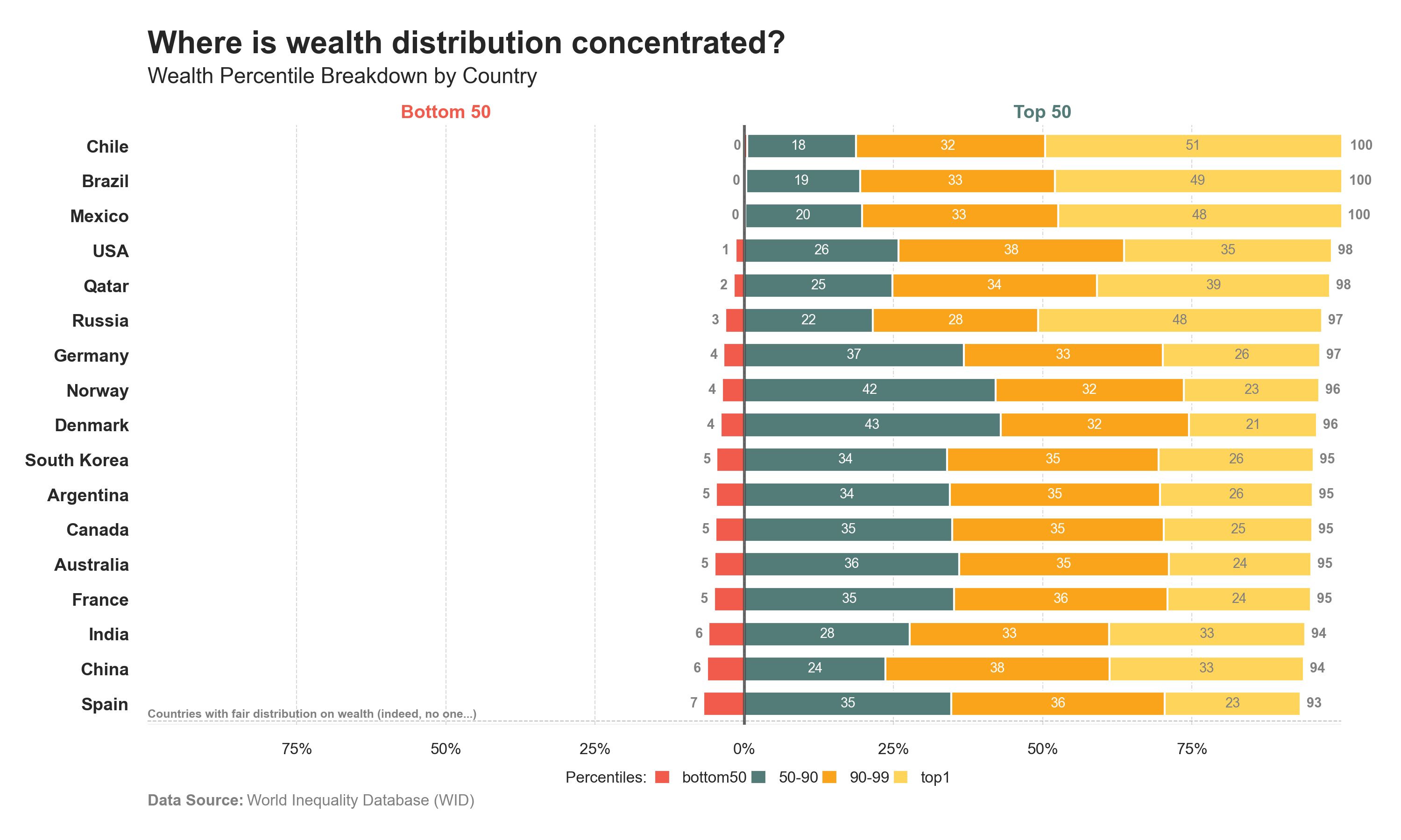
Distributions blocks 1
The distribution of “Income” and “Wealth” chart is split into two blocks [50-50]: • Bottom 50 • Top 50
Code
# Libraries# ==========================================import pandas as pdimport numpy as npimport requestsimport seaborn as snsimport matplotlib.pyplot as plt# Data Extraction - GITHUB (Countries)# =====================================================================# Extract JSON and bring data to a dataframeurl ='https://raw.githubusercontent.com/guillemmaya92/world_map/main/Dim_Country.json'response = requests.get(url)data = response.json()df = pd.DataFrame(data)df = pd.DataFrame.from_dict(data, orient='index').reset_index()df_countries = df.rename(columns={'index': 'ISO3', 'Country_Abr': 'name'})# Data Extraction - WID (Percentiles)# ==========================================# Carga del archivo Parquetdf = pd.read_parquet("https://github.com/guillemmaya92/Analytics/raw/refs/heads/master/Data/WID_Percentiles.parquet")# Data Manipulation# =====================================================================# Filter a year and select measuredf = df[df['country'].isin(["NO", "DK", "ES", "FR", "DE", "UK", "US", "IN", "CN", "JA", "AR", "RU", "QA", "CL", "BR", "CA", "AU", "KR", "MX"])]df = df[df['year'] ==2021]df['value'] = df['income']# Grouping by percentilesdf["group"] = pd.cut( df["percentile"], bins=[0, 50, 89, 99, 100], labels=["bottom50", "50-90", "90-99", "top1"], include_lowest=True)# Calculate percentsdf['side'] = np.where(df['group'].isin(['bottom50']), 'left', 'right')df['value'] *= df['side'].eq('left').map({True: -1, False: 1})# Select columnsdf = df[['country', 'group', 'value']]df = df.groupby(["country", "group"], as_index=False)["value"].sum()# Pivot columnsdf_pivot = df.pivot(index="country", columns="group", values="value").fillna(0).reset_index()# Merge namesdf_pivot = df_pivot.merge(df_countries[['ISO2', 'name']], left_on='country', right_on='ISO2', how='inner')df_pivot = df_pivot.drop(columns=['ISO2'])# Define column with values for individuals and professionalsdf_pivot['total_left'] = df_pivot['bottom50']df_pivot['total_right'] = df_pivot['50-90'] + df_pivot['90-99'] + df_pivot['top1']df_pivot = df_pivot.sort_values(by='total_left', ascending=True)# Select and order columnsorder = ["name", "bottom50", "50-90", "90-99", "top1"]dfplot = df_pivot[order]dfplot.set_index('name', inplace=True)print(dfplot)# Data Visualization# ==========================================# Font and styleplt.rcParams.update({'font.family': 'sans-serif', 'font.sans-serif': ['Franklin Gothic'], 'font.size': 9})sns.set(style="white", palette="muted")# Palette colorpalette = ["#f15b4c", "#537c78", "#faa41b", "#ffd45b"]# Create horizontal stack bar plotax = dfplot.plot(kind="barh", stacked=True, figsize=(10, 6), width=0.7, color=palette)# Add title and labelsax.text(0, 1.12, f'Where is income distribution concentrated?', fontsize=16, fontweight='bold', ha='left', transform=ax.transAxes)ax.text(0, 1.07 , f'Income Percentile Breakdown by Country', fontsize=11, color='#262626', ha='left', transform=ax.transAxes)ax.set_xlim(-100, 100)xticks = np.linspace(-75, 75, 7)plt.xticks(xticks, labels=[f"{abs(int(i))}%"for i in xticks], fontsize=8)plt.gca().set_ylabel('')plt.yticks(fontsize=9, color='#282828', fontweight='bold')plt.grid(axis='x', linestyle='--', color='gray', linewidth=0.5, alpha=0.3)plt.axvline(x=0, color='#282828', linestyle='-', linewidth=1.5, alpha=0.7)# Add individual and professional textplt.text(0.25, 1.02, 'Bottom 50', fontsize=9.5, fontweight='bold', va='center', ha='center', transform=ax.transAxes, color="#f15b4c")plt.text(0.75, 1.02, 'Top 50', fontsize=9.5, fontweight='bold', va='center', ha='center', transform=ax.transAxes, color="#537c78")# Add strict regulation zoneynum =5ax.axvspan(-100, 100, ymin=0, ymax=ynum/len(dfplot), color='gray', alpha=0.1)plt.axhline(y=ynum-0.5, color='#282828', linestyle='--', linewidth=0.5, alpha=0.3)plt.text(-100, ynum-0.4, 'Countries with progressive tax systems', fontsize=6, fontweight='bold', color="gray")# Add values for total bottom50 barsfor i, (city, total) inenumerate(zip(dfplot.index, df_pivot['total_left'])): ax.text(total -1, i, f'{abs(total):.0f}', va='center', ha='right', fontsize=7, color='grey', fontweight='bold')# Add values for total top50 barsfor i, (city, total) inenumerate(zip(dfplot.index, df_pivot['total_right'])): ax.text(total +1, i, f'{total:.0f} ', va='center', ha='left', fontsize=7, color='grey', fontweight='bold')# Add values for individual bars (top1)for i, (city, center, top9, top1) inenumerate(zip(dfplot.index, df_pivot["50-90"], df_pivot["90-99"], df_pivot["top1"])): ax.text(center+top9+(top1/2), i, f'{abs(top1):.0f}', va='center', ha='center', fontsize=7, color='grey')# Add values for individual bars (top9)for i, (city, center, top9) inenumerate(zip(dfplot.index, df_pivot["50-90"], df_pivot["90-99"])): ax.text(center+(top9/2), i, f'{abs(top9):.0f}', va='center', ha='center', fontsize=7, color='white')# Add values for individual bars (center)for i, (city, center) inenumerate(zip(dfplot.index, df_pivot["50-90"])): ax.text(center /2, i, f'{abs(center):.0f}', va='center', ha='center', fontsize=7, color='white')# Legend configurationplt.plot([], [], label="Percentiles: ", color='white')plt.legend( loc='lower center', bbox_to_anchor=(0.5, -0.12), ncol=7, fontsize=8, frameon=False, handlelength=1, handleheight=1, borderpad=0.2, columnspacing=0.2)# Add Data Sourceplt.text(0, -0.135, 'Data Source:', transform=plt.gca().transAxes, fontsize=8, fontweight='bold', color='gray')space =" "*23plt.text(0, -0.135, space +'World Inequality Database (WID)', transform=plt.gca().transAxes, fontsize=8, color='gray')# Remove spinesfor spine in plt.gca().spines.values(): spine.set_visible(False)# Adjust layoutplt.tight_layout()# Plot it! :)plt.show()
Code
# Libraries# ==========================================import pandas as pdimport numpy as npimport requestsimport seaborn as snsimport matplotlib.pyplot as plt# Data Extraction - GITHUB (Countries)# =====================================================================# Extract JSON and bring data to a dataframeurl ='https://raw.githubusercontent.com/guillemmaya92/world_map/main/Dim_Country.json'response = requests.get(url)data = response.json()df = pd.DataFrame(data)df = pd.DataFrame.from_dict(data, orient='index').reset_index()df_countries = df.rename(columns={'index': 'ISO3', 'Country_Abr': 'name'})# Data Extraction - WID (Percentiles)# ==========================================# Carga del archivo Parquetdf = pd.read_parquet("https://github.com/guillemmaya92/Analytics/raw/refs/heads/master/Data/WID_Percentiles.parquet")# Data Manipulation# =====================================================================# Filter a year and select measuredf = df[df['country'].isin(["NO", "DK", "ES", "FR", "DE", "UK", "US", "IN", "CN", "JA", "AR", "RU", "QA", "CL", "BR", "CA", "AU", "KR", "MX"])]df = df[df['year'] ==2021]df['value'] = df['wealth']# Grouping by percentilesdf["group"] = pd.cut( df["percentile"], bins=[0, 50, 89, 99, 100], labels=["bottom50", "50-90", "90-99", "top1"], include_lowest=True)# Calculate percentsdf['side'] = np.where(df['group'].isin(['bottom50']), 'left', 'right')df['value'] *= df['side'].eq('left').map({True: -1, False: 1})# Select columnsdf = df[['country', 'group', 'value']]df = df.groupby(["country", "group"], as_index=False)["value"].sum()# Pivot columnsdf_pivot = df.pivot(index="country", columns="group", values="value").fillna(0).reset_index()# Merge namesdf_pivot = df_pivot.merge(df_countries[['ISO2', 'name']], left_on='country', right_on='ISO2', how='inner')df_pivot = df_pivot.drop(columns=['ISO2'])# Define column with values for individuals and professionalsdf_pivot['total_left'] = df_pivot['bottom50']df_pivot['total_right'] = df_pivot['50-90'] + df_pivot['90-99'] + df_pivot['top1']df_pivot = df_pivot.sort_values(by='total_left', ascending=True)# Select and order columnsorder = ["name", "bottom50", "50-90", "90-99", "top1"]dfplot = df_pivot[order]dfplot.set_index('name', inplace=True)print(dfplot)# Data Visualization# ==========================================# Font and styleplt.rcParams.update({'font.family': 'sans-serif', 'font.sans-serif': ['Franklin Gothic'], 'font.size': 9})sns.set(style="white", palette="muted")# Palette colorpalette = ["#f15b4c", "#537c78", "#faa41b", "#ffd45b"]# Create horizontal stack bar plotax = dfplot.plot(kind="barh", stacked=True, figsize=(10, 6), width=0.7, color=palette)# Add title and labelsax.text(0, 1.12, f'Where is wealth distribution concentrated?', fontsize=16, fontweight='bold', ha='left', transform=ax.transAxes)ax.text(0, 1.07 , f'Wealth Percentile Breakdown by Country', fontsize=11, color='#262626', ha='left', transform=ax.transAxes)ax.set_xlim(-100, 100)xticks = np.linspace(-75, 75, 7)plt.xticks(xticks, labels=[f"{abs(int(i))}%"for i in xticks], fontsize=8)plt.gca().set_ylabel('')plt.yticks(fontsize=9, color='#282828', fontweight='bold')plt.grid(axis='x', linestyle='--', color='gray', linewidth=0.5, alpha=0.3)plt.axvline(x=0, color='#282828', linestyle='-', linewidth=1.5, alpha=0.7)# Add individual and professional textplt.text(0.25, 1.02, 'Bottom 50', fontsize=9.5, fontweight='bold', va='center', ha='center', transform=ax.transAxes, color="#f15b4c")plt.text(0.75, 1.02, 'Top 50', fontsize=9.5, fontweight='bold', va='center', ha='center', transform=ax.transAxes, color="#537c78")# Add strict regulation zoneynum =0ax.axvspan(-100, 100, ymin=0, ymax=ynum/len(dfplot), color='gray', alpha=0.1)plt.axhline(y=ynum-0.5, color='#282828', linestyle='--', linewidth=0.5, alpha=0.3)plt.text(-100, ynum-0.4, 'Countries with fair distribution on wealth (indeed, no one...)', fontsize=6, fontweight='bold', color="gray")# Add values for total bottom50 barsfor i, (city, total) inenumerate(zip(dfplot.index, df_pivot['total_left'])): ax.text(total -1, i, f'{abs(total):.0f}', va='center', ha='right', fontsize=7, color='grey', fontweight='bold')# Add values for total top50 barsfor i, (city, total) inenumerate(zip(dfplot.index, df_pivot['total_right'])): ax.text(total +1, i, f'{total:.0f} ', va='center', ha='left', fontsize=7, color='grey', fontweight='bold')# Add values for individual bars (top1)for i, (city, center, top9, top1) inenumerate(zip(dfplot.index, df_pivot["50-90"], df_pivot["90-99"], df_pivot["top1"])): ax.text(center+top9+(top1/2), i, f'{abs(top1):.0f}', va='center', ha='center', fontsize=7, color='grey')# Add values for individual bars (top9)for i, (city, center, top9) inenumerate(zip(dfplot.index, df_pivot["50-90"], df_pivot["90-99"])): ax.text(center+(top9/2), i, f'{abs(top9):.0f}', va='center', ha='center', fontsize=7, color='white')# Add values for individual bars (center)for i, (city, center) inenumerate(zip(dfplot.index, df_pivot["50-90"])): ax.text(center /2, i, f'{abs(center):.0f}', va='center', ha='center', fontsize=7, color='white')# Legend configurationplt.plot([], [], label="Percentiles: ", color='white')plt.legend( loc='lower center', bbox_to_anchor=(0.5, -0.12), ncol=7, fontsize=8, frameon=False, handlelength=1, handleheight=1, borderpad=0.2, columnspacing=0.2)# Add Data Sourceplt.text(0, -0.135, 'Data Source:', transform=plt.gca().transAxes, fontsize=8, fontweight='bold', color='gray')space =" "*23plt.text(0, -0.135, space +'World Inequality Database (WID)', transform=plt.gca().transAxes, fontsize=8, color='gray')# Remove spinesfor spine in plt.gca().spines.values(): spine.set_visible(False)# Adjust layoutplt.tight_layout()# Plot it! :)plt.show()
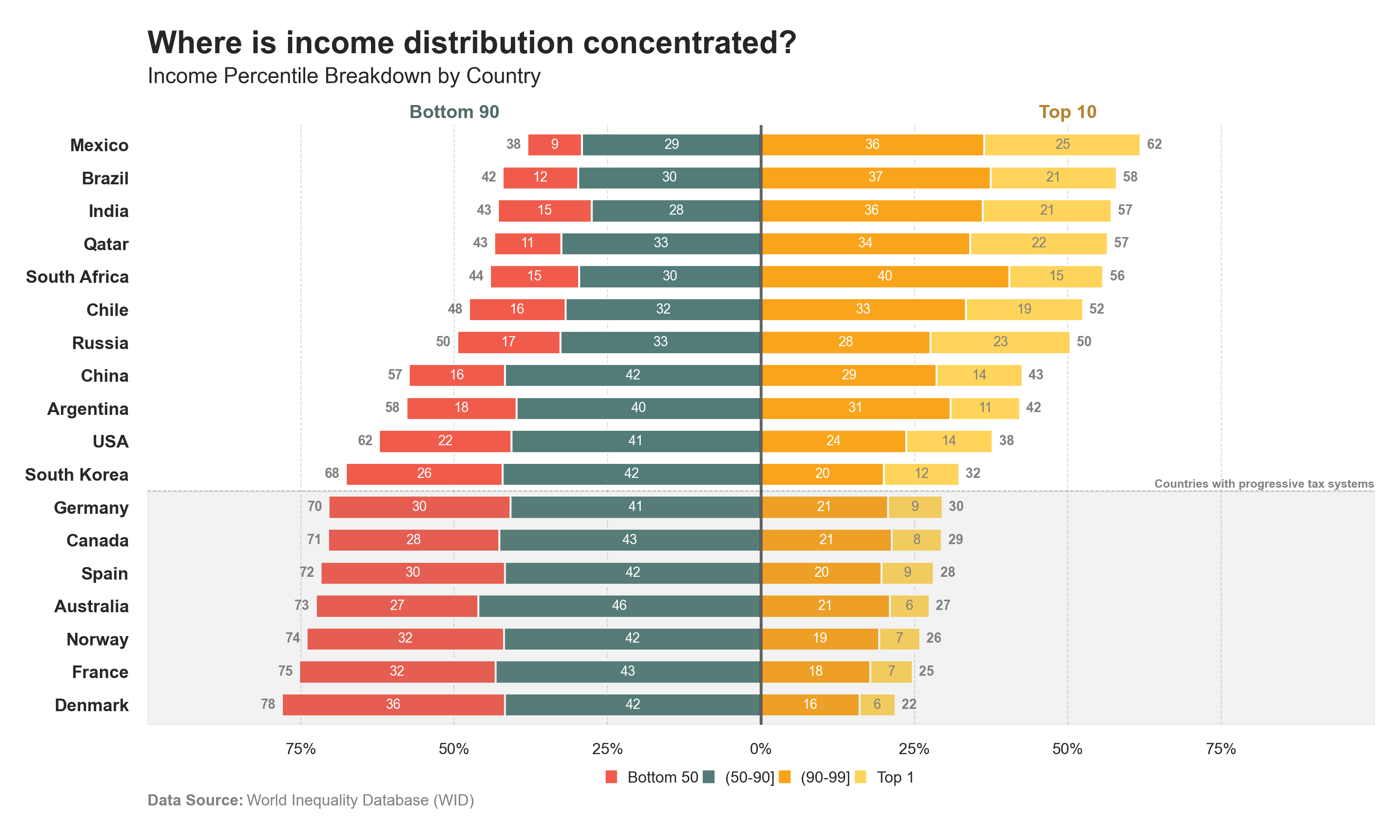
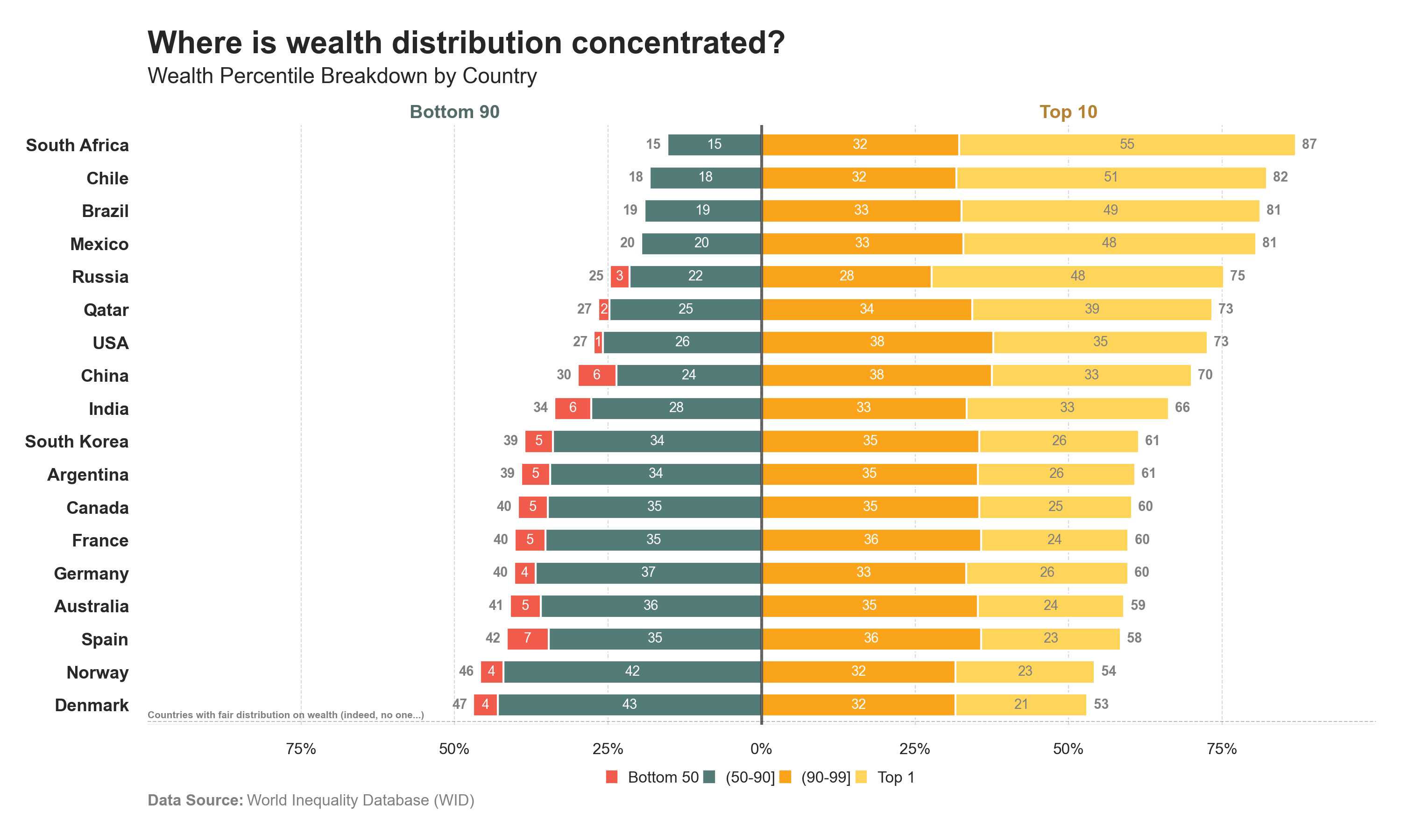
Distributions blocks 2
The distribution of “Income” and “Wealth” chart is split into two blocks [90-10]: • Bottom 90 • Top 10
Code
# Libraries# ==========================================import pandas as pdimport numpy as npimport requestsimport seaborn as snsimport matplotlib.pyplot as pltimport matplotlib.patches as mpatches# Data Extraction - GITHUB (Countries)# =====================================================================# Extract JSON and bring data to a dataframeurl ='https://raw.githubusercontent.com/guillemmaya92/world_map/main/Dim_Country.json'response = requests.get(url)data = response.json()df = pd.DataFrame(data)df = pd.DataFrame.from_dict(data, orient='index').reset_index()df_countries = df.rename(columns={'index': 'ISO3', 'Country_Abr': 'name'})# Data Extraction - WID (Percentiles)# ==========================================# Carga del archivo Parquetdf = pd.read_parquet("https://github.com/guillemmaya92/Analytics/raw/refs/heads/master/Data/WID_Percentiles.parquet")# Data Manipulation# =====================================================================# Filter a year and select measuredf = df[df['country'].isin(["NO", "DK", "ES", "FR", "DE", "UK", "US", "IN", "CN", "JA", "AR", "RU", "QA", "CL", "BR", "CA", "AU", "KR", "MX", "ZA"])]df = df[df['year'] ==2021]df['value'] = df['income']# Grouping by percentilesdf["group"] = pd.cut( df["percentile"], bins=[0, 50, 89, 99, 100], labels=["bottom50", "50-90", "90-99", "top1"], include_lowest=True)# Calculate percentsdf['side'] = np.where(df['group'].isin(['bottom50', '50-90']), 'left', 'right')df['value'] *= df['side'].eq('left').map({True: -1, False: 1})# Select columnsdf = df[['country', 'group', 'value']]df = df.groupby(["country", "group"], as_index=False)["value"].sum()# Pivot columnsdf_pivot = df.pivot(index="country", columns="group", values="value").fillna(0).reset_index()# Merge namesdf_pivot = df_pivot.merge(df_countries[['ISO2', 'name']], left_on='country', right_on='ISO2', how='inner')df_pivot = df_pivot.drop(columns=['ISO2'])# Define column with values for individuals and professionalsdf_pivot['total_left'] = df_pivot['bottom50'] + df_pivot['50-90']df_pivot['total_right'] = df_pivot['90-99'] + df_pivot['top1']df_pivot = df_pivot.sort_values(by='total_left', ascending=True)# Select and order columnsorder = ["name", "50-90", "bottom50", "90-99", "top1"]dfplot = df_pivot[order]dfplot.set_index('name', inplace=True)print(dfplot)# Data Visualization# ==========================================# Font and styleplt.rcParams.update({'font.family': 'sans-serif', 'font.sans-serif': ['Franklin Gothic'], 'font.size': 9})sns.set(style="white", palette="muted")# Palette colorpalette = ["#537c78", "#f15b4c", "#faa41b", "#ffd45b"]# Create horizontal stack bar plotax = dfplot.plot(kind="barh", stacked=True, figsize=(10, 6), width=0.7, color=palette)# Add title and labelsax.text(0, 1.12, f'Where is income distribution concentrated?', fontsize=16, fontweight='bold', ha='left', transform=ax.transAxes)ax.text(0, 1.07 , f'Income Percentile Breakdown by Country', fontsize=11, color='#262626', ha='left', transform=ax.transAxes)ax.set_xlim(-100, 100)xticks = np.linspace(-75, 75, 7)plt.xticks(xticks, labels=[f"{abs(int(i))}%"for i in xticks], fontsize=8)plt.gca().set_ylabel('')plt.yticks(fontsize=9, color='#282828', fontweight='bold')plt.grid(axis='x', linestyle='--', color='gray', linewidth=0.5, alpha=0.3)plt.axvline(x=0, color='#282828', linestyle='-', linewidth=1.5, alpha=0.7)# Add individual and professional textplt.text(0.25, 1.02, 'Bottom 90', fontsize=9.5, fontweight='bold', va='center', ha='center', transform=ax.transAxes, color="#526b69")plt.text(0.75, 1.02, 'Top 10', fontsize=9.5, fontweight='bold', va='center', ha='center', transform=ax.transAxes, color="#b58231")# Add strict regulation zoneynum =7ax.axvspan(-100, 100, ymin=0, ymax=ynum/len(dfplot), color='gray', alpha=0.1)plt.axhline(y=ynum-0.5, color='#282828', linestyle='--', linewidth=0.5, alpha=0.3)plt.text(+100, ynum-0.4, 'Countries with progressive tax systems', fontsize=6, fontweight='bold', color="gray", ha="right")# Add values for total bottom50 barsfor i, (city, total) inenumerate(zip(dfplot.index, df_pivot['total_left'])): ax.text(total -1, i, f'{abs(total):.0f}', va='center', ha='right', fontsize=7, color='grey', fontweight='bold')# Add values for total top50 barsfor i, (city, total) inenumerate(zip(dfplot.index, df_pivot['total_right'])): ax.text(total +1, i, f'{total:.0f} ', va='center', ha='left', fontsize=7, color='grey', fontweight='bold')# Add values for individual bars (top1)for i, (city, center, top9, top1) inenumerate(zip(dfplot.index, df_pivot["50-90"], df_pivot["90-99"], df_pivot["top1"])): ax.text(top9+(top1/2), i, f'{abs(top1):.0f}', va='center', ha='center', fontsize=7, color='grey')# Add values for individual bars (top9)for i, (city, center, top9) inenumerate(zip(dfplot.index, df_pivot["50-90"], df_pivot["90-99"])): ax.text((top9/2), i, f'{abs(top9):.0f}', va='center', ha='center', fontsize=7, color='white')# Add values for individual bars (center)for i, (city, bottom50, center) inenumerate(zip(dfplot.index, df_pivot["bottom50"], df_pivot["50-90"])): ax.text(center+(bottom50/2), i, f'{abs(bottom50):.0f}', va='center', ha='center', fontsize=7, color='white')# Add values for individual bars (center)for i, (city, center) inenumerate(zip(dfplot.index, df_pivot["50-90"])): ax.text((center/2), i, f'{abs(center):.0f}', va='center', ha='center', fontsize=7, color='white')# Configurar la leyenda manualmente con cuadradoshandles = [ mpatches.Patch(color=palette[1], label="Bottom 50", linewidth=2), mpatches.Patch(color=palette[0], label="(50-90]", linewidth=2), mpatches.Patch(color=palette[2], label="(90-99]", linewidth=2), mpatches.Patch(color=palette[3], label="Top 1", linewidth=2)]# Configuración de la leyendaplt.legend( handles=handles, loc='lower center', bbox_to_anchor=(0.5, -0.12), ncol=4, # Para que los elementos queden en una fila fontsize=8, frameon=False, handlelength=0.5, handleheight=0.5, borderpad=0.2, columnspacing=0.4)# Add Data Sourceplt.text(0, -0.135, 'Data Source:', transform=plt.gca().transAxes, fontsize=8, fontweight='bold', color='gray')space =" "*23plt.text(0, -0.135, space +'World Inequality Database (WID)', transform=plt.gca().transAxes, fontsize=8, color='gray')# Remove spinesfor spine in plt.gca().spines.values(): spine.set_visible(False)# Adjust layoutplt.tight_layout()# Plot it! :)plt.show()
Code
# Libraries# ==========================================import pandas as pdimport numpy as npimport requestsimport seaborn as snsimport matplotlib.pyplot as pltimport matplotlib.patches as mpatches# Data Extraction - GITHUB (Countries)# =====================================================================# Extract JSON and bring data to a dataframeurl ='https://raw.githubusercontent.com/guillemmaya92/world_map/main/Dim_Country.json'response = requests.get(url)data = response.json()df = pd.DataFrame(data)df = pd.DataFrame.from_dict(data, orient='index').reset_index()df_countries = df.rename(columns={'index': 'ISO3', 'Country_Abr': 'name'})# Data Extraction - WID (Percentiles)# ==========================================# Carga del archivo Parquetdf = pd.read_parquet("https://github.com/guillemmaya92/Analytics/raw/refs/heads/master/Data/WID_Percentiles.parquet")# Data Manipulation# =====================================================================# Filter a year and select measuredf = df[df['country'].isin(["NO", "DK", "ES", "FR", "DE", "UK", "US", "IN", "CN", "JA", "AR", "RU", "QA", "CL", "BR", "CA", "AU", "KR", "MX", "ZA"])]df = df[df['year'] ==2021]df['value'] = df['wealth']# Grouping by percentilesdf["group"] = pd.cut( df["percentile"], bins=[0, 50, 89, 99, 100], labels=["bottom50", "50-90", "90-99", "top1"], include_lowest=True)# Calculate percentsdf['side'] = np.where(df['group'].isin(['bottom50', '50-90']), 'left', 'right')df['value'] *= df['side'].eq('left').map({True: -1, False: 1})# Select columnsdf = df[['country', 'group', 'value']]df = df.groupby(["country", "group"], as_index=False)["value"].sum()df['value'] = np.where((df['group'] =='bottom50') & (df['value'] >=0), np.nan, df['value'])# Pivot columnsdf_pivot = df.pivot(index="country", columns="group", values="value").fillna(0).reset_index()# Merge namesdf_pivot = df_pivot.merge(df_countries[['ISO2', 'name']], left_on='country', right_on='ISO2', how='inner')df_pivot = df_pivot.drop(columns=['ISO2'])# Define column with values for individuals and professionalsdf_pivot['total_left'] = df_pivot['bottom50'] + df_pivot['50-90']df_pivot['total_right'] = df_pivot['90-99'] + df_pivot['top1']df_pivot = df_pivot.sort_values(by='total_left', ascending=True)# Select and order columnsorder = ["name", "50-90", "bottom50", "90-99", "top1"]dfplot = df_pivot[order]dfplot.set_index('name', inplace=True)print(dfplot)# Data Visualization# ==========================================# Font and styleplt.rcParams.update({'font.family': 'sans-serif', 'font.sans-serif': ['Franklin Gothic'], 'font.size': 9})sns.set(style="white", palette="muted")# Palette colorpalette = ["#537c78", "#f15b4c", "#faa41b", "#ffd45b"]# Create horizontal stack bar plotax = dfplot.plot(kind="barh", stacked=True, figsize=(10, 6), width=0.7, color=palette)# Add title and labelsax.text(0, 1.12, f'Where is income distribution concentrated?', fontsize=16, fontweight='bold', ha='left', transform=ax.transAxes)ax.text(0, 1.07 , f'Income Percentile Breakdown by Country', fontsize=11, color='#262626', ha='left', transform=ax.transAxes)ax.set_xlim(-100, 100)xticks = np.linspace(-75, 75, 7)plt.xticks(xticks, labels=[f"{abs(int(i))}%"for i in xticks], fontsize=8)plt.gca().set_ylabel('')plt.yticks(fontsize=9, color='#282828', fontweight='bold')plt.grid(axis='x', linestyle='--', color='gray', linewidth=0.5, alpha=0.3)plt.axvline(x=0, color='#282828', linestyle='-', linewidth=1.5, alpha=0.7)# Add individual and professional textplt.text(0.25, 1.02, 'Bottom 90', fontsize=9.5, fontweight='bold', va='center', ha='center', transform=ax.transAxes, color="#526b69")plt.text(0.75, 1.02, 'Top 10', fontsize=9.5, fontweight='bold', va='center', ha='center', transform=ax.transAxes, color="#b58231")# Add strict regulation zoneynum =0ax.axvspan(-100, 100, ymin=0, ymax=ynum/len(dfplot), color='gray', alpha=0.1)plt.axhline(y=ynum-0.5, color='#282828', linestyle='--', linewidth=0.5, alpha=0.3)plt.text(-100, ynum-0.4, 'Countries with fair distribution on wealth (indeed, no one...)', fontsize=5, fontweight='bold', color="gray", ha="left")# Add values for total bottom50 barsfor i, (city, total) inenumerate(zip(dfplot.index, df_pivot['total_left'])): ax.text(total -1, i, f'{abs(total):.0f}', va='center', ha='right', fontsize=7, color='grey', fontweight='bold')# Add values for total top50 barsfor i, (city, total) inenumerate(zip(dfplot.index, df_pivot['total_right'])): ax.text(total +1, i, f'{total:.0f} ', va='center', ha='left', fontsize=7, color='grey', fontweight='bold')# Add values for individual bars (top1)for i, (city, center, top9, top1) inenumerate(zip(dfplot.index, df_pivot["50-90"], df_pivot["90-99"], df_pivot["top1"])): ax.text(top9+(top1/2), i, f'{abs(top1):.0f}', va='center', ha='center', fontsize=7, color='grey')# Add values for individual bars (top9)for i, (city, center, top9) inenumerate(zip(dfplot.index, df_pivot["50-90"], df_pivot["90-99"])): ax.text((top9/2), i, f'{abs(top9):.0f}', va='center', ha='center', fontsize=7, color='white')# Add values for individual bars (bottom50)for i, (city, bottom50, center) inenumerate(zip(dfplot.index, df_pivot["bottom50"], df_pivot["50-90"])): value =abs(bottom50)ifround(value) !=0: # Solo muestra el texto si el valor redondeado no es cero ax.text(center + (bottom50 /2), i, f'{value:.0f}', va='center', ha='center', fontsize=7, color='white')# Add values for individual bars (center)for i, (city, center) inenumerate(zip(dfplot.index, df_pivot["50-90"])): ax.text((center/2), i, f'{abs(center):.0f}', va='center', ha='center', fontsize=7, color='white')# Configurar la leyenda manualmente con cuadradoshandles = [ mpatches.Patch(color=palette[1], label="Bottom 50", linewidth=2), mpatches.Patch(color=palette[0], label="(50-90]", linewidth=2), mpatches.Patch(color=palette[2], label="(90-99]", linewidth=2), mpatches.Patch(color=palette[3], label="Top 1", linewidth=2)]# Configuración de la leyendaplt.legend( handles=handles, loc='lower center', bbox_to_anchor=(0.5, -0.12), ncol=4, # Para que los elementos queden en una fila fontsize=8, frameon=False, handlelength=0.5, handleheight=0.5, borderpad=0.2, columnspacing=0.4)# Add Data Sourceplt.text(0, -0.135, 'Data Source:', transform=plt.gca().transAxes, fontsize=8, fontweight='bold', color='gray')space =" "*23plt.text(0, -0.135, space +'World Inequality Database (WID)', transform=plt.gca().transAxes, fontsize=8, color='gray')# Remove spinesfor spine in plt.gca().spines.values(): spine.set_visible(False)# Adjust layoutplt.tight_layout()# Plot it! :)plt.show()