# Libraries
# ==========================================
import pandas as pd
import numpy as np
import requests
import matplotlib.pyplot as plt
from matplotlib.ticker import FuncFormatter
import matplotlib.patches as patches
import os
# Variables
# ==========================================
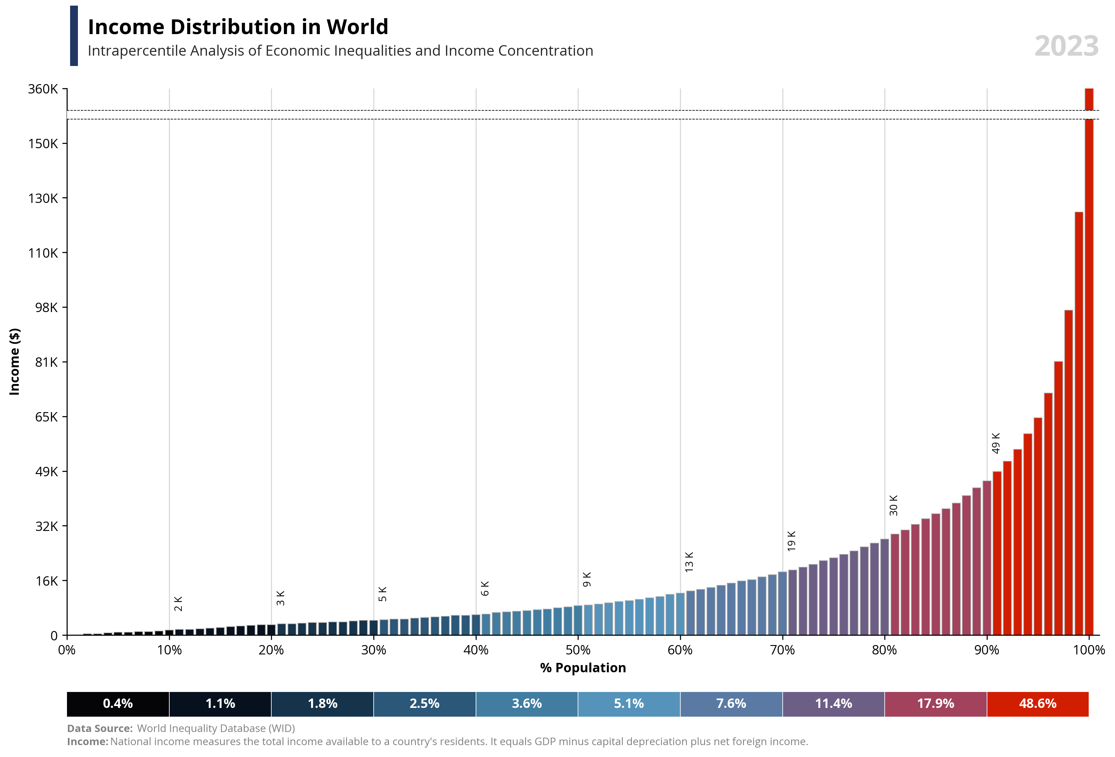
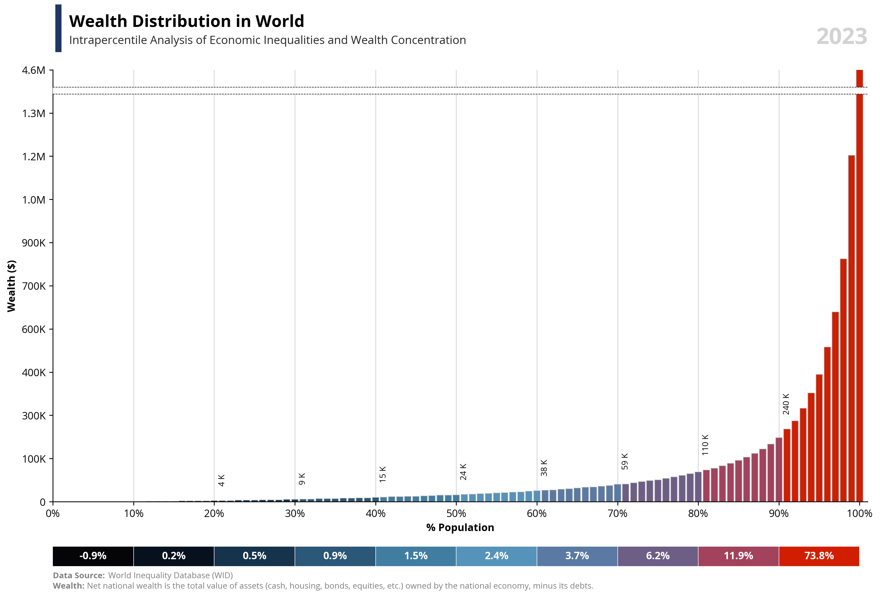
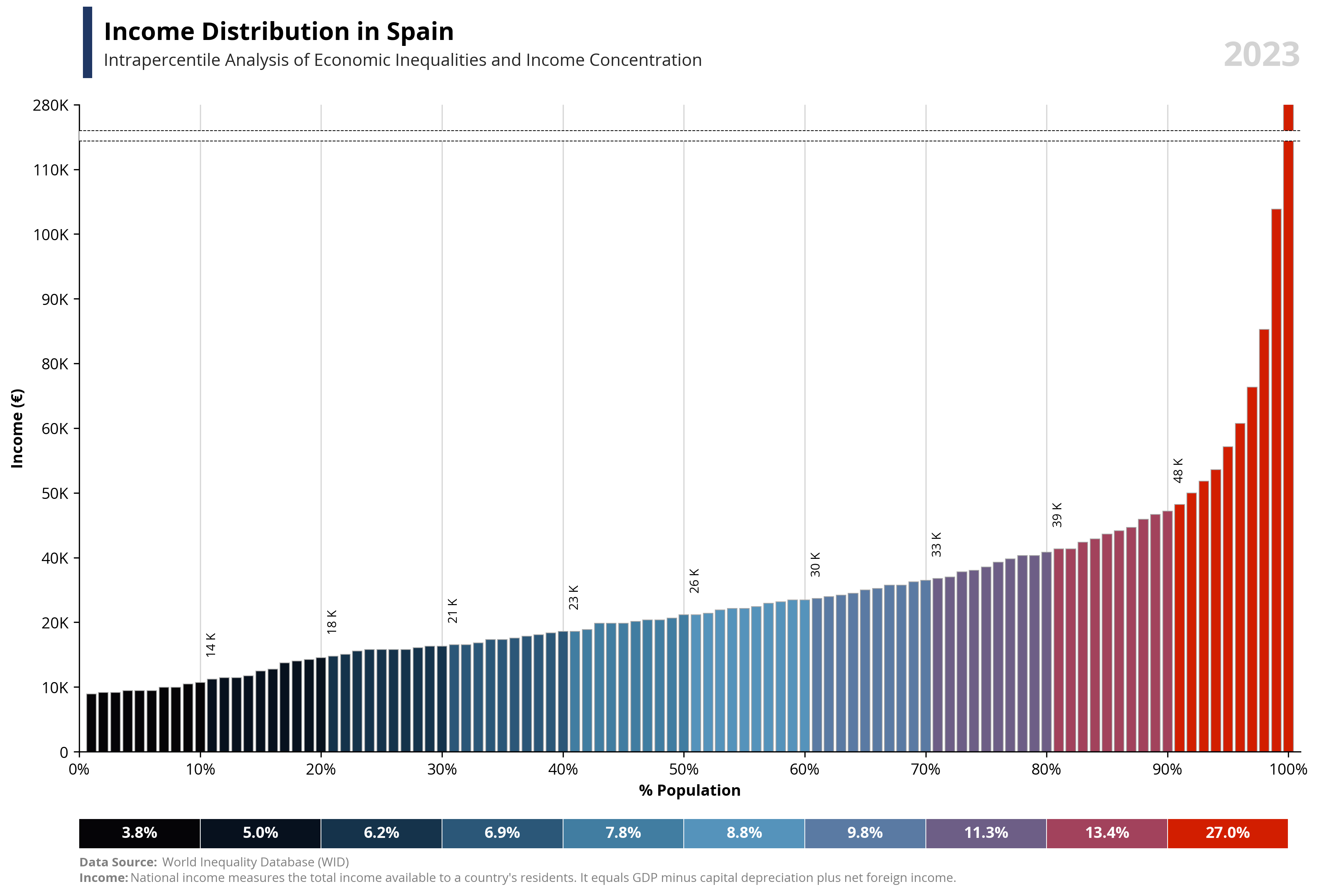
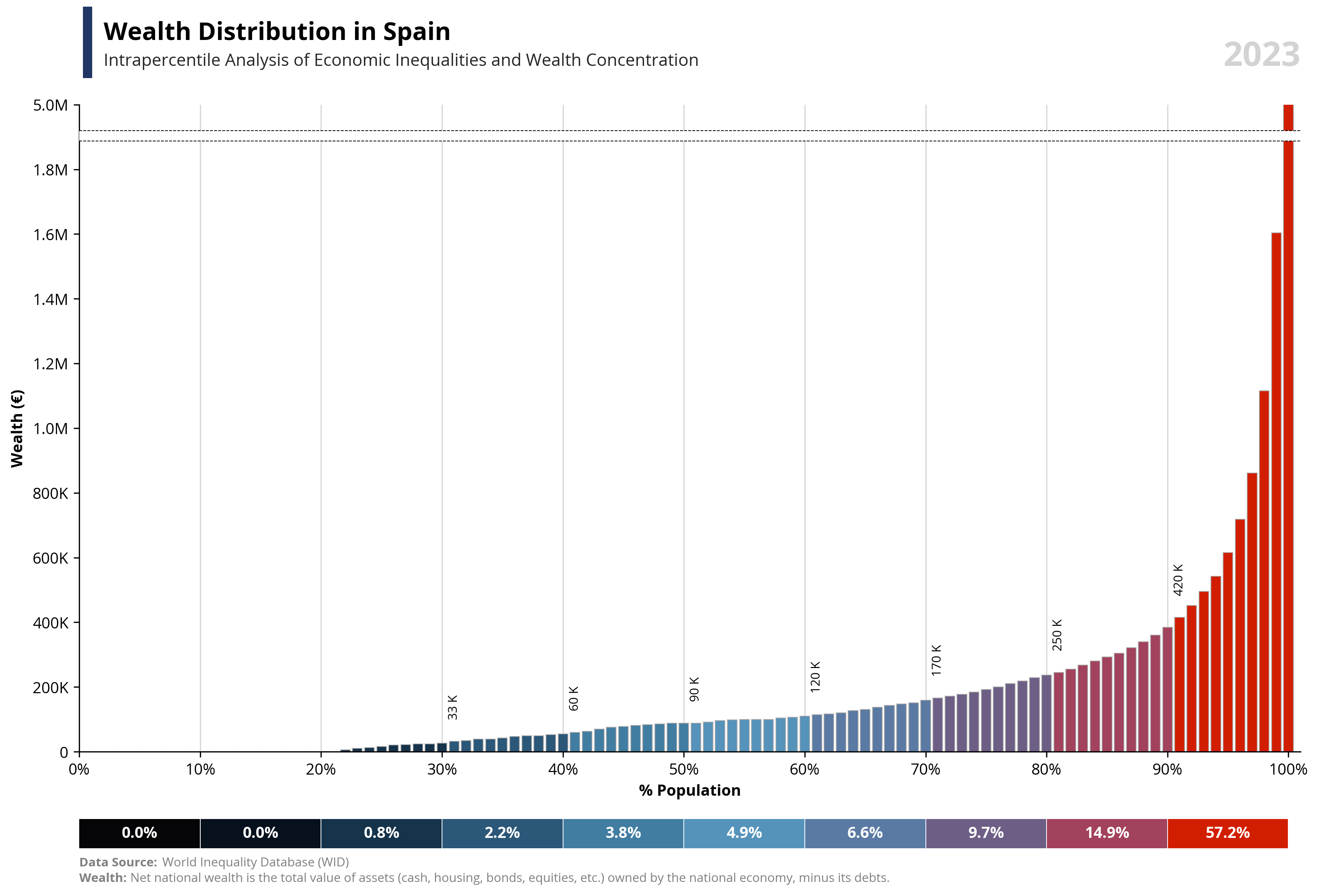
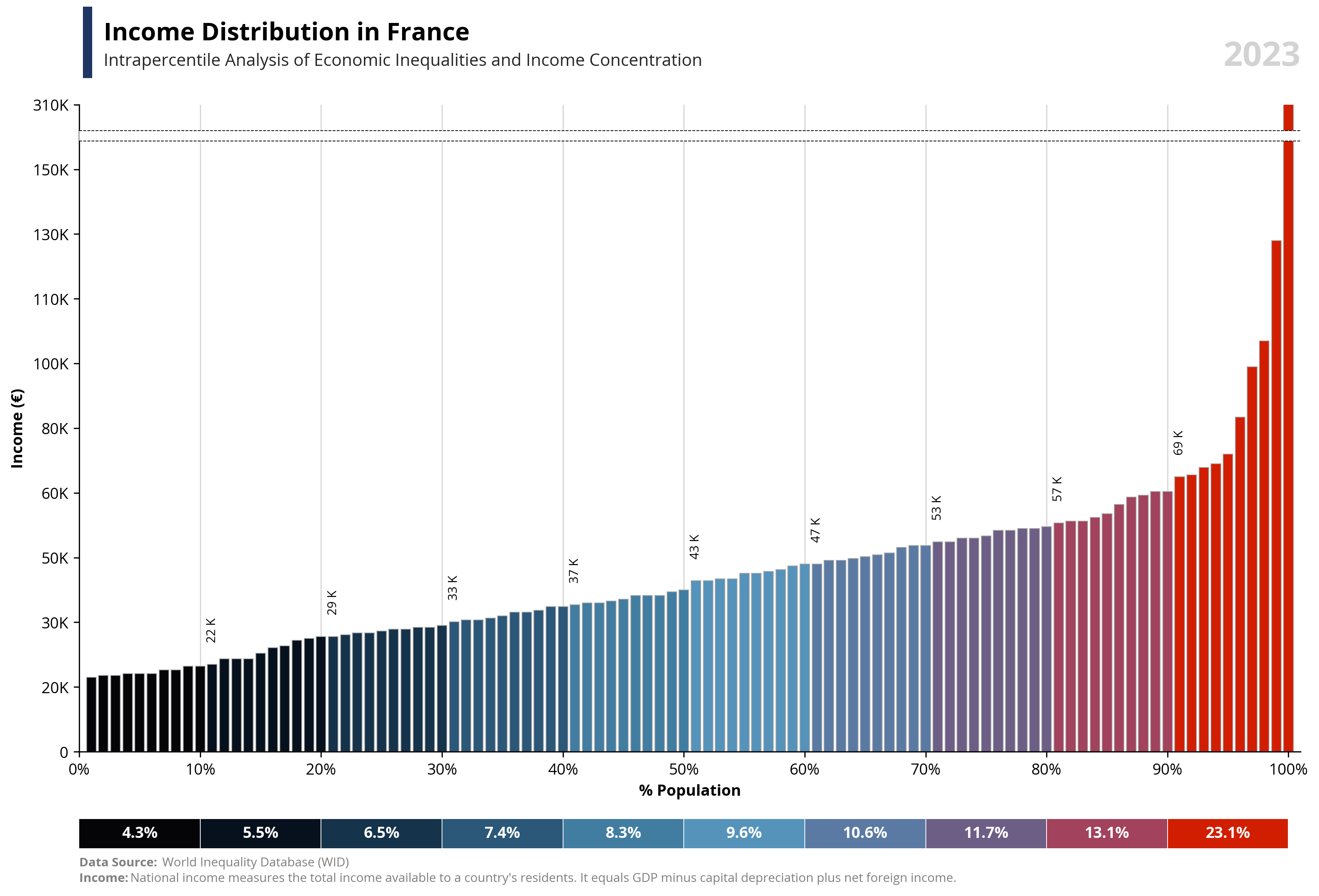
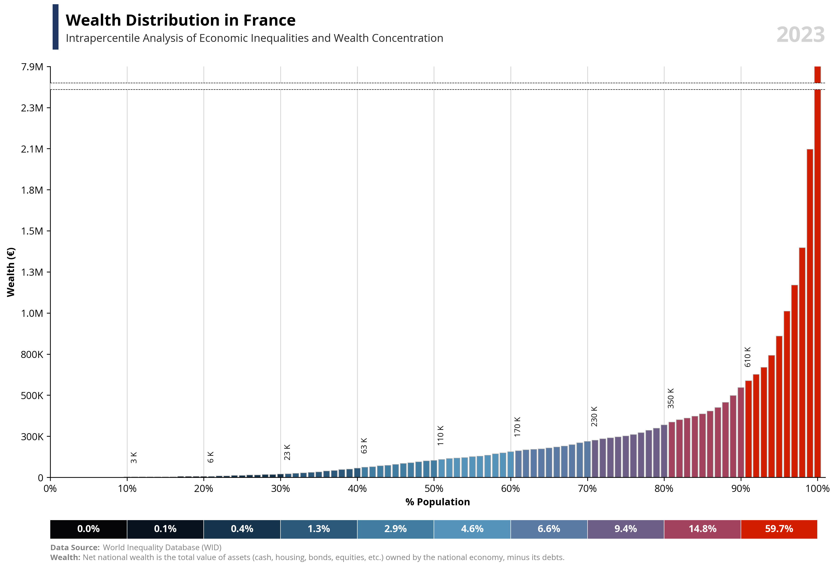
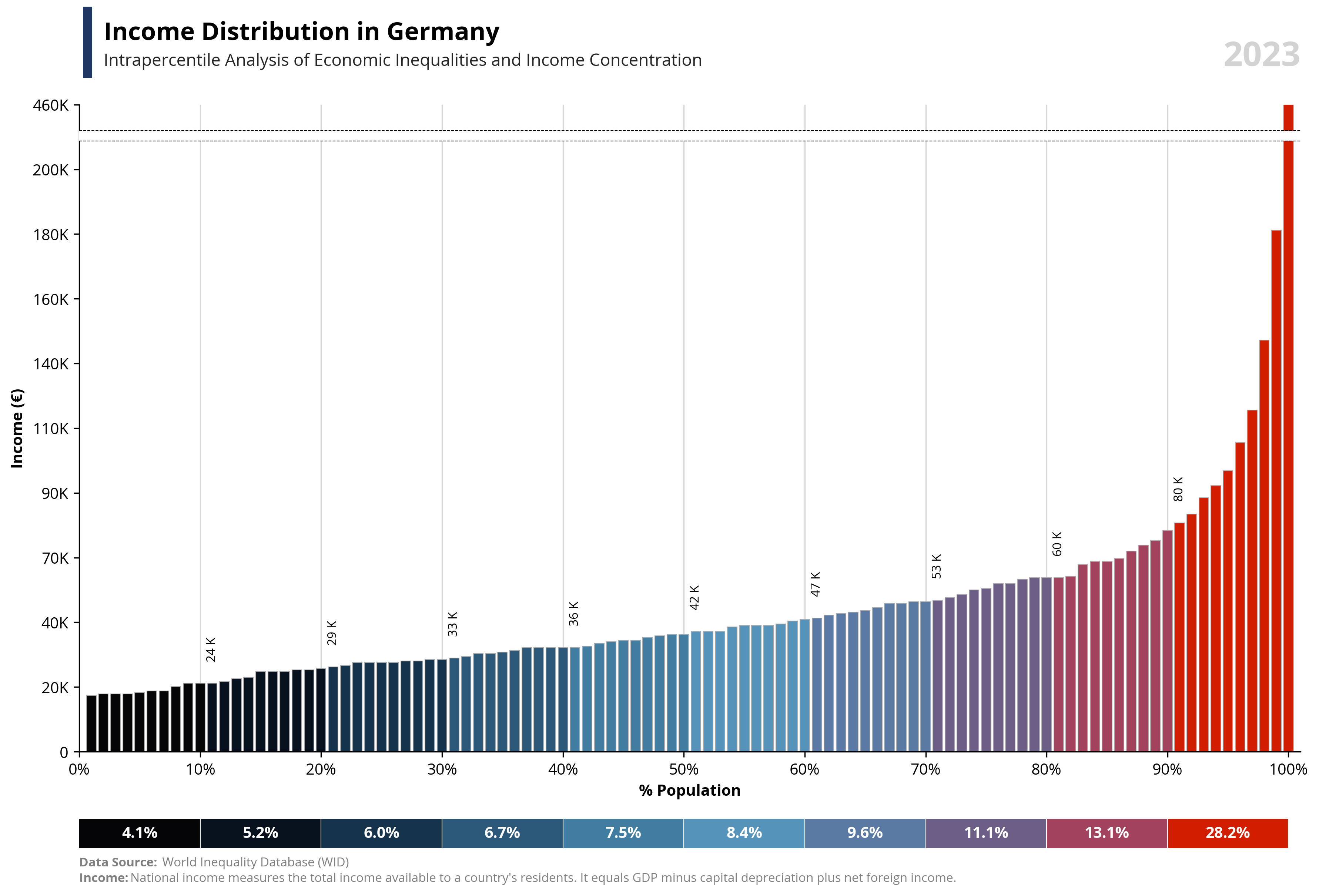
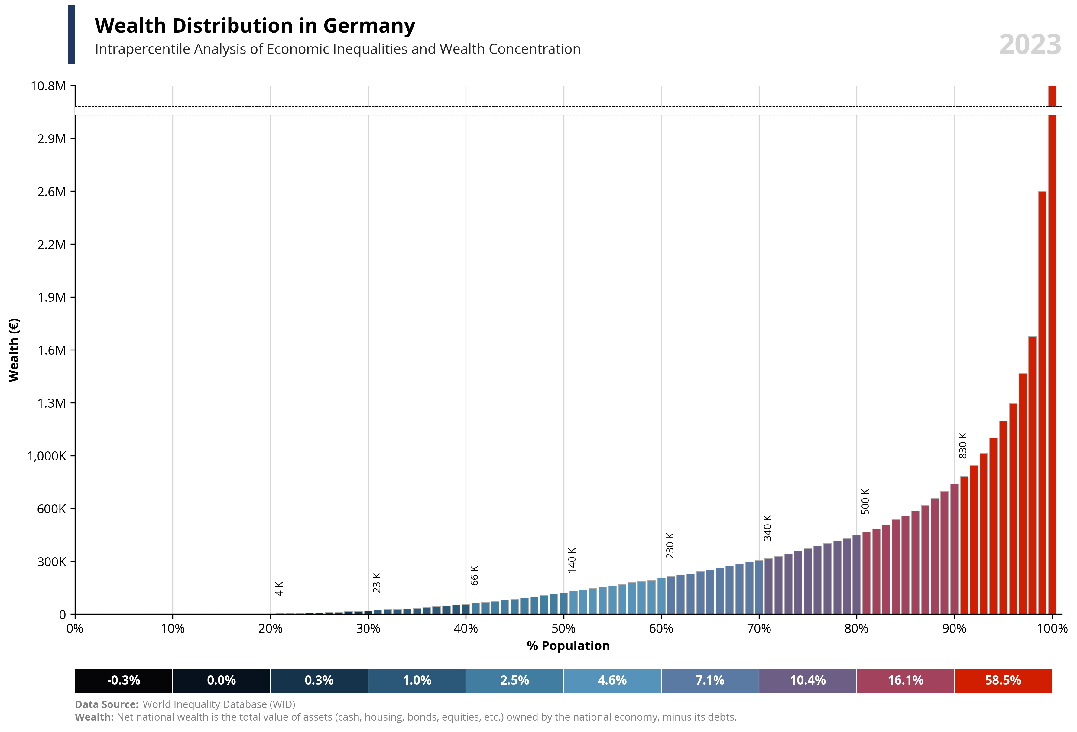
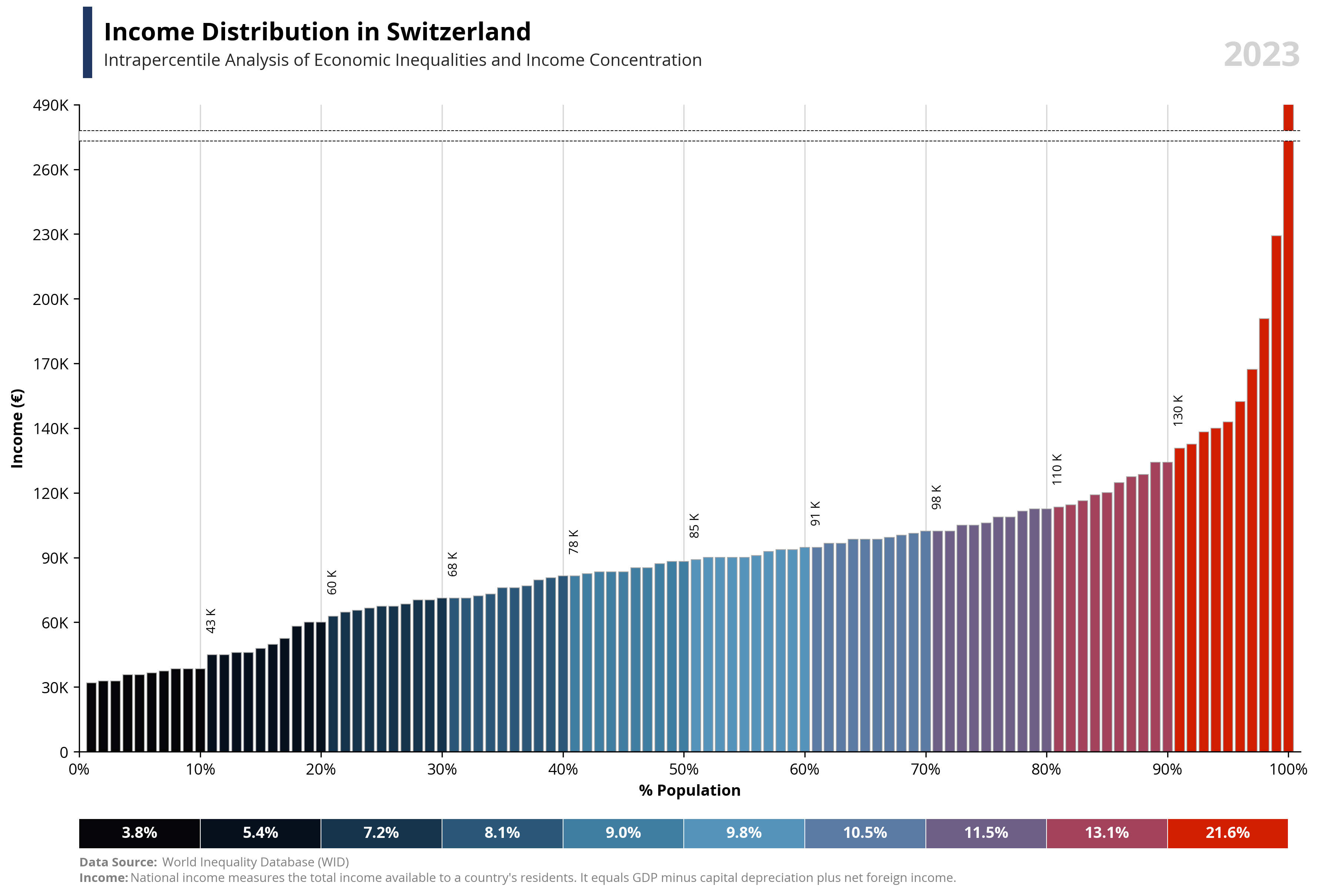
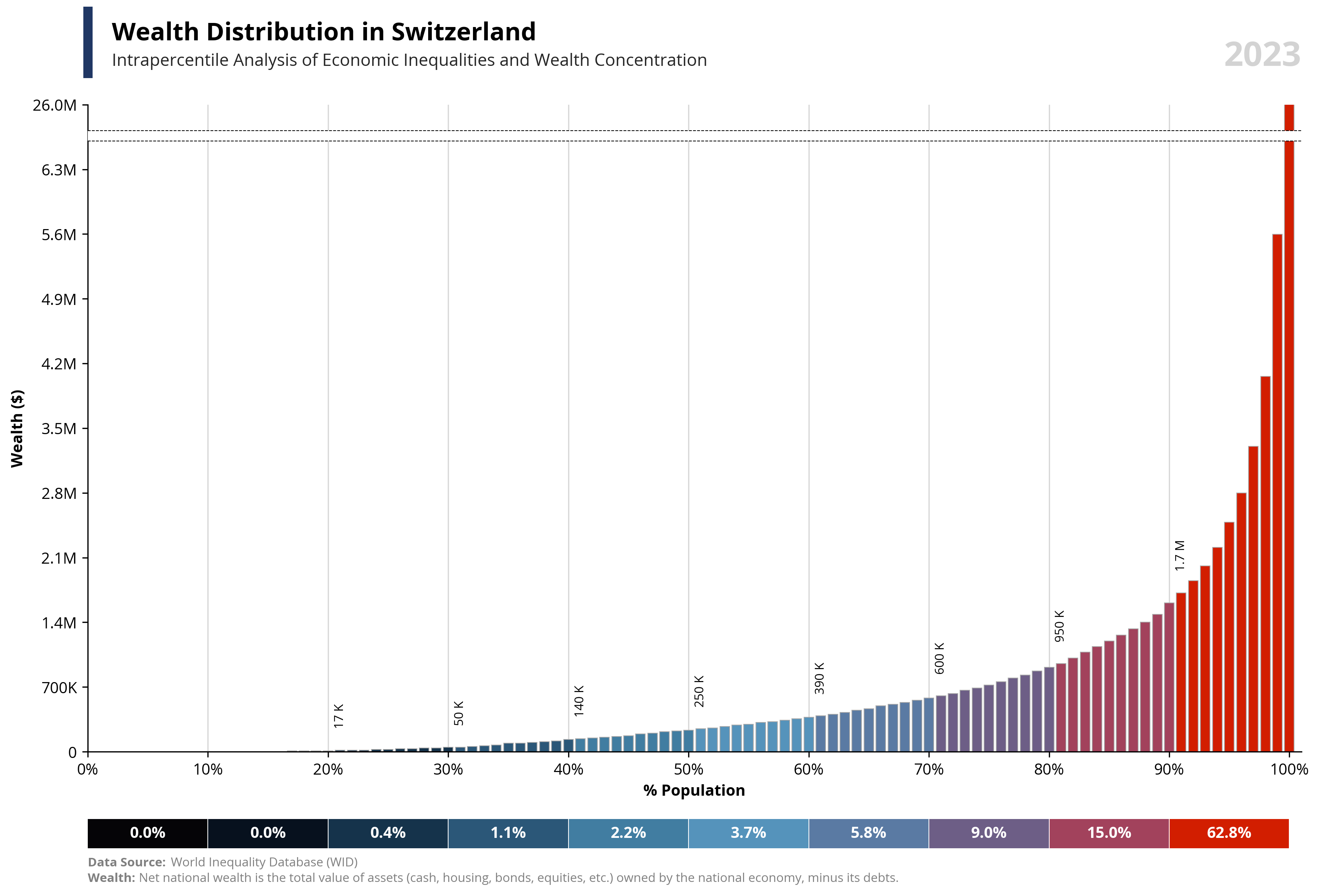
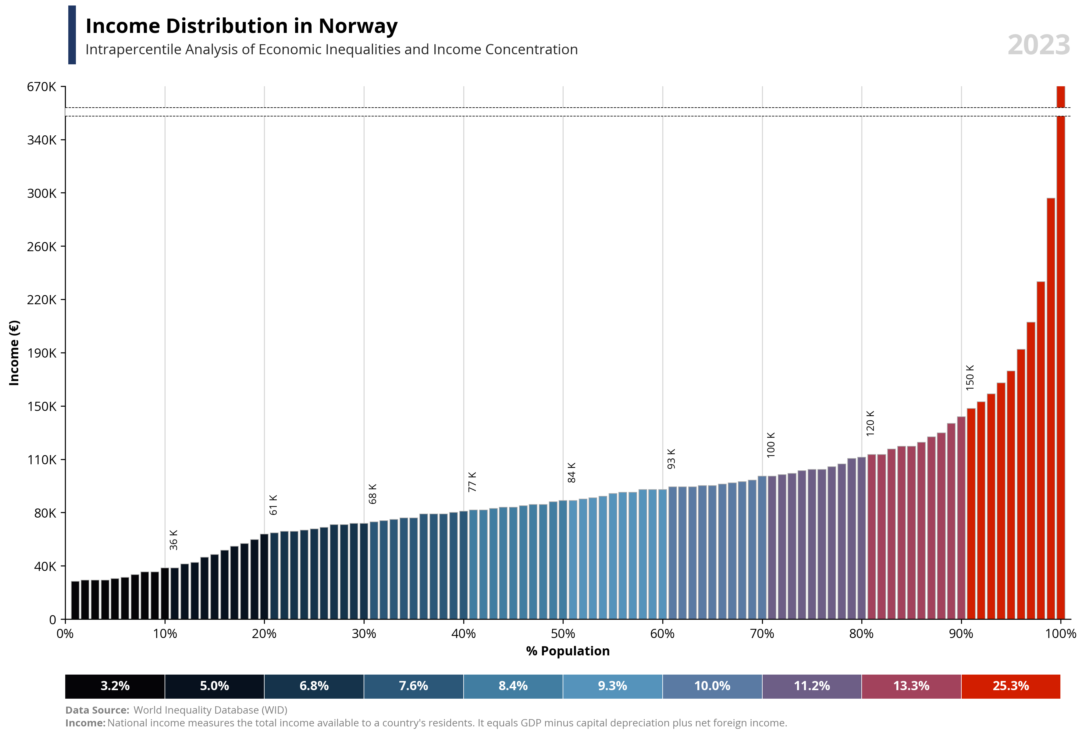
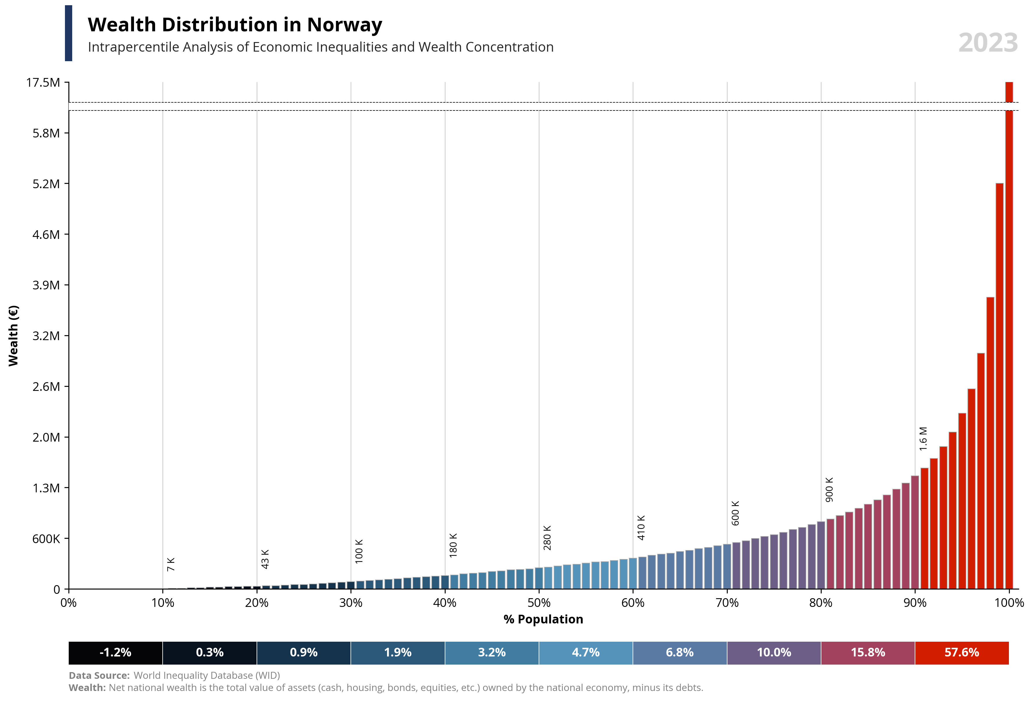
value = 'wealth' #income or wealth
year = 2023 # year
country = 'ES' #iso2 or WO (world)
currency = 'eur' #local, usd, eur
# Data Extraction - GITHUB (Countries)
# =====================================================================
# Extract JSON and bring data to a dataframe
url = 'https://raw.githubusercontent.com/guillemmaya92/world_map/main/Dim_Country.json'
response = requests.get(url)
data = response.json()
df = pd.DataFrame(data)
df = pd.DataFrame.from_dict(data, orient='index').reset_index()
df_countries = df.rename(columns={'ISO2': 'country', 'Country_Abr': 'name', 'Cod_Currency': 'currency', 'Symbol': 'symbol'})
# Data Extraction - WID (Percentiles)
# ==========================================
# Extract percentiles
dfp = pd.read_parquet("https://github.com/guillemmaya92/Analytics/raw/refs/heads/master/Data/WID_Percentiles.parquet")
# Extract values
dfv = pd.read_parquet("https://github.com/guillemmaya92/Analytics/raw/refs/heads/master/Data/WID_Values.parquet")
# Data Manipulation
# =====================================================================
# Filter a year and select measure
dfp = dfp[dfp['country'].isin([country])]
dfp = dfp[dfp['year'] == year]
dfp['percentage'] = dfp[value]
# Merge dataframes
df = pd.merge(dfp, dfv, on=['country', 'year'], how='inner')
df = pd.merge(df, df_countries, on=['country'], how='left')
# Select columns
df['value'] = df['percentage'] * (df['tincome2'] if value == 'income' else df['twealth2']) / (df['xusd'] if currency == 'usd' else df['xeur'] if currency == 'eur' else 1)
df['currency'] = ('USD' if currency == 'usd' else df['currency'])
df['symbol'] = ('€' if currency == 'eur' else ('$' if currency == 'usd' else df['symbol']))
df = df[['country', 'name', 'currency', 'symbol', 'year', 'percentile', 'value']]
# If country == WO
df['name'] = df.apply(lambda row: 'World' if row['country'] == 'WO' else row['name'], axis=1)
df['symbol'] = df.apply(lambda row: '$' if row['country'] == 'WO' and currency == 'usd'
else '€' if row['country'] == 'WO' and currency != 'usd'
else row['symbol'], axis=1)
# Grouping by 10
df['percentile2'] = pd.cut(
df['percentile'],
bins=range(1, 111, 10),
right=False,
labels=[i + 9 for i in range(1, 101, 10)]
).astype(int)
# Define palette
color_palette = {
10: "#050407",
20: "#07111e",
30: "#15334b",
40: "#2b5778",
50: "#417da1",
60: "#5593bb",
70: "#5a7aa3",
80: "#6d5e86",
90: "#a2425c",
100: "#D21E00"
}
# Map palette color
df['color'] = df['percentile2'].map(color_palette)
# Percentiles dataframe
df2 = df.copy()
df2 = df.groupby(['percentile2', 'color'], as_index=False)['value'].sum()
df2['valueper'] = df2['value'] / (df2['value']).sum()
df2['count'] = 10
print(df)
# Data Visualization
# ===================================================
# Font Style
plt.rcParams.update({'font.family': 'sans-serif', 'font.sans-serif': ['Open Sans'], 'font.size': 10})
# Create the figure and suplots
fig, (ax1, ax2) = plt.subplots(2, 1, figsize=(12, 8), gridspec_kw={'height_ratios': [10, 0.5]})
# Calculated values
per99 = round(df.loc[df['percentile'] == 99, 'value'].iloc[0], -4) * 1.25
per100 = round(df.loc[df['percentile'] == 100, 'value'].iloc[0], -4)
area99 = round(df.loc[df['percentile'] == 99, 'value'].iloc[0], -4) * 1.18
area100 = round(df.loc[df['percentile'] == 99, 'value'].iloc[0], -4) * 1.20
capital_value = value.capitalize()
symbol = df.loc[df['percentile'] == 99, 'symbol'].iloc[0]
country = df.loc[df['percentile'] == 99, 'name'].iloc[0]
year = df.loc[df['percentile'] == 99, 'year'].iloc[0]
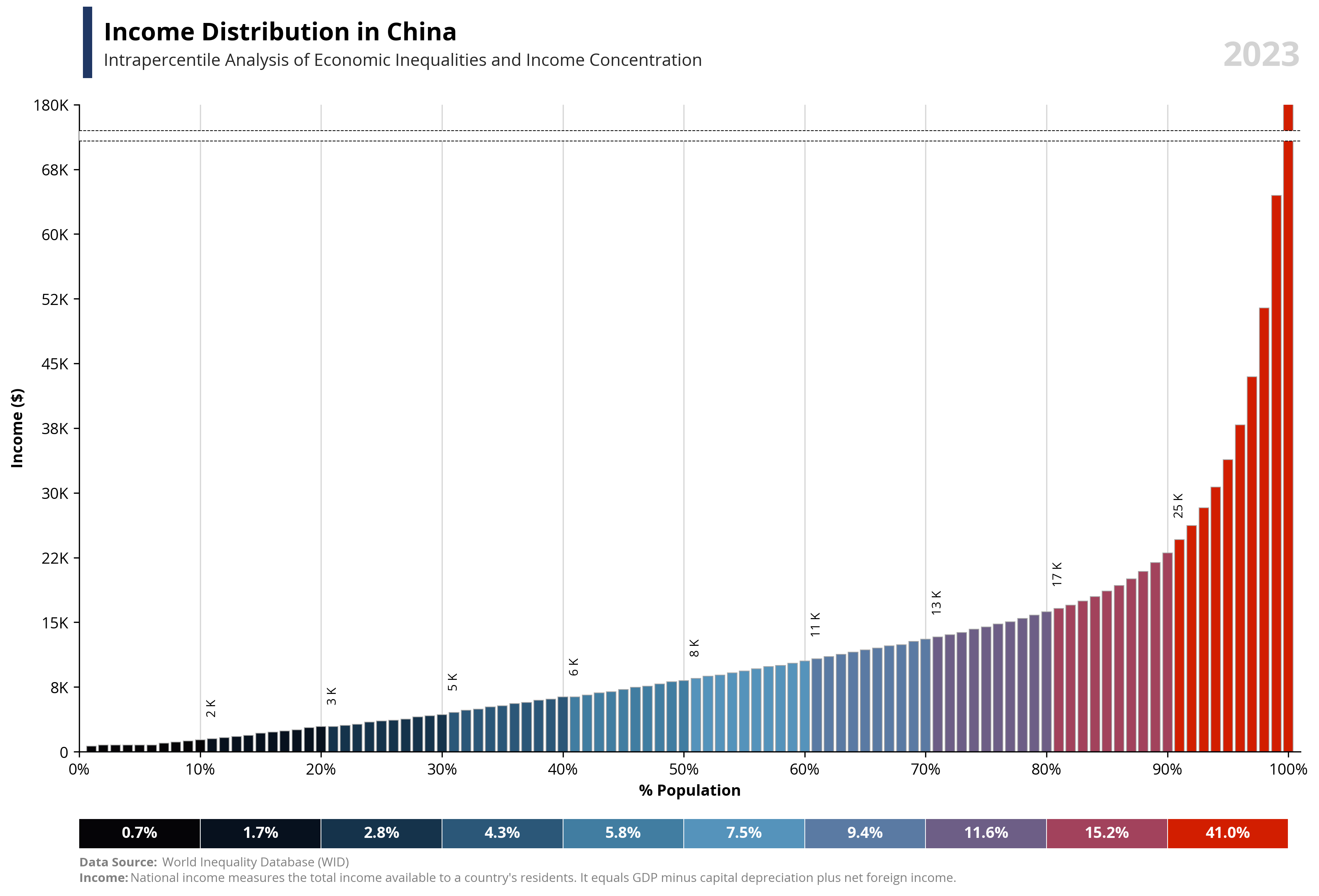
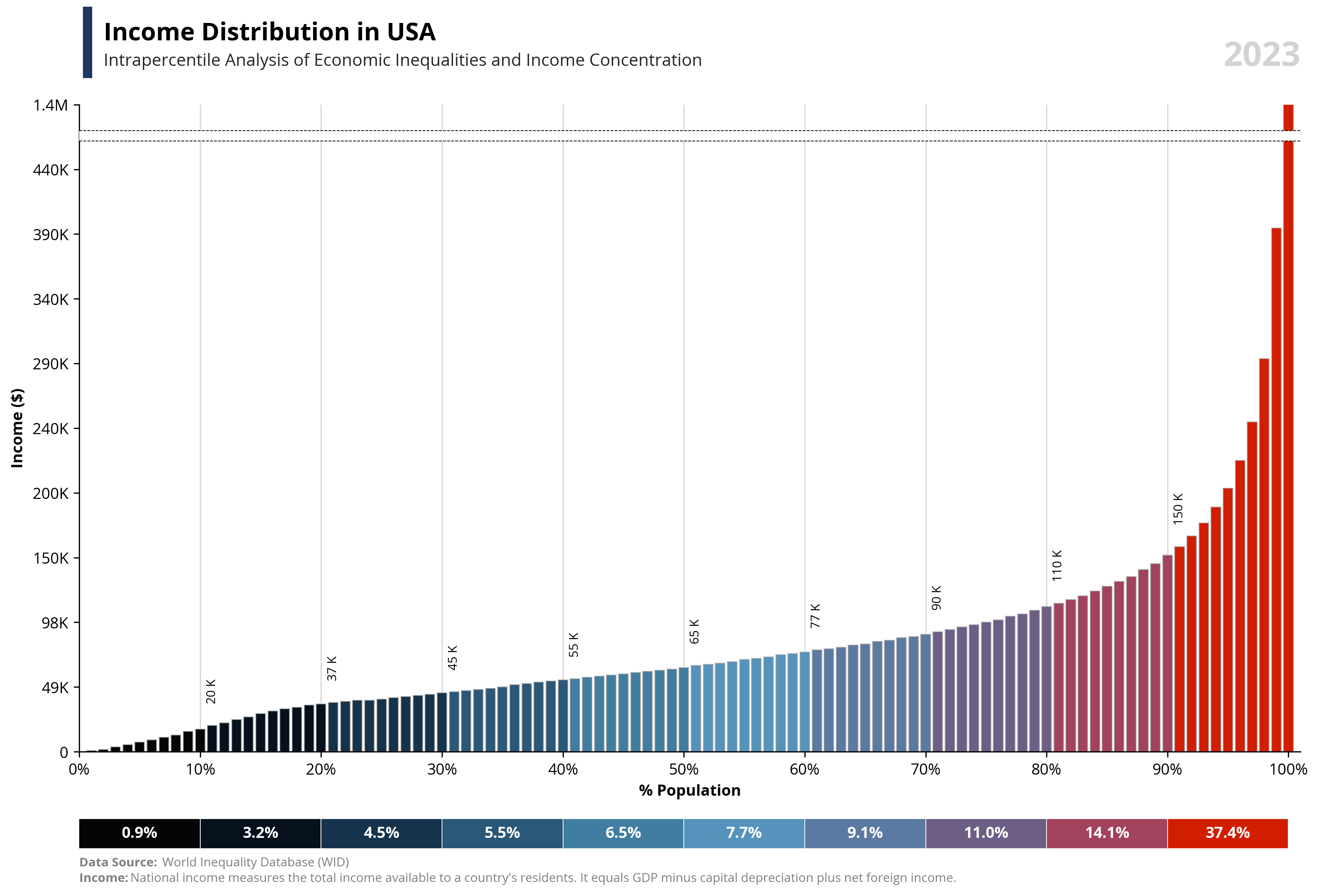
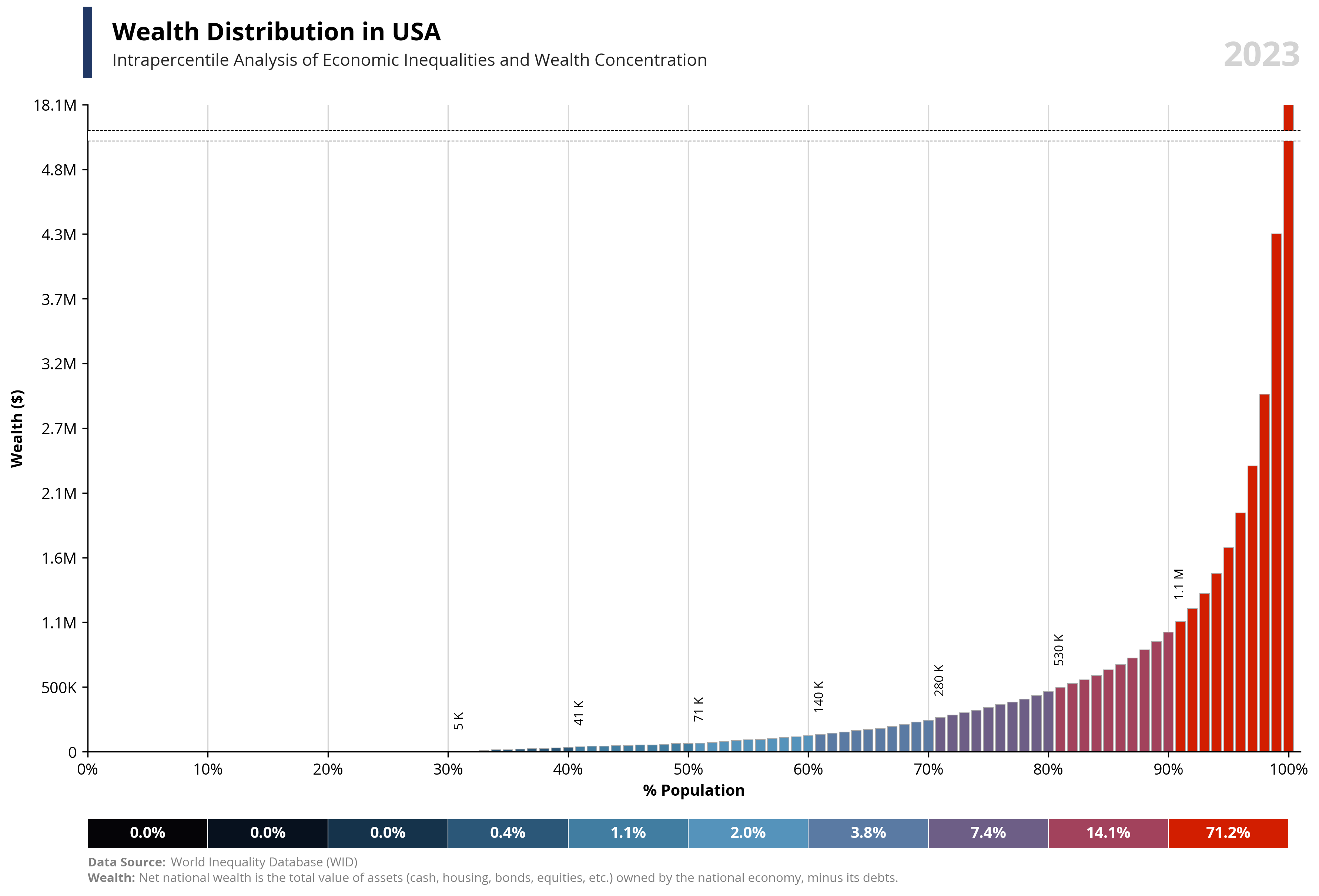
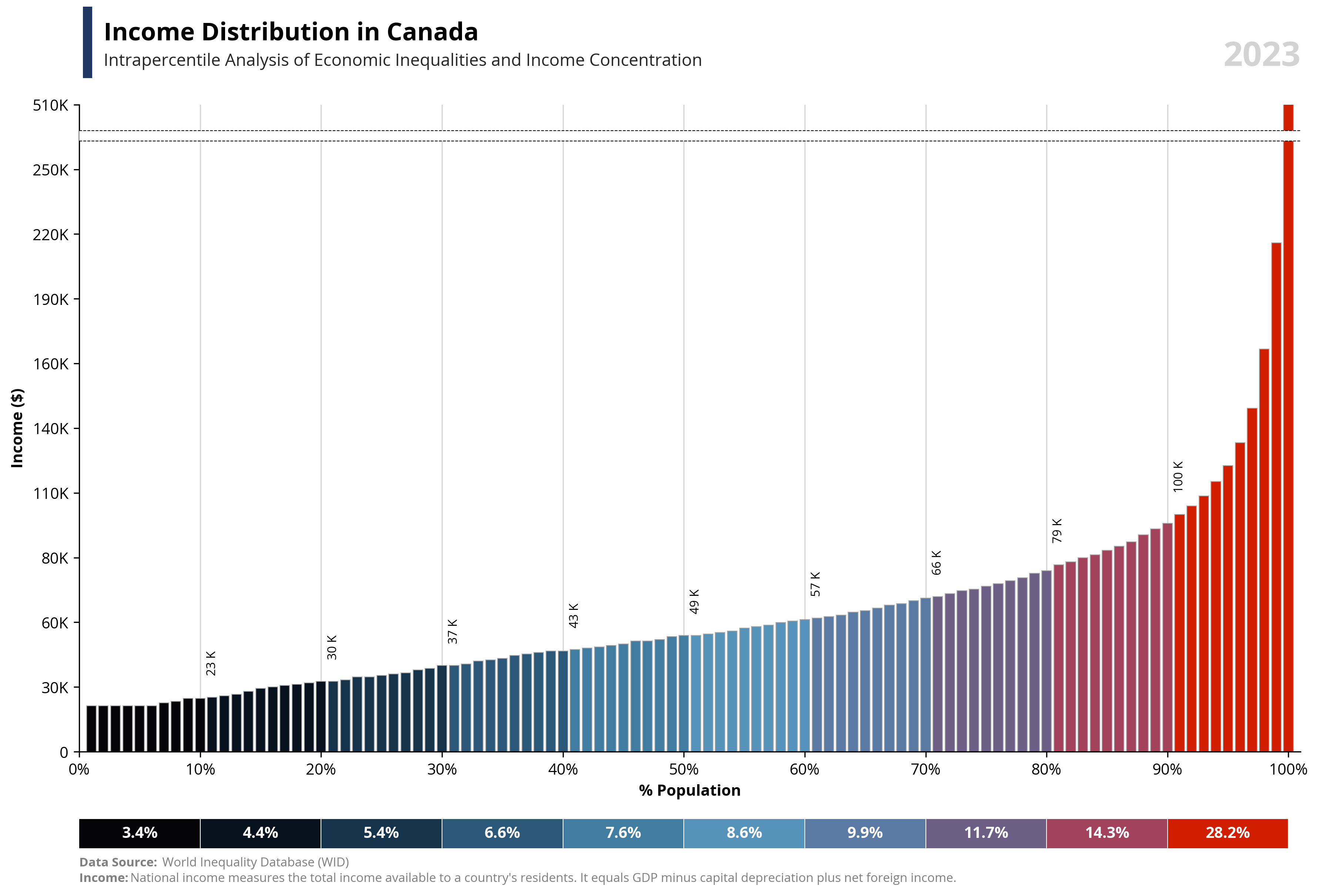
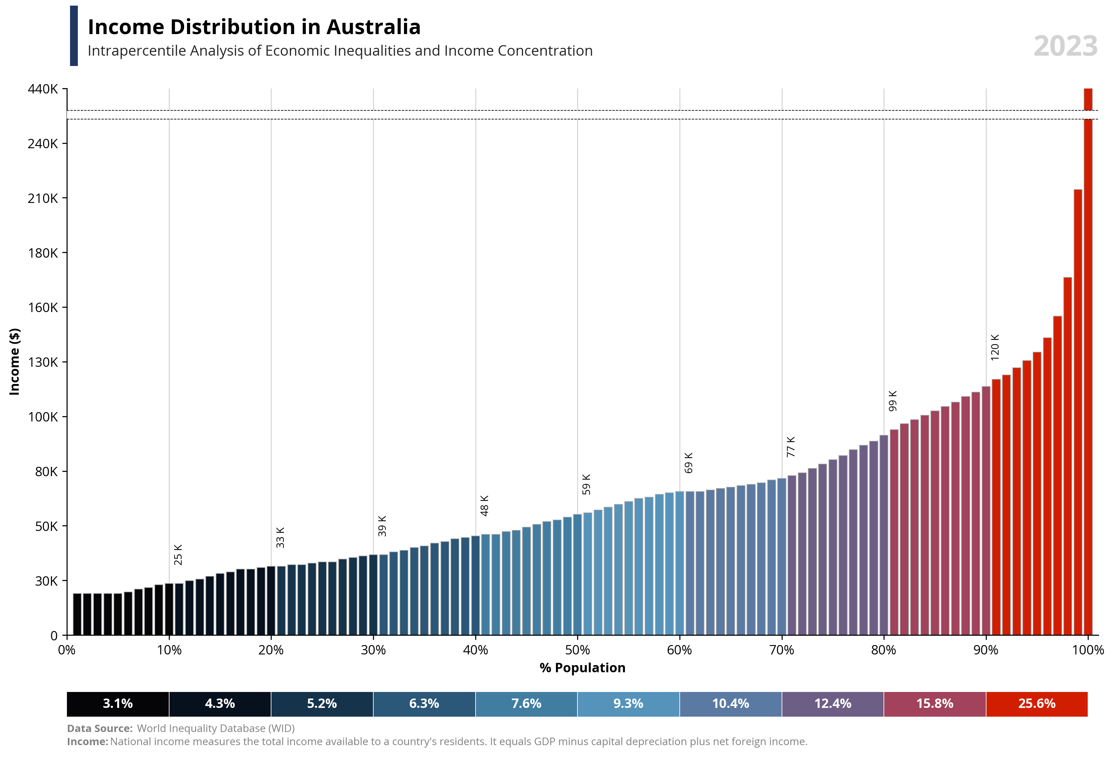
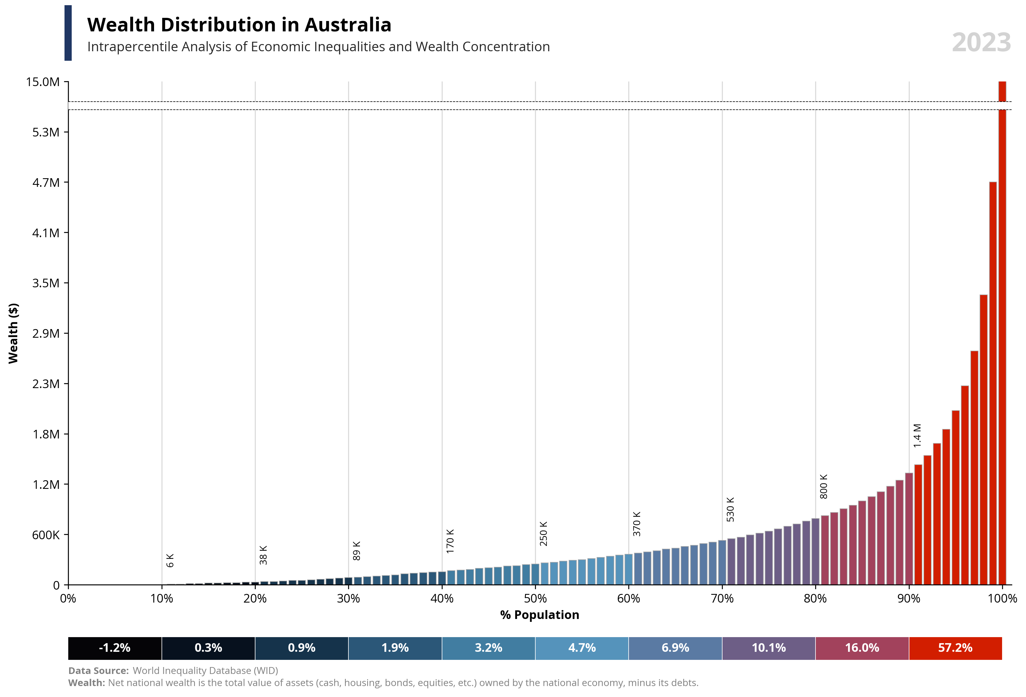
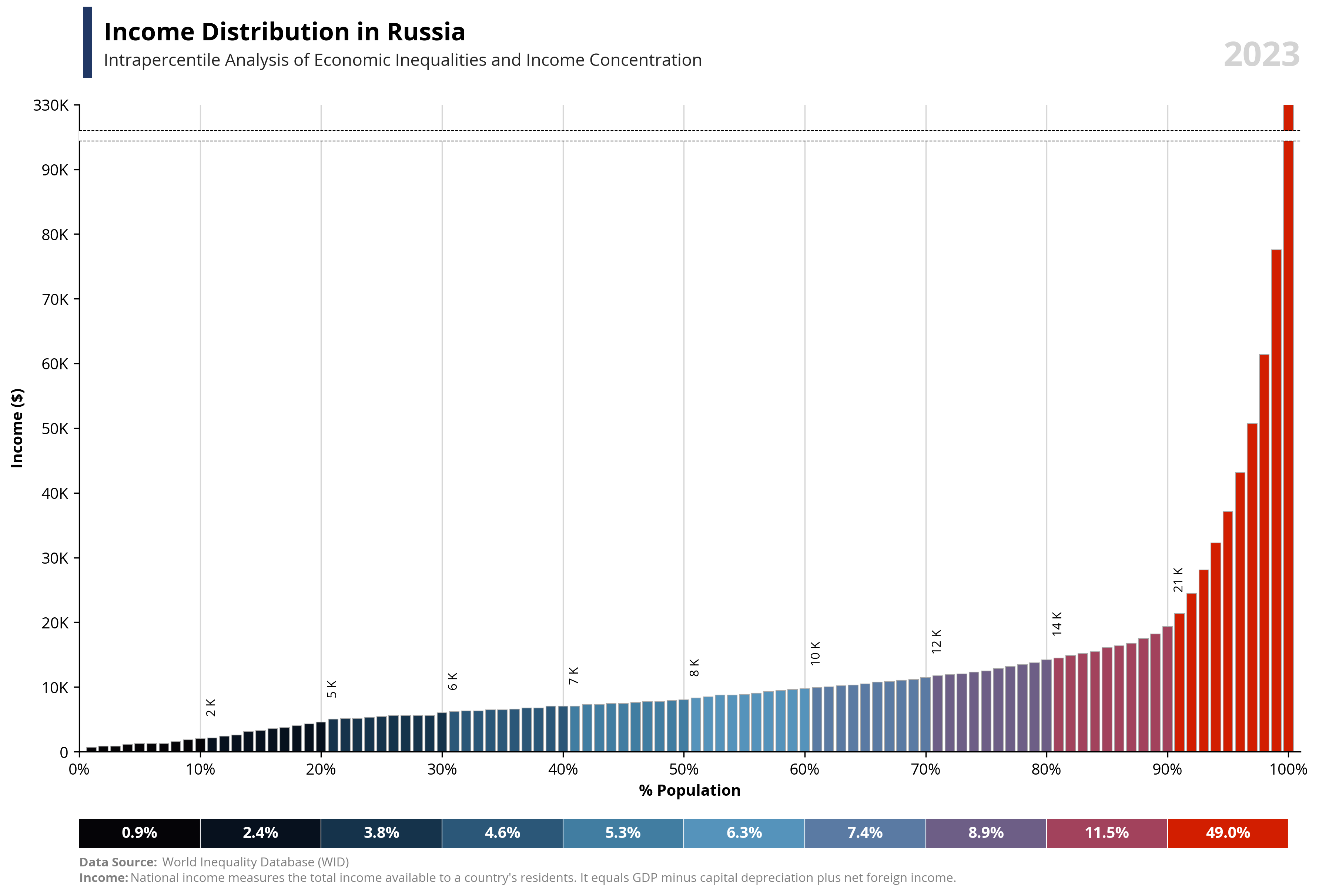
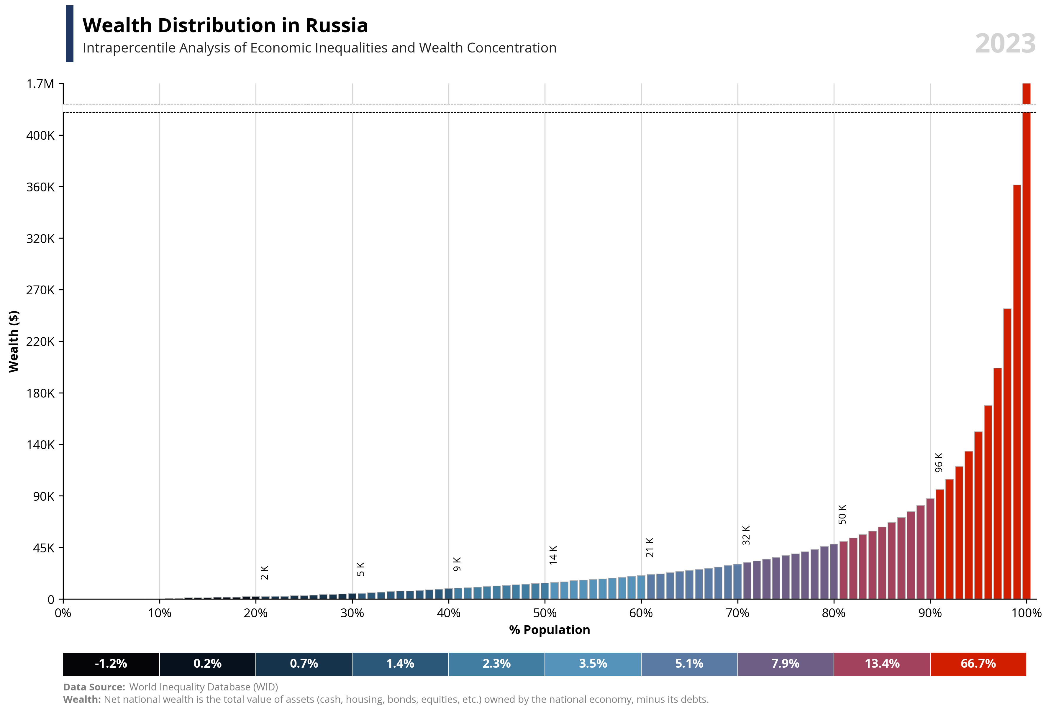
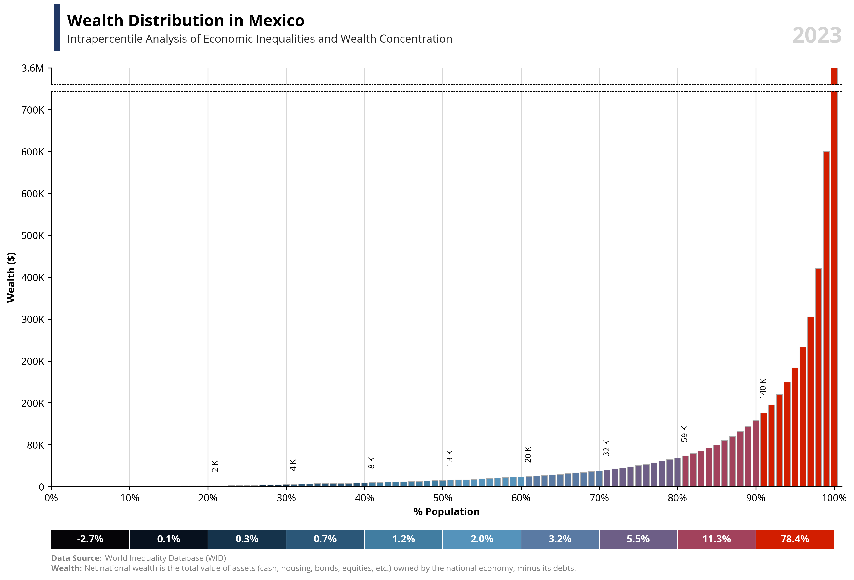
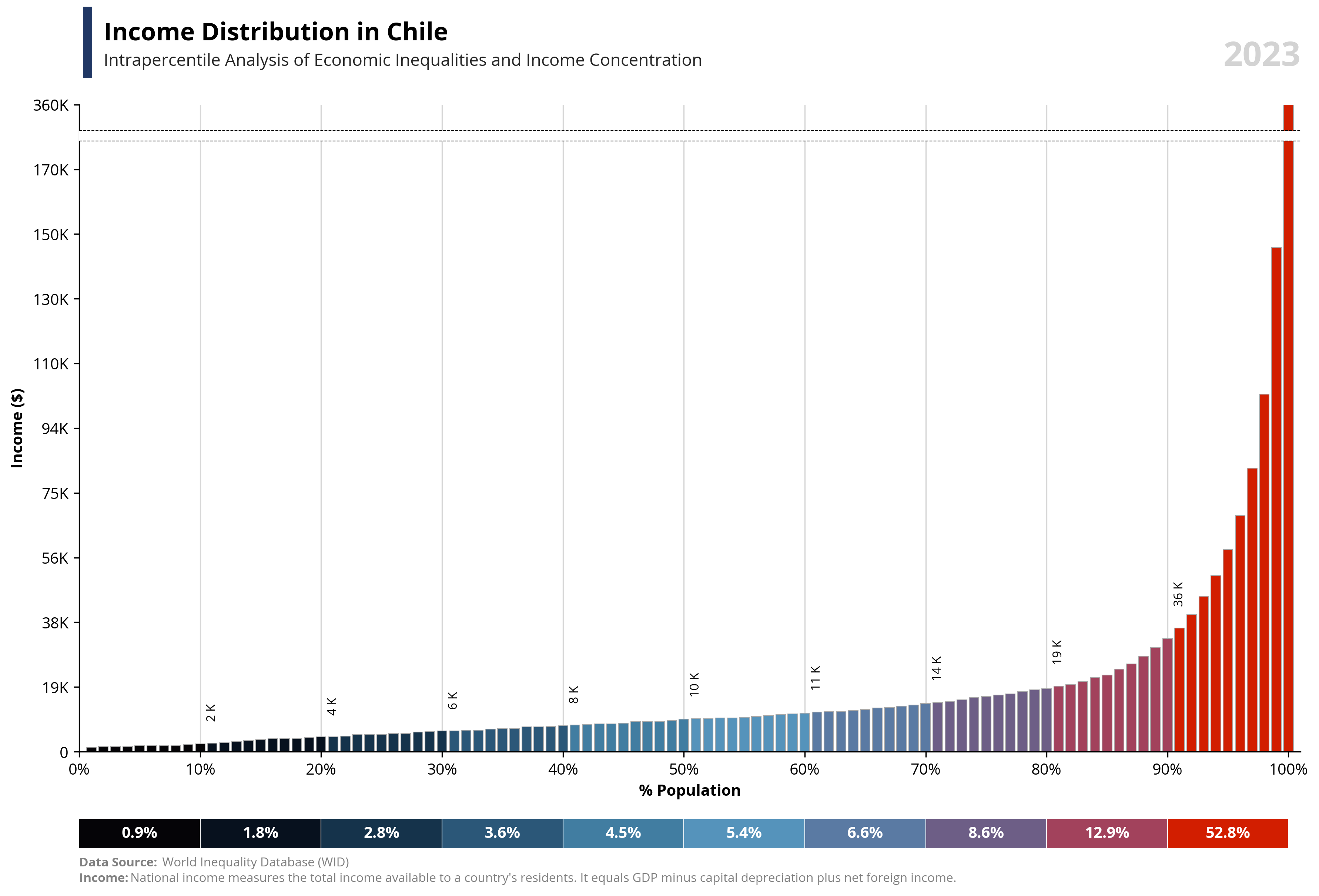
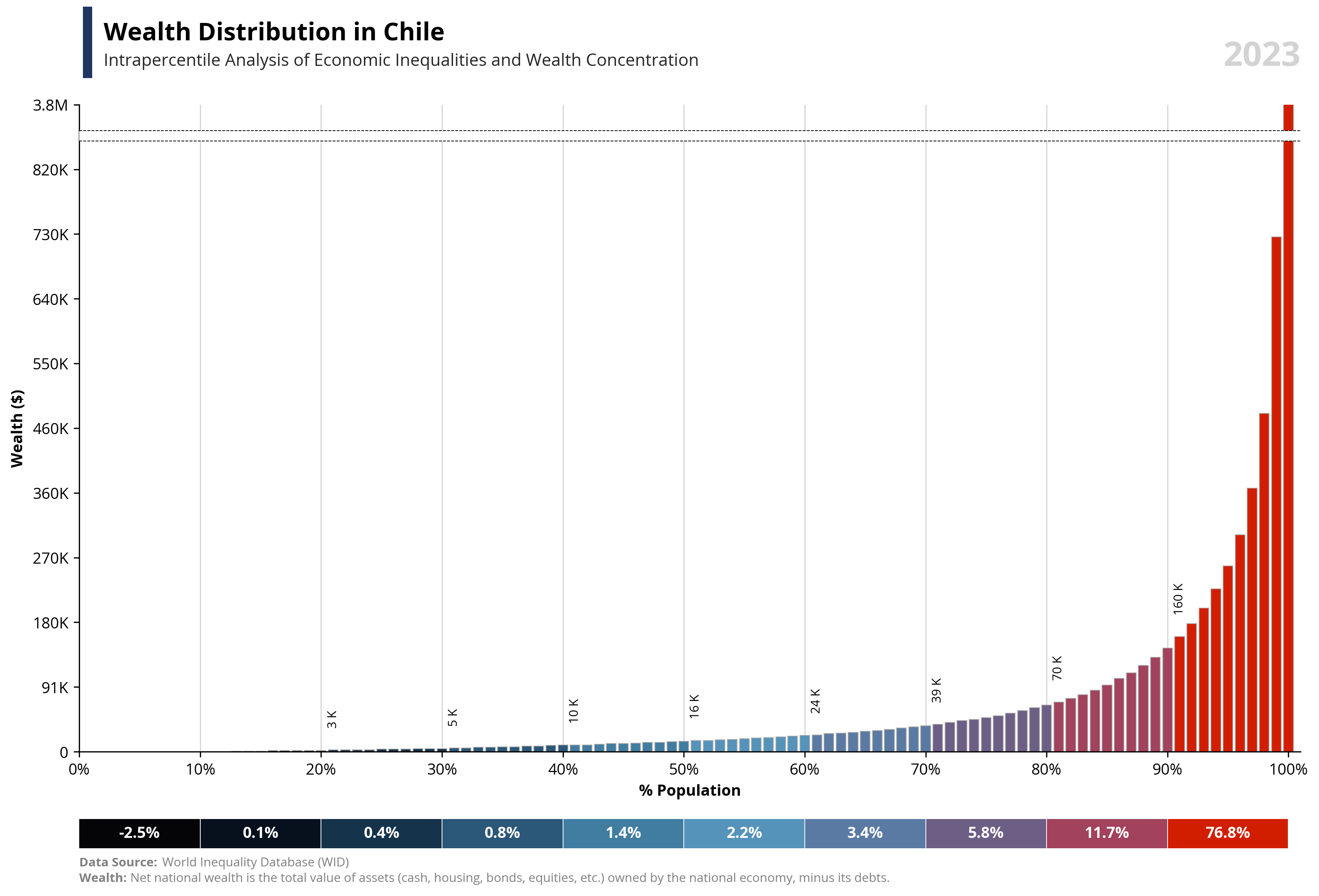
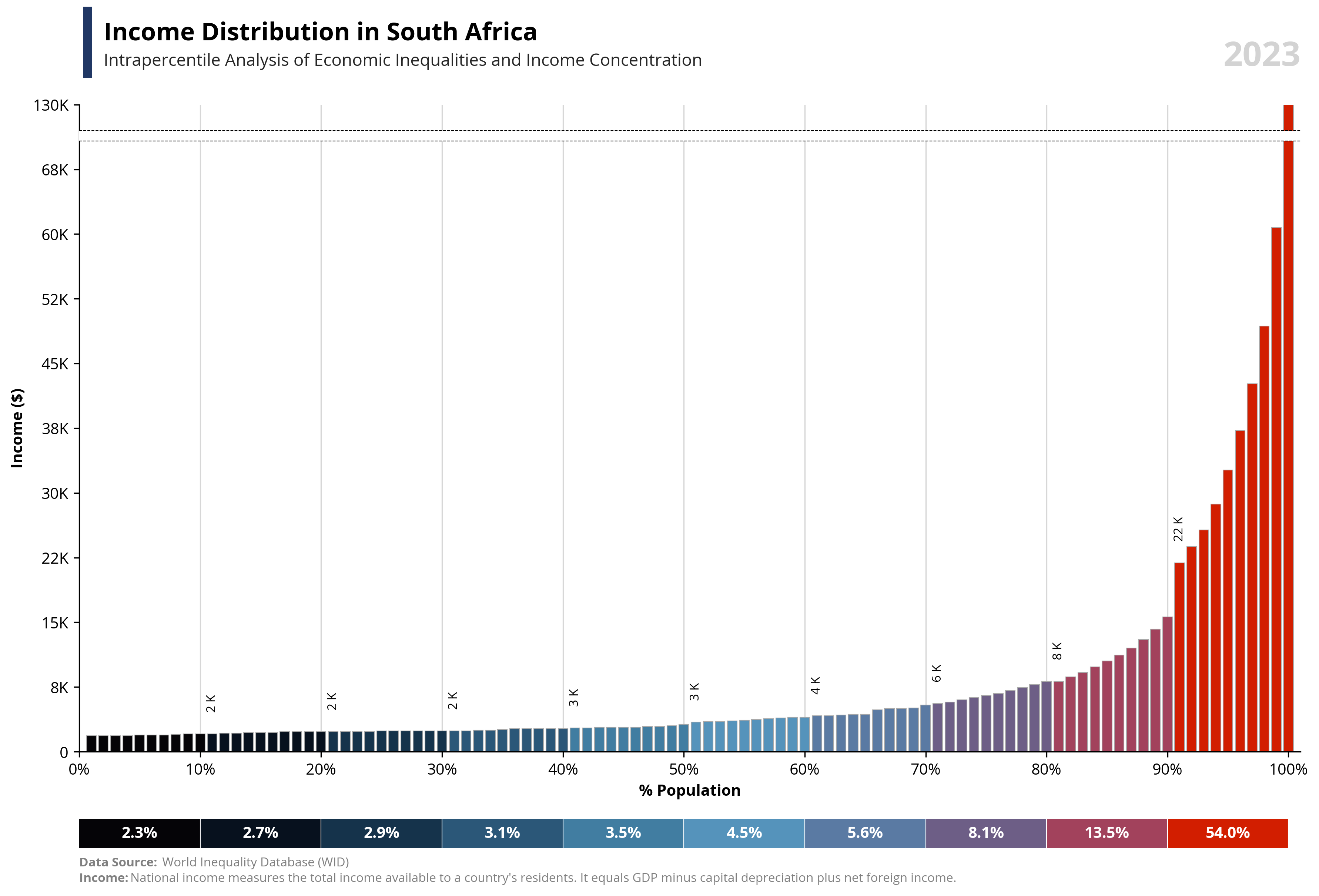
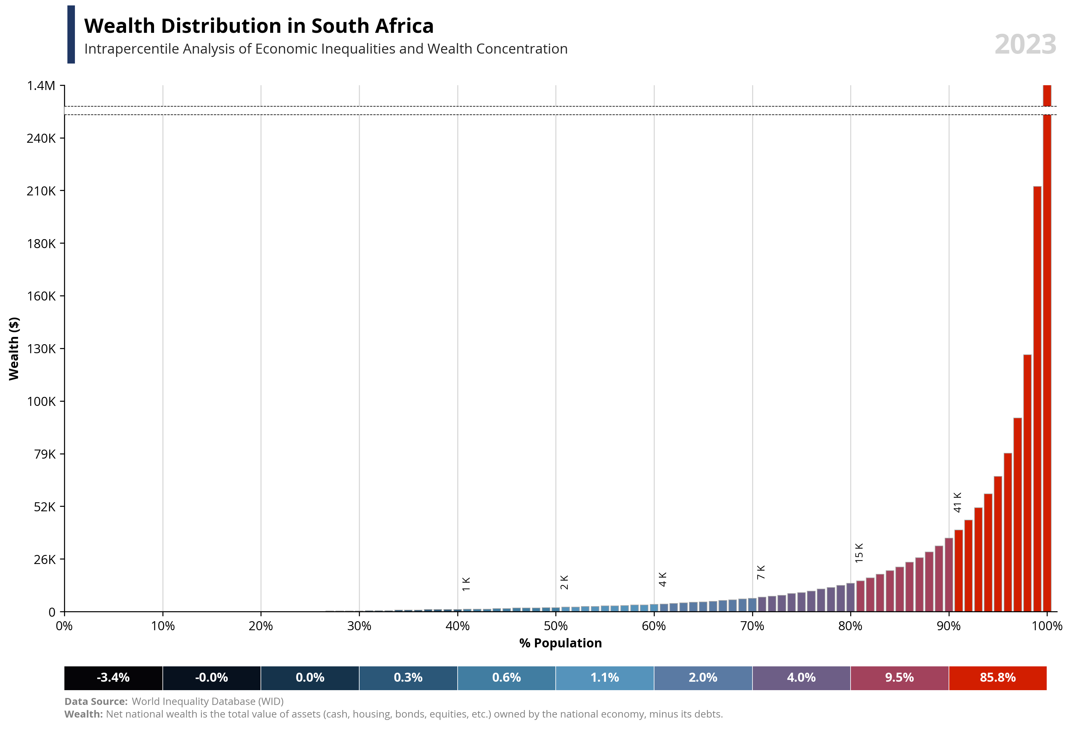
if value == "wealth":
note = "Net national wealth is the total value of assets (cash, housing, bonds, equities, etc.) owned by the national economy, minus its debts."
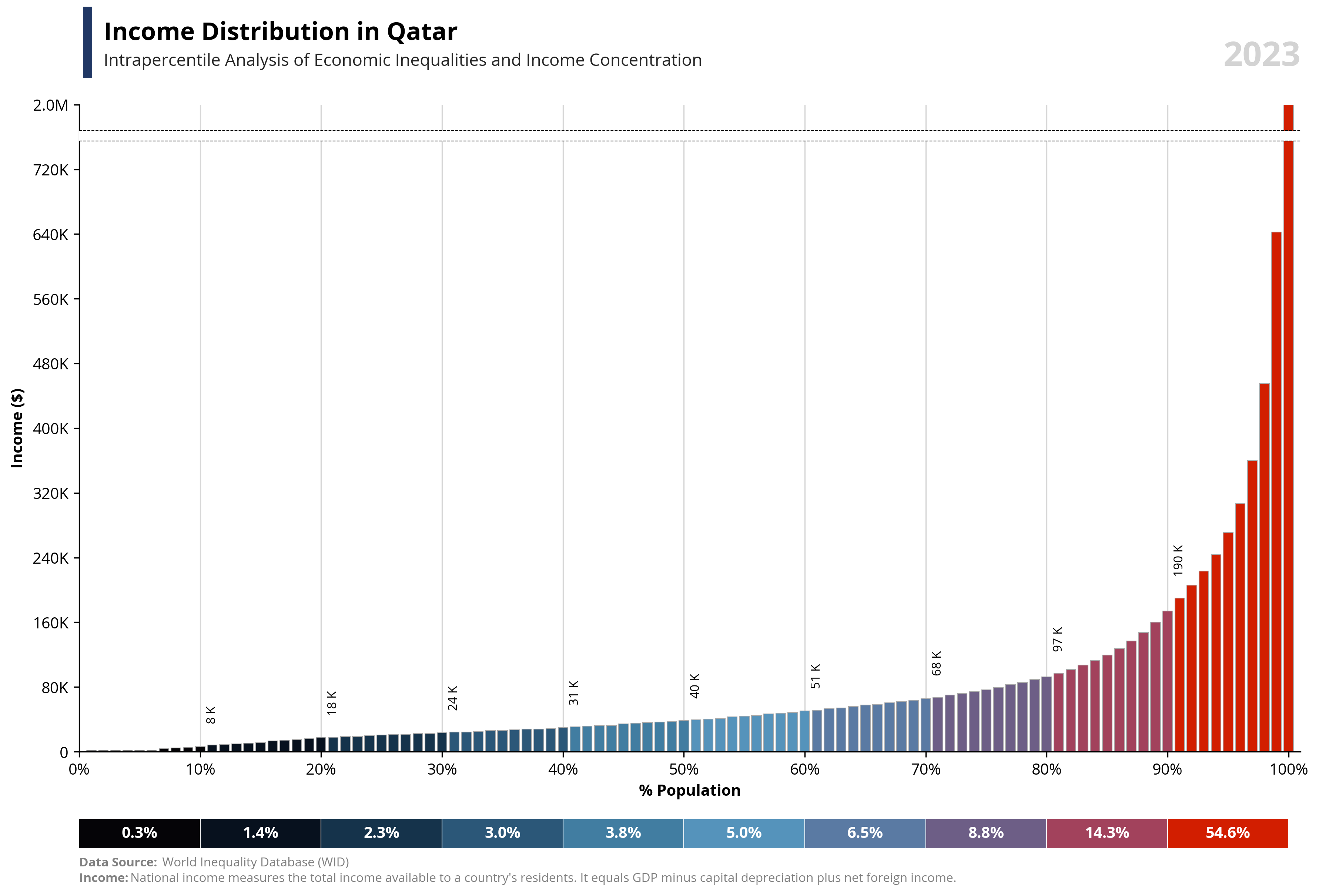
else:
note = "National income measures the total income available to a country's residents. It equals GDP minus capital depreciation plus net foreign income."
# First Plot
# ==================
# Plot Bars
bars = ax1.bar(df['percentile'], df['value'], color=df['color'], edgecolor='darkgrey', linewidth=0.5, zorder=2)
# Title and labels
fig.add_artist(plt.Line2D([0.07, 0.07], [0.93, 1], linewidth=6, color='#203764'))
ax1.text(0.02, 1.1, f'{capital_value} Distribution in {country}', fontsize=16, fontweight='bold', ha='left', transform=ax1.transAxes)
ax1.text(0.02, 1.06, f'Intrapercentile Analysis of Economic Inequalities and {capital_value} Concentration', fontsize=11, color='#262626', ha='left', transform=ax1.transAxes)
ax1.set_xlabel('% Population', fontsize=10, weight='bold')
ax1.set_ylabel(f'{capital_value} ({symbol})', fontsize=10, weight='bold')
# Configuration
ax1.grid(axis='x', linestyle='-', alpha=0.5, zorder=1)
ax1.set_xlim(0, 101)
ax1.set_ylim(0, per99)
ax1.set_xticks(np.arange(0, 101, step=10))
ax1.set_yticks(np.arange(0, per99+1, step=per99/10))
ax1.tick_params(axis='x', labelsize=10)
ax1.tick_params(axis='y', labelsize=10)
ax1.spines['top'].set_visible(False)
ax1.spines['right'].set_visible(False)
# Function to format Y axis
def format_func(value, tick_number=None):
if abs(value) >= 1e6:
return '{:,.1f}M'.format(round(value / 1e5) / 10)
elif abs(value) >= 1e5:
return '{:,.0f}K'.format(round(value / 1e3, -2))
elif abs(value) >= 1e4:
return '{:,.0f}K'.format(round(value / 1e3, -1))
elif abs(value) >= 1e3:
return '{:,.0f}K'.format(round(value / 1e3))
else:
return str(round(value))
# Function to format label bars
def format_func2(value, tick_number=None):
if abs(value) >= 1e6:
return '{:,.1f} M'.format(round(value / 1e5) / 10)
elif abs(value) >= 1e5:
return '{:,.0f} K'.format(round(value / 1e3, -1))
elif abs(value) >= 1e4:
return '{:,.0f} K'.format(round(value / 1e3))
elif abs(value) >= 1e3:
return '{:,.0f} K'.format(round(value / 1e3))
else:
return str(round(value))
# Formatting x and y axis
ax1.xaxis.set_major_formatter(FuncFormatter(lambda x, _: f'{x:.0f}%'))
ax1.yaxis.set_major_formatter(FuncFormatter(format_func))
# Lines and area to separate outliers
ax1.axhline(y=area100, color='black', linestyle='--', linewidth=0.5, zorder=4)
ax1.axhline(y=area99, color='black', linestyle='--', linewidth=0.5, zorder=4)
ax1.add_patch(patches.Rectangle((0, area99), 105, area100-area99, linewidth=0, edgecolor='none', facecolor='white', zorder=3))
# Y Axis modify the outlier value
labels = [item.get_text() for item in ax1.get_yticklabels()]
labels[-1] = format_func(per100)
ax1.set_yticklabels(labels)
# Show labels each 10 percentile
for i, (bar, value) in enumerate(zip(bars, df['value'])):
if i % 10 == 0 and i != 0 and value > 1000:
ax1.text(bar.get_x() + bar.get_width() / 2,
abs(bar.get_height()) + per99 / 30,
format_func2(value),
ha='center',
va='bottom',
fontsize=8,
color='black',
rotation=90)
# Second Plot
# ==================
# Plot Bars
ax2.barh([0] * len(df2), df2['count'], left=df2['percentile2'] - df2['count'], color=df2['color'])
# Configuration
ax2.grid(axis='x', linestyle='-', color='white', alpha=1, linewidth=0.5)
ax2.tick_params(axis='x', which='both', bottom=False, top=False, labelbottom=False)
ax2.tick_params(axis='y', which='both', left=False, right=False, labelleft=False)
ax2.spines['top'].set_visible(False)
ax2.spines['right'].set_visible(False)
ax2.spines['left'].set_visible(False)
ax2.spines['bottom'].set_visible(False)
x_ticks = np.linspace(df2['percentile2'].min(), df2['percentile2'].max(), 10)
ax2.set_xticks(x_ticks)
ax2.set_xlim(0, 101)
# Add label values
for i, row in df2.iterrows():
plt.text(row['percentile2'] - row['count'] + row['count'] / 2, 0,
f'{row["valueper"] * 100:.1f}%', ha='center', va='center', color='white', fontweight='bold')
# Add Year label
ax1.text(1, 1.1, f'{year}',
transform=ax1.transAxes,
fontsize=22, ha='right', va='top',
fontweight='bold', color='#D3D3D3')
# Add Data Source
ax2.text(0, -0.5, 'Data Source:',
transform=plt.gca().transAxes,
fontsize=8,
fontweight='bold',
color='gray')
space = " " * 26
ax2.text(0, -0.5, space + 'World Inequality Database (WID)',
transform=ax2.transAxes,
fontsize=8,
color='gray')
# Add Notes
ax2.text(0, -0.99, f'{capital_value}:',
transform=plt.gca().transAxes,
fontsize=8,
fontweight='bold',
color='gray')
space = " " * 16
ax2.text(0, -0.99, space + f'{note}',
transform=ax2.transAxes,
fontsize=8,
color='gray')
# Adjust layout
plt.tight_layout()
# Save it...
download_folder = os.path.join(os.path.expanduser("~"), "Downloads")
filename = os.path.join(download_folder, f"FIG_WID_{country}_{capital_value}_Distribution.png")
plt.savefig(filename, dpi=300, bbox_inches='tight')
# Plot it!
plt.show()