China: From rural to urban

economy
python
Examining Social and Economic Inequalities Amid China’s Urbanization
Published

Jun 12, 2026

Keywords

urbanization

Summary

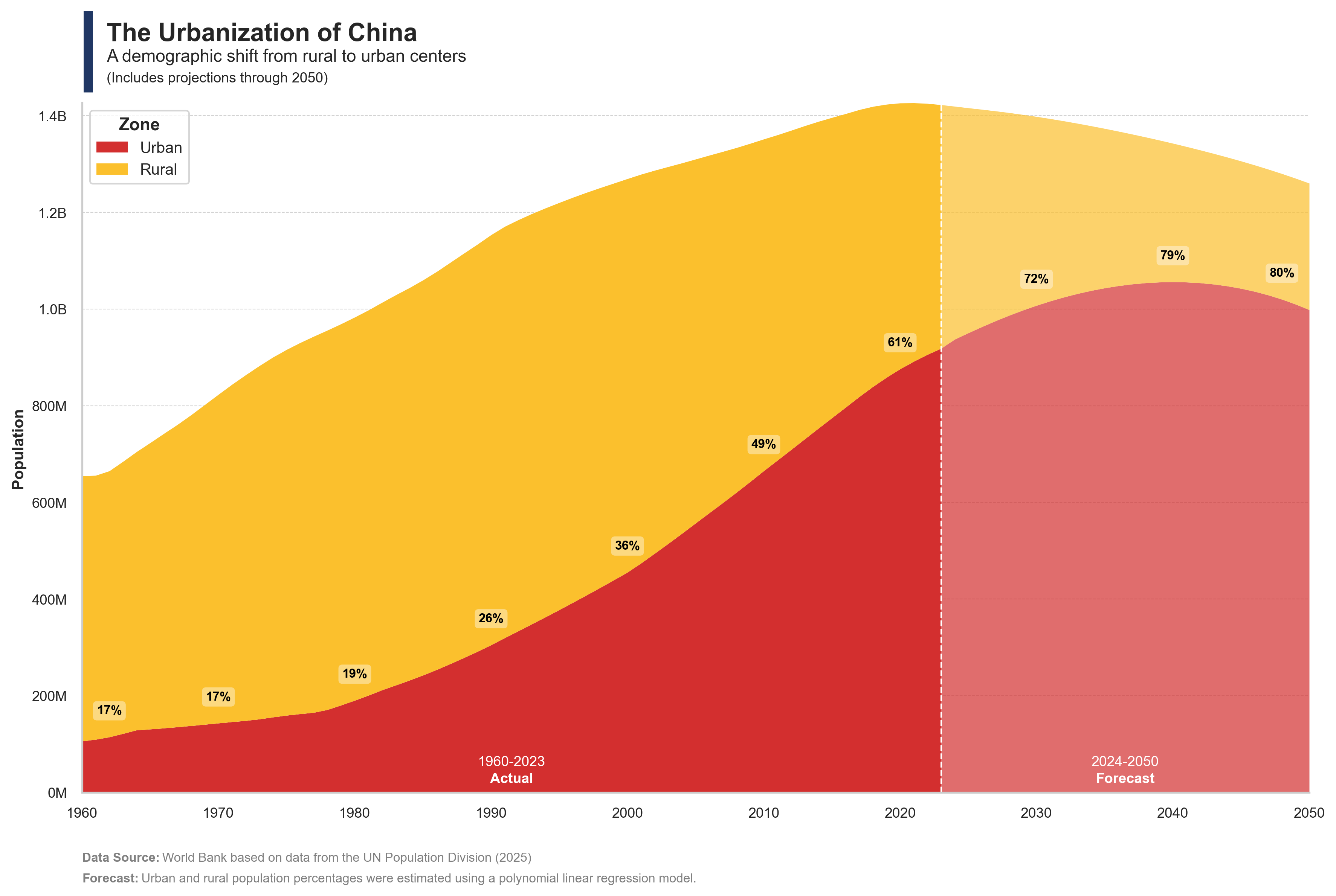
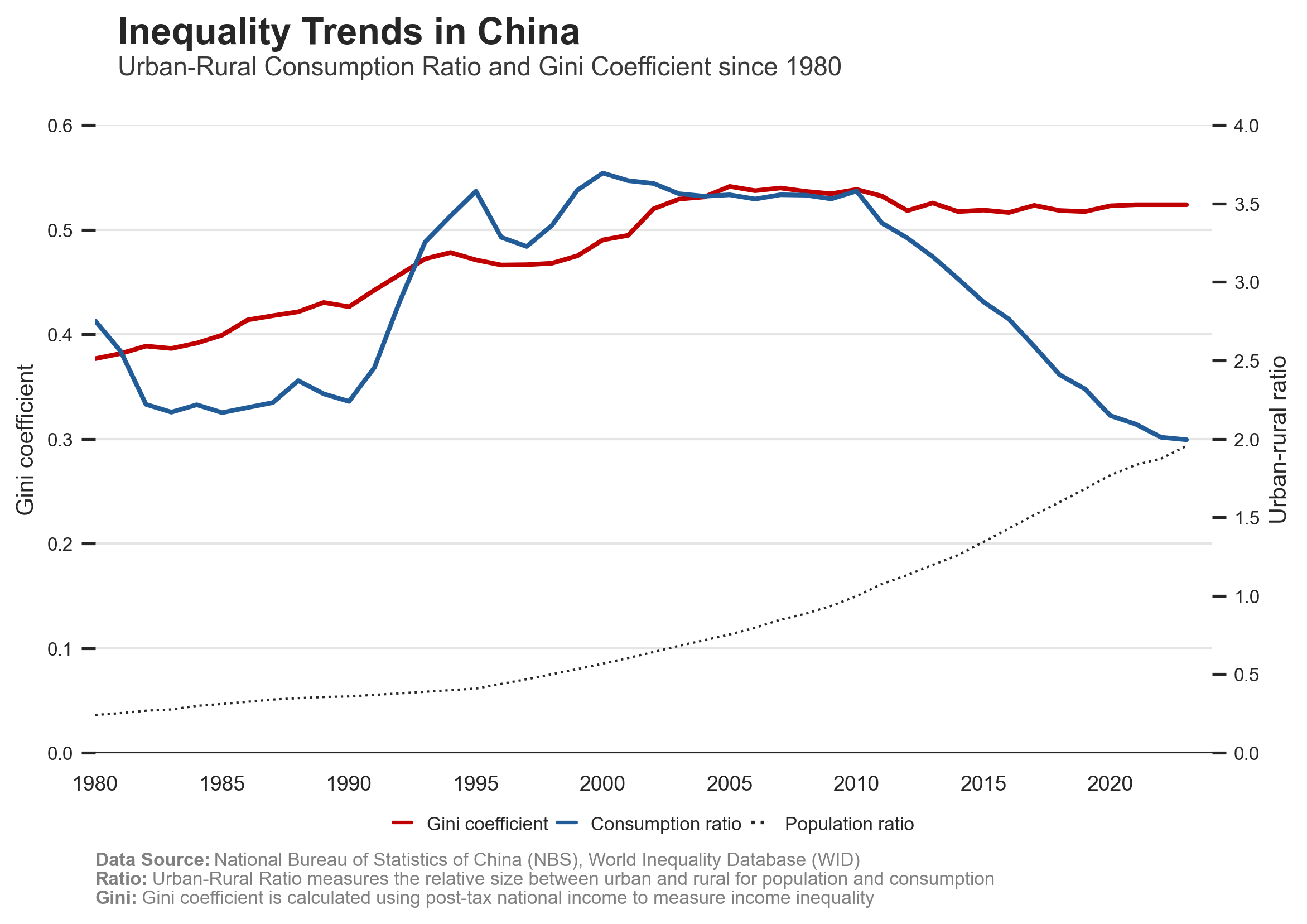
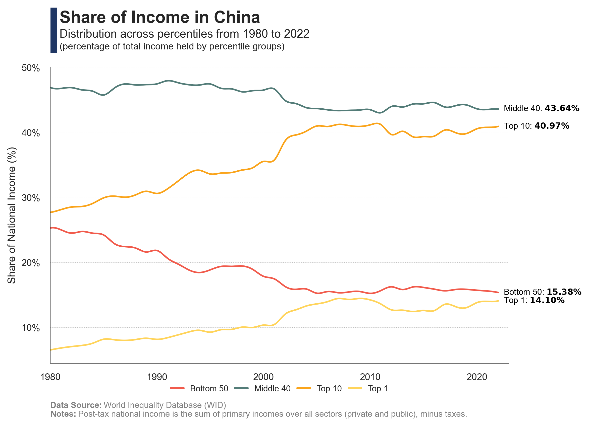
The charts illustrate the evolution of urbanization in China, the income inequality between rural and urban populations, and the scale of income distribution across cities.

Code
# Libraries
# ========================================================
import pandas as pd
import numpy as np
import os
from sklearn.linear_model import LinearRegression
from sklearn.preprocessing import PolynomialFeatures
import matplotlib.pyplot as plt
import seaborn as sns
import matplotlib.font_manager as fm

# Parameters
# ========================================================
code_iso = 'CHN'
name_iso = 'China'
max_urban = 0.82
year_pred = 1980 

# Data Extraction (urban and rural)
# ========================================================
# OWD Urban and Rural Population Data
df = pd.read_csv("https://ourworldindata.org/grapher/share-of-population-urban.csv?v=1&csvType=full&useColumnShortNames=true", storage_options = {'User-Agent': 'Our World In Data data fetch/1.0'})
df = df[df['Code'] == code_iso]
df = df[(df['Year'] >= 1960) & (df['Year'] <= 2023)]
df['Urban'] = df['sp_urb_totl_in_zs'] / 100
df = df[['Code', 'Year', 'Urban']]

# Variables
dfx = df[df['Year'] >= year_pred]
X = dfx[['Year']]
y = dfx['Urban']

# Transformar to polynomial
poly = PolynomialFeatures(degree=3)
X_poly = poly.fit_transform(X)

# Training model
model = LinearRegression()
model.fit(X_poly, y)

# Future year range
future_years = pd.DataFrame({'Year': range(2024, 2051)})
future_X_poly = poly.transform(future_years)

# Prediction
future_preds = model.predict(future_X_poly)

# Limit prediction to max_urban
future_preds = np.clip(future_preds, None, max_urban)

# Dataframe prediction
future_df = pd.DataFrame({
    'Code': code_iso,
    'Year': future_years['Year'],
    'Urban': future_preds
})

# Concatenate future predictions with original dataframe
df = pd.concat([df, future_df], ignore_index=True)

# Add rural percentage
df['Rural'] = 1 - df['Urban']

# Data Extraction (population)
# ========================================================
# OWD Population Data
dfp = pd.read_csv("https://ourworldindata.org/grapher/population-long-run-with-projections.csv?v=1&csvType=full&useColumnShortNames=true", storage_options = {'User-Agent': 'Our World In Data data fetch/1.0'})
dfp = dfp[dfp['Code'] == code_iso]
dfp = dfp[dfp['Year'] >= 1960]
dfp['Total'] = dfp['population_projection'].fillna(0) + dfp['population_historical'].fillna(0)
dfp = dfp[['Code', 'Year', 'Total']]

# Merge urban and rural data with population data
df = df.merge(dfp, on=['Code', 'Year'], how='left')
df['Urban_Per'] = df['Urban']
df['Urban'] = df['Urban'] * df['Total']
df['Rural'] = df['Rural'] * df['Total']
df = df[['Code', 'Year', 'Urban', 'Rural', 'Urban_Per']]

print(df)

# Data Visualization
# ========================================================
# Seaborn figure style
sns.set(style="whitegrid")
fig, ax = plt.subplots(figsize=(12, 8))

# Create a palette
palette1 = ["#D32F2F", "#FBC02D"]  # 1960–2023

# Separar periods (actual and forecast)
df1 = df[df['Year'] <= 2023].copy()
df2 = df[df['Year'] >= 2023].copy()

# Create stacked area plot
df1.set_index('Year')[['Urban', 'Rural']].plot(
    kind="area", stacked=True, color=palette1, ax=ax, linewidth=0
)
df2.set_index('Year')[['Urban', 'Rural']].plot(
    kind="area", stacked=True, color=palette1, ax=ax, linewidth=0, alpha=0.7, legend=False
)

# Title
fig.add_artist(plt.Line2D([0.073, 0.073], [0.90, 0.99], linewidth=6, color='#203764', solid_capstyle='butt'))
ax.text(0.02, 1.09, f'The Urbanization of {name_iso}', fontsize=16, fontweight='bold', ha='left', transform=plt.gca().transAxes)
ax.text(0.02, 1.06, f'A demographic shift from rural to urban centers', fontsize=11, color='#262626', ha='left', transform=plt.gca().transAxes)
ax.text(0.02, 1.03, f'(Includes projections through 2050)', fontsize=9, color='#262626', ha='left', transform=plt.gca().transAxes)

# Configuration
ax.set_xlim(1960, 2050)
ax.set_xlabel('')
ax.set_ylabel('Population', fontsize=10, fontweight='bold')
ax.grid(axis='x')
ax.grid(axis='y', linestyle='--', linewidth=0.5, color='lightgray')
ax.tick_params(axis='x', labelsize=9)
ax.tick_params(axis='y', labelsize=9) 
ax.yaxis.set_major_formatter(plt.FuncFormatter(
    lambda x, _: f'{x/1e9:.1f}B' if x >= 1e9 else f'{x/1e6:.0f}M'
))
ax.spines['top'].set_visible(False)
ax.spines['right'].set_visible(False)

max_total = (df["Urban"] + df["Rural"]).max()

# Establecer el límite del eje y
ax.set_ylim(top=max_total)

# White vertical line at 2023
ax.axvline(x=2023, color='white', linestyle='--', linewidth=1)

# Add text labels for urban percentages
y_offset = df['Urban'].max() * 0.04
for i, year in enumerate(df['Year']):
    if year % 10 == 0 and year not in [1960, 2050] or year in [1962, 2048]:
        urban_value = df.loc[i, 'Urban']
        urban_per = df.loc[i, 'Urban_Per']
        ax.text(
            year,
            urban_value + y_offset,
            f'{urban_per:.0%}',
            ha='center',
            va='bottom',
            fontsize=8,
            color='black',
            weight='bold',
            bbox=dict(facecolor='white', alpha=0.4, edgecolor='none', boxstyle='round,pad=0.3')
        )

# Legend configuration
handles, labels = ax.get_legend_handles_labels()
title_font = fm.FontProperties(weight='bold', size=11)
ax.legend(
    handles[:2], labels[:2],
    title="Zone",
    title_fontproperties=title_font,
    fontsize=10,
    loc='upper left'
)

# Actual text
y_max = ax.get_ylim()[1]
plt.text(
    x=(2023-1960)/2 + 1960,
    y=y_max*0.035,
    s="1960-2023",
    fontsize=9, 
    color='white',
    ha='center',
    va='bottom'
)
plt.text(
    x=(2023-1960)/2 + 1960,
    y=y_max*0.01,
    s="Actual",
    fontsize=9, 
    fontweight='bold',
    color='white',
    ha='center',
    va='bottom'
)

# Forecast text
plt.text(
    x=(2050-2023)/2 + 2023,
    y=y_max*0.035,
    s="2024-2050",
    fontsize=9, 
    color='white',
    ha='center',
    va='bottom'
)
plt.text(
    x=(2050-2023)/2 + 2023,
    y=y_max*0.01,
    s="Forecast",
    fontsize=9, 
    fontweight='bold',
    color='white',
    ha='center',
    va='bottom'
)

# Add Data Source
plt.text(0, -0.1, 'Data Source:', 
    transform=plt.gca().transAxes, 
    fontsize=8,
    fontweight='bold',
    color='gray')
space = " " * 23
plt.text(0, -0.1, space + 'World Bank based on data from the UN Population Division (2025)', 
    transform=plt.gca().transAxes, 
    fontsize=8,
    color='gray')

# Add Notes
plt.text(0, -0.12, 'Forecast:', 
    transform=plt.gca().transAxes, 
    fontsize=8,
    fontweight='bold',
    color='gray')
space = " " * 17
plt.text(0, -0.12, space + 'Urban and rural population percentages were estimated using a polynomial linear regression model.', 
    transform=plt.gca().transAxes, 
    fontsize=8,
    color='gray')

# Adjust layout
plt.tight_layout()

# Save it...
download_folder = os.path.join(os.path.expanduser("~"), "Downloads")
filename = os.path.join(download_folder, f"FIG_OWD_Population_Rural_Urban_{code_iso}.png")
plt.savefig(filename, dpi=300, bbox_inches='tight')

# Show :)
plt.show()

Code
# Libraries
# =====================================================================
import pandas as pd
import numpy as np
import seaborn as sns
import matplotlib.pyplot as plt
import matplotlib.ticker as ticker
import requests
import os

# Data (China) 
# =====================================================================
# Read wikipedia data
url = "https://en.wikipedia.org/wiki/List_of_prefecture-level_divisions_of_China_by_GDP"
headers = {
    "User-Agent": "Mozilla/5.0 (Windows NT 10.0; Win64; x64) AppleWebKit/537.36 (KHTML, like Gecko) Chrome/118.0.0.0 Safari/537.36"
}
html = requests.get(url, headers=headers).text
tables = pd.read_html(html)
df = tables[0]
df.columns = ['region', '1', '2', '3', 'gdp', '4', 'gdpc', '5']
df['population'] = df['gdp'] / df['gdpc'] * 1000
df = df[['region', 'gdpc', 'population']]
df['region'] = df['region'].str.replace('*', '', regex=False)

data = pd.DataFrame({
    'region': ['Beijing', 'Shangai', 'Chongqing', 'Tianjin', 'Hong Kong', 'Macao', 'Taiwan'],
    'gdpc': [28294, 26747, 12350, 17727, 48800, 36909, 32756],
    'population': [21.8, 24.7, 32.0, 13.9, 7.5, 0.68, 23.3],
})

df = pd.concat([df, data], ignore_index=True)

# Data Manipulation
# =====================================================================
# Order dataframe
df = df.sort_values(by=['gdpc'])

# Calculate 'left accrual widths'
df['population_cum'] = df['population'].cumsum()
df['left'] = df['population'].cumsum() - df['population']

# Pondered Gini Function
def gini(x, weights=None):
    if weights is None:
        weights = np.ones_like(x)
    count = np.multiply.outer(weights, weights)
    mad = np.abs(np.subtract.outer(x, x) * count).sum() / count.sum()
    rmad = mad / np.average(x, weights=weights)
    return 0.5 * rmad

# Calculate gini and median
gini_index = gini(df['gdpc'].values, df['population'].values)

# Calculate weighted median
df.sort_values('gdpc', inplace=True)
cumsum = df['population'].cumsum()
cutoff = df['population'].sum() / 2.0
median = df.loc[cumsum >= cutoff, 'gdpc'].iloc[0]

# Show dataframe, gini and median
print(df)
print(gini_index)
print(median)

# Data Visualization
# =====================================================================
# Seaborn figure style
sns.set(style="whitegrid")
fig, ax = plt.subplots(figsize=(12, 8))

# Create a palette
norm = plt.Normalize(df["gdpc"].min(), 25000)
colors = plt.cm.coolwarm_r(norm(df["gdpc"]))

# Create a Matplotlib plot
bars = plt.bar(df['left'], df['gdpc'], width=df['population'], 
        color=colors, alpha=1, align='edge', edgecolor='grey', linewidth=0.1)

# Title
fig.add_artist(plt.Line2D([0.085, 0.085], [0.90, 0.985], linewidth=6, color='#203764', solid_capstyle='butt'))
ax.text(0.02, 1.09, f'Regional GDP Distribution of China', fontsize=16, fontweight='bold', ha='left', transform=plt.gca().transAxes)
ax.text(0.02, 1.06, f'From rural to urban, the role of location in income inequality', fontsize=11, color='#262626', ha='left', transform=plt.gca().transAxes)
ax.text(0.02, 1.03, f'(GDP per capita in $US)', fontsize=9, color='#262626', ha='left', transform=plt.gca().transAxes)

# Configuration grid and labels
ax.set_xlim(0, df['population_cum'].max()) 
ax.set_ylim(0, df['gdpc'].max() * 1.093)
ax.set_xlabel('Cumulative Population (M)', fontsize=10, fontweight='bold')
ax.set_ylabel('GDP per capita ($USD)', fontsize=10, fontweight='bold')
ax.grid(axis='x')
ax.grid(axis='y', linestyle='--', linewidth=0.5, color='lightgray')
ax.tick_params(axis='x', labelsize=9)
ax.tick_params(axis='y', labelsize=9) 
ax.yaxis.set_major_formatter(ticker.FuncFormatter(lambda x, _: f'{int(x):,}'))
ax.xaxis.set_major_formatter(ticker.FuncFormatter(lambda x, _: f'{int(x):,}'))
ax.spines['top'].set_visible(False)
ax.spines['right'].set_visible(False)
ax.axhline(y=median, color='red', linestyle='--', linewidth=0.5, zorder=0, alpha=0.4)
ax.text(75, median + 100, f"Median: {median:,.0f}$", color='darkred', fontweight='bold', fontsize=9, ha='center', va='bottom', zorder=2)

# Add text each region except Ávila and Segovia
for i, bar in enumerate(bars):
    region_name = df['region'].iloc[i]
    
    top_cities = [
        'Beijing', 'Shangai', 'Chongqing', 'Tianjin', 'Hong Kong',
        'Ordos', 'Suzhou, Jiangsu', 'Zhenjiang', 'Jieyang', 'Kashgar', 'Shangrao', 'Qujing',
        'Shenzhen', 'Guangzhou', 'Suzhou', 'Chengdu', 'Wuhan', 'Hangzhou', 'Nanjing',
        'Ningbo', 'Qingdao', 'Wuxi', 'Changsha', 'Zhengzhou', 'Fuzhou', 'Quanzhou',
        'Jinan', 'Dongguan', 'Foshan', "Xi'an", 'Dalian', 'Wenzhou', 'Shenyang',
        'Kunming', 'Baoding', 'Shijiazhuang', 'Linyi', 'Harbin', 'Nanyang',
        'Weifang', 'Handan', 'Changchun', 'Xuzhou', 'Ganzhou', 'Zhoukou', 'Nanning',
        'Heze', 'Fujian', 'Jining', 'Shaoyang', 'Hefei', 'Nantong', 'Shangqiu',
        'Tangshan', 'Hengyang', 'Cangzhou', 'Jinhua', 'Luoyang', 'Xingtai',
        'Zhanjiang', 'Zhumadian', 'Bijie', 'Taiwan', 'Macao'
    ]
    
    # Add labels
    if region_name in top_cities:
        x = bar.get_x() + bar.get_width() / 2
        y = bar.get_height()
        
        # Special position
        if region_name == "Macao":
            x += -8
            y += 1000
        elif region_name == "Ordos":
            x += -2
            y += 3500
        elif region_name in ["Jinan", "Foshan", "Qingdao"]:
            x -= 5
            y += 1000
        else:
            y += 1000

        ax.text(
            x, y,
            region_name,
            ha='center', va='bottom', color='#363636', fontsize=7, rotation=90,
        )

# Add Year label 
ax.text(1, 1.12, f'2022',
             transform=plt.gca().transAxes,
             fontsize=22, ha='right', va='top',
             fontweight='bold', color='#D3D3D3')
    
# Add Data Source
ax.text(0, -0.1, 'Data Source: National Bureau of Statistics of China', 
            transform=plt.gca().transAxes, 
            fontsize=8, 
            color='gray')

# Show GINI Index
ax.text(
    0.09, 0.97, f"Gini Index: {gini_index:.2f}", 
    transform=ax.transAxes,
    fontsize=8.5,
    color='black',
    ha='right',
    va='top', 
    bbox=dict(boxstyle="round,pad=0.3", edgecolor='gray', facecolor='white')
)

# Add Gini Index
ax.text(0, -0.12, 'Notes: The Gini coefficient has been calculated using population weights for each region.', 
            transform=plt.gca().transAxes, 
            fontsize=8, 
            color='gray')

# Add label "poorest" and "richest"
ax.text(0, -0.065, 'Low Income',
             transform=ax.transAxes,
             fontsize=11, fontweight='bold', color='darkred', ha='left', va='center')
ax.text(0.915, -0.065, 'High Income',
             transform=ax.transAxes,
             fontsize=11, fontweight='bold', color='darkblue', va='center')

# Adjust layout
plt.tight_layout()

# Save it...
download_folder = os.path.join(os.path.expanduser("~"), "Downloads")
filename = os.path.join(download_folder, f"FIG_BUREAU_Region_Distribution_China_Prefecture.png")
plt.savefig(filename, dpi=300, bbox_inches='tight')

# Show :)
plt.show()

Code
# Libraries
# =====================================================
import pandas as pd
import matplotlib.pyplot as plt
import seaborn as sns
import os

# Get Data (NBS and WID)
# =====================================================
data = {
    "year": list(range(1980, 2025)),
    "urban_population": [
        19140, 20171, 21480, 22274, 24017, 25094, 26366, 27674, 28661, 29540, 30195, 31203, 32175,
        33173, 34169, 35174, 37304, 39449, 41608, 43748, 45906, 48064, 50212, 52376, 54283, 56212,
        58288, 60633, 62403, 64512, 66978, 69927, 72175, 74502, 76738, 79302, 81924, 84343, 86433,
        88426, 90220, 91425, 92071, 93267, 94350
    ],
    "rural_population": [
        79565, 79901, 80174, 80734, 80340, 80757, 81141, 81626, 82365, 83164, 84138, 84620, 84996,
        85344, 85681, 85947, 85085, 84177, 83153, 82038, 80837, 79563, 78241, 76851, 75705, 74544,
        73160, 71496, 70399, 68938, 67113, 64989, 63747, 62224, 60908, 59024, 57308, 55668, 54108,
        52582, 50992, 49835, 49104, 47700, 46478
    ],
    "urban_consumption": [
        490, 517, 504, 547, 621, 750, 847, 953, 1200, 1345, 1404, 1623, 2017, 2676, 3671, 4810,
        5437, 5705, 5977, 6429, 7083, 7409, 7826, 8166, 8942, 9900, 10820, 12582, 14147, 15161,
        17119, 19853, 21563, 23386, 25264, 27039, 29324, 31454, 33700, 35841, 34823, 39205, 40066,
        43797, 45717
    ],
    "rural_consumption": [
        178, 202, 227, 252, 280, 346, 385, 427, 506, 588, 627, 661, 701, 822, 1073, 1344, 1655, 1768,
        1778, 1793, 1917, 2032, 2157, 2292, 2521, 2784, 3066, 3538, 3981, 4295, 4782, 5880, 6573,
        7397, 8365, 9409, 10609, 12145, 13985, 15460, 16209, 18720, 19929, 21953, 23313
    ],
    "gini_pre": [
        0.3822, 0.387, 0.3942, 0.3919, 0.3969, 0.4045, 0.4193, 0.4232, 0.4267, 0.4358, 0.4323, 0.4478,
        0.4626, 0.4776, 0.4835, 0.4774, 0.4713, 0.471, 0.472, 0.4813, 0.498, 0.5072, 0.5346, 0.5428, 0.546,
        0.5577, 0.559, 0.562, 0.5622, 0.5627, 0.5665, 0.5646, 0.5531, 0.5621, 0.5546, 0.5555, 0.5497, 0.5574,
        0.5552, 0.5539, 0.5602, 0.5613, 0.5644, 0.5644, 0.5644
    ],
    "gini_pos": [
        0.3775,0.3823,0.3895,0.3872,0.3923,0.3991,0.4139,0.4181,0.422,0.4308,0.4268,0.4428,0.4577,0.4728,
        0.4788,0.4717,0.4668,0.467,0.4683,0.4755,0.4908,0.4958,0.5215,0.5305,0.5327,0.5429,0.5395,0.5427,
        0.5404,0.5387,0.5426,0.5374,0.5241,0.5313,0.523,0.5242,0.5224,0.5296,0.5253,0.5245,0.5295,0.5318,
        0.5351,0.5354,0.5354
    ],
   "gini_urb": [
        0.2415, 0.243, 0.2424, 0.2463, 0.2606, 0.2886, 0.2711, 0.2576, 0.267, 0.2738,
        0.2709, 0.2643, 0.2848, 0.3021, 0.3103, 0.3074, 0.3151, 0.3239, 0.3316, 0.3372,
        0.3456, 0.3589, 0.4127, 0.4245, 0.4383, 0.4464, 0.4492, 0.452, 0.456, 0.4516,
        0.4569, 0.4802, 0.4412, 0.474, 0.4466, 0.4474,
        None, None, None, None, None, None, None, None, None
    ],
    "gini_rur": [
        0.3329, 0.3422, 0.349, 0.3542, 0.3584, 0.3619, 0.3707, 0.3774, 0.3827, 0.387,
        0.3907, 0.4043, 0.4128, 0.4201, 0.4262, 0.4275, 0.43, 0.4315, 0.4267, 0.4311,
        0.4531, 0.4608, 0.4665, 0.4677, 0.4601, 0.4886, 0.483, 0.4921, 0.4903, 0.4963,
        0.5239, 0.5292, 0.5259, 0.524, 0.5232, 0.524, 
        None, None, None, None, None, None, None, None, None
    ],
    "gini_wea": [
    0.5358, 0.5358, 0.5358, 0.5358, 0.5358, 0.5358, 0.5358, 0.5358,
    0.5358, 0.5358, 0.5358, 0.5358, 0.5358, 0.5358, 0.5358, 0.5366, 0.5518, 0.5637,
    0.5729, 0.5803, 0.5863, 0.5913, 0.5956, 0.5957, 0.6080, 0.6204, 0.6334, 0.6479,
    0.6560, 0.6661, 0.7312, 0.7496, 0.7477, 0.7478, 0.7492, 0.7545, 0.7546, 0.7563,
    0.7558, 0.7553, 0.7567, 0.7579, 0.7574, 0.7573, 0.7573
]
}

df = pd.DataFrame(data)
df['var_consumption'] = df['urban_consumption'] / df['rural_consumption']
df['var_population'] = df['urban_population'] / df['rural_population']
df['gini'] = df['gini_pos']
df = df[['year', 'gini', 'gini_wea', 'var_consumption', 'var_population', 'gini_urb', 'gini_rur']]

# Interpolate monthly data (cubic)
df['date'] = pd.to_datetime(df['year'], format='%Y')
df= df[['date', 'gini','gini_wea','var_consumption','var_population']]
df = df.set_index('date').resample('D').mean().interpolate(method='cubic').reset_index()
df['year'] = df['date'].dt.year 

# Formatting date
df['date'] = pd.to_datetime(df['date'])

print(df)

# Data Visualization
# =====================================================
# Font and style
plt.rcParams.update({'font.family': 'sans-serif', 'font.sans-serif': ['Franklin Gothic'], 'font.size': 9})
sns.set(style="white", palette="muted")

# Create figure and axis
fig, ax1 = plt.subplots(figsize=(8, 6))

# Axis 1 DISPARITY
ax1.set_ylabel('Gini coefficient', fontsize=10)
line1, = ax1.plot(df['date'], df['gini'], color='#C00000', linewidth=2)
line1, = ax1.plot(df['date'], df['gini_wea'], color="#BF8F00", linewidth=2)
ax1.tick_params(axis='y')
ax1.set_ylim(0, 0.8)
ax1.tick_params(axis='x', labelsize=9)
ax1.tick_params(axis='y', labelsize=8)

# Axis 2 GINI
ax2 = ax1.twinx()
ax2.set_ylabel('Urban-rural ratio', fontsize=10)
line2, = ax2.plot(df['date'], df['var_consumption'], color='#215C98', linewidth=2)
ax2.tick_params(axis='y')
ax2.set_ylim(0, 5.5)
ax2.tick_params(axis='y', labelsize=8)

# Title and grid
plt.text(0.02, 1.13, f'Inequality Trends in China', fontsize=16, fontweight='bold', ha='left', transform=plt.gca().transAxes)
plt.text(0.02, 1.08, f'Urban-Rural Consumption Ratio and Gini Coefficient since 1980', fontsize=11, color="#3A3A3A", ha='left', transform=plt.gca().transAxes)
ax1.grid(axis='y', linestyle='-', alpha=0.5)

# Remove spines
for ax in (ax1, ax2):
    for spine_name, spine in ax.spines.items():
        if spine_name == 'bottom':
            spine.set_visible(True)
            spine.set_linewidth(0.5)
        else:
            spine.set_visible(False)

# Legend at bottom center
plt.plot([], [], color='#C00000', label='Gini coefficient (income)')
plt.plot([], [], color="#BF8F00", label='Gini coefficient (wealth)')
plt.plot([], [], color='#215C98', label='Consumption ratio')

plt.legend(
    loc='lower center',
    bbox_to_anchor=(0.5, -0.15),
    ncol=3,
    fontsize=8,
    frameon=False,
    handlelength=1,
    handleheight=1,
    borderpad=0.2,
    columnspacing=0.5
)

# Add Data Source
plt.text(0, -0.18, 'Data Source:', 
    transform=plt.gca().transAxes, 
    fontsize=8,
    fontweight='bold',
    color='gray')
space = " " * 23
plt.text(0, -0.18, space + 'National Bureau of Statistics of China (NBS), World Inequality Database (WID)', 
    transform=plt.gca().transAxes, 
    fontsize=8,
    color='gray')

# Add Notes
plt.text(0, -0.21, 'Ratio:', 
    transform=plt.gca().transAxes, 
    fontsize=7,
    fontweight='bold',
    color='gray')
space = " " * 11
plt.text(0, -0.21, space + 'Urban-Rural Ratio measures the relative size between urban and rural consumption', 
    transform=plt.gca().transAxes, 
    fontsize=7,
    color='gray')

# Add Notes
plt.text(0, -0.24, 'Gini:', 
    transform=plt.gca().transAxes, 
    fontsize=7,
    fontweight='bold',
    color='gray')
space = " " * 9
plt.text(0, -0.24, space + 'Gini coefficient is calculated using post-tax national income to measure income inequality', 
    transform=plt.gca().transAxes, 
    fontsize=7,
    color='gray')

# Adjust
plt.tight_layout()

# Save it...
download_folder = os.path.join(os.path.expanduser("~"), "Downloads")
filename = os.path.join(download_folder, f"FIG_NBS_Inequality_China.png")
plt.savefig(filename, dpi=300, bbox_inches='tight')

# Show it :)
plt.show()

Code
# Libraries
# ===================================================
import os
import pandas as pd
import seaborn as sns
import matplotlib.pyplot as plt
import matplotlib.dates as mdates
from matplotlib.ticker import PercentFormatter

# Data Extraction
# ===================================================
# Define CSV path
path = r'C:\Users\guill\Downloads\wid_all_data\analyze'

# List to save dataframe
list = []

# Iterate over each file
for archivo in os.listdir(path):
    if archivo.startswith("WID_data_") and archivo.endswith(".csv"):
        df = pd.read_csv(os.path.join(path, archivo), delimiter=';')
        list.append(df)

# Combine all dataframes and create a copy
df = pd.concat(list, ignore_index=True)

# Filter dataframes
country = ['CN'] # iso3
variable = ['sdiincj992'] # sdiincj992 / shwealj992
percentile = ['p99p100', 'p90p100', 'p50p90', 'p0p50']
year = range(1978, 2023)
df = df[(df['country'].isin(country)) & df['variable'].isin(variable) & df['percentile'].isin(percentile) & df['year'].isin(year)]
df = df[['country', 'percentile', 'year', 'value']]

# Interpolate monthly data (cubic)
dfs = []

for percentile in df['percentile'].unique():
    temp_df = df[df['percentile'] == percentile].copy()
    temp_df['date'] = pd.to_datetime(temp_df['year'], format='%Y')
    temp_df = temp_df[['date', 'value']]
    temp_df = temp_df.set_index('date').resample('D').mean().interpolate(method='cubic').reset_index()
    temp_df['percentile'] = percentile
    temp_df['year'] = temp_df['date'].dt.year 
    dfs.append(temp_df)

df = pd.concat(dfs, ignore_index=True)

# Formatting date
df['date'] = pd.to_datetime(df['date'])

# Replace percentile values
replace_dict = {
    'p99p100': 'Top 1',
    'p90p100': 'Top 10',
    'p50p90': 'Middle 40',
    'p0p50': 'Bottom 50'
}

df['percentile'] = df['percentile'].replace(replace_dict)

print(df)

# Data Visualization
# ===================================================
# Font and style
plt.rcParams.update({'font.family': 'sans-serif', 'font.sans-serif': ['Franklin Gothic'], 'font.size': 9})
sns.set(style="white", palette="muted")

# Create figure
fig, ax = plt.subplots(figsize=(8, 6))

# Define custom color palette
palette = {
    "Bottom 50": "#F15B4C",   # naranja
    "Middle 40": "#537C78",  # verde
    "Top 10": "#FAA41B",     # azul
    "Top 1": "#FFD45B"      # rojo
}

# Line plot
sns.lineplot(data=df, x='date', y='value', hue='percentile', palette=palette, legend=False, ax=ax)

# Add title and subtitle
fig.add_artist(plt.Line2D([0.1, 0.1], [0.86, 0.96], linewidth=6, color='#203764', solid_capstyle='butt'))
plt.text(0.02, 1.15, f'Share of Income in China', fontsize=16, fontweight='bold', ha='left', transform=plt.gca().transAxes)
plt.text(0.02, 1.1, f'Distribution across percentiles from 1980 to 2022', fontsize=11, color='#262626', ha='left', transform=plt.gca().transAxes)
plt.text(0.02, 1.06, f'(percentage of total income held by percentile groups)', fontsize=9, color='#262626', ha='left', transform=plt.gca().transAxes)

# Axis x-axis limits and labels
ax.set_xlim(pd.to_datetime("1980-01-01"), pd.to_datetime("2022-12-31"))
ax.xaxis.set_major_locator(mdates.YearLocator(10))  
ax.xaxis.set_major_formatter(mdates.DateFormatter("%Y")) 
ax.tick_params(axis="x", labelsize=9) 
ax.set_xlabel('') 

# Set y-axis limits and labels
ax.set_ylabel('Share of National Income (%)', fontsize=10)
ax.tick_params(axis='y', labelsize=9)
ax.grid(axis='y', linestyle=':', color='gray', alpha=0.7, linewidth=0.25)
ax.yaxis.set_major_formatter(PercentFormatter(xmax=1, decimals=0))

# Remove spines and legend
ax = plt.gca()
ax.spines['top'].set_visible(False)
ax.spines['right'].set_visible(False)
ax.spines['bottom'].set_linewidth(0.5)
ax.spines['left'].set_linewidth(0.5)

# Add percentages for each line at the end of the plot
for percentile in df['percentile'].unique():
    # Filter the last value for each percentile
    subset = df[df['percentile'] == percentile]
    last_value = subset.iloc[-1]
    
    # Create the text with bold percentage
    texto = f"{last_value['percentile']}: " + r"$\bf{" + f"{last_value['value']*100:.2f}" + r"\%}$"
    
    # Add annotation
    plt.annotate(texto, 
                 xy=(last_value['date'], last_value['value']), 
                 xytext=(5, 0),
                 textcoords='offset points', 
                 color='black', 
                 fontsize=8, 
                 weight='normal',
                 va='center',
                 ha='left')

for key, color in palette.items():
    ax.plot([], [], color=color, label=key, linestyle='-', linewidth=2)

ax.legend(
    loc='lower center',
    bbox_to_anchor=(0.5, -0.12),
    ncol=len(palette),
    fontsize=8,
    frameon=False,
    handlelength=1.5,
    handleheight=1,
    borderpad=0.2,
    columnspacing=0.8
)

# Add Data Source
plt.text(0, -0.15, 'Data Source:', 
    transform=plt.gca().transAxes, 
    fontsize=8,
    fontweight='bold',
    color='gray')
space = " " * 23
plt.text(0, -0.15, space + 'World Inequality Database (WID)', 
    transform=plt.gca().transAxes, 
    fontsize=8,
    color='gray')

# Add Note
plt.text(0, -0.18, 'Notes:', 
    transform=plt.gca().transAxes, 
    fontsize=8,
    fontweight='bold',
    color='gray')
space = " " * 12
plt.text(0, -0.18, space + 'Post-tax national income is the sum of primary incomes over all sectors (private and public), minus taxes.',
    transform=plt.gca().transAxes, 
    fontsize=8,
    color='gray')
      
# Adjust layout
plt.tight_layout()

# Save it...
download_folder = os.path.join(os.path.expanduser("~"), "Downloads")
filename = os.path.join(download_folder, f"FIG_WID_China_Income_Percentiles")
plt.savefig(filename, dpi=300, bbox_inches='tight')

# Mostrar el gráfico
plt.show()

Code
# Libraries
# ===================================================
import os
import pandas as pd
import seaborn as sns
import matplotlib.pyplot as plt
import matplotlib.ticker as mtick
from matplotlib.lines import Line2D

# Data Extraction
# ===================================================
# Define CSV path
path = r'C:\Users\guill\Downloads\wid_all_data\analyze'

# List to save dataframe
list = []

# Iterate over each file
for archivo in os.listdir(path):
    if archivo.startswith("WID_data_") and archivo.endswith(".csv"):
        df = pd.read_csv(os.path.join(path, archivo), delimiter=';')
        list.append(df)

# Combine all dataframes and create a copy
df = pd.concat(list, ignore_index=True)

# Filter dataframes
country = ['CN']
variable = ['wwealhi999', 'wwealgi999', 'wwealni999']
percentile = ['p0p100']
year = range(1978, 2023)
df = df[(df['country'].isin(country)) & df['variable'].isin(variable) & df['percentile'].isin(percentile) & df['year'].isin(year)]
df = df[['country', 'variable', 'year', 'value']]

# Replace values
df['variable'] = df['variable'].replace({
    'wwealhi999': 'private',
    'wwealgi999': 'public',
    'wwealni999': 'total'
})

df['variable'] = df['variable'] + df['country']

# Interpolate monthly data (cubic)
dfs = []

for variable in df['variable'].unique():
    temp_df = df[df['variable'] == variable].copy()
    temp_df['date'] = pd.to_datetime(temp_df['year'], format='%Y')
    temp_df = temp_df[['date', 'value']]
    temp_df = temp_df.set_index('date').resample('D').mean().interpolate(method='cubic').reset_index()
    temp_df['variable'] = variable
    temp_df['year'] = temp_df['date'].dt.year 
    dfs.append(temp_df)

df = pd.concat(dfs, ignore_index=True)

# Formatting date
df['date'] = pd.to_datetime(df['date'])

# Separate detail and total
dfdetail = df[df['variable'] != 'totalCN'].copy()
dftotal = df[df['variable'] == 'totalCN'].copy()

print(df)

# Data Visualization
# ===================================================
# Font and style
plt.rcParams.update({'font.family': 'sans-serif', 'font.sans-serif': ['Franklin Gothic'], 'font.size': 9})
sns.set(style="white", palette="muted")

# Create figure
fig, ax = plt.subplots(figsize=(8, 6))

# Plot lines
sns.lineplot(data=dftotal, x='date', y='value', hue='variable', legend=False, palette=["#0D0D0D"], linewidth=2)
sns.lineplot(data=dfdetail, x='date', y='value', hue='variable', legend=False, palette=["#153D64", "#C00000"], linewidth=1.25)

# Add title and subtitle
fig.add_artist(plt.Line2D([0.08, 0.08], [0.87, 0.97], linewidth=6, color='#203764', solid_capstyle='butt'))
plt.text(0.02, 1.09, f'Wealth Property in China', fontsize=16, fontweight='bold', ha='left', transform=plt.gca().transAxes)
plt.text(0.02, 1.045, f'Evolution of public and private wealth-income ratio', fontsize=11, color='#262626', ha='left', transform=plt.gca().transAxes)
plt.text(0.02, 1.01, f'(wealth divided by annual income)', fontsize=9, color='#262626', ha='left', transform=plt.gca().transAxes)

# Axis configuration
plt.grid(axis='y', linewidth=0.5, color='lightgray')
ax.set_xlim(pd.to_datetime("1978-01-01"), pd.to_datetime("2023-12-31"))
plt.xlabel('')
plt.ylabel('')
plt.tick_params(axis='both', which='major', labelsize=9)

# Modify spines
for spine in ['top', 'right', 'left']:
    plt.gca().spines[spine].set_visible(False)
plt.gca().spines['bottom'].set_color('#404040')
plt.gca().spines['bottom'].set_linewidth(0.75)
plt.gca().yaxis.set_major_formatter(mtick.PercentFormatter(xmax=1))

# Create custom legend
legend_elements = [
    Line2D([0], [0], color='#0D0D0D', lw=2, label='Total'),
    Line2D([0], [0], color='#153D64', lw=2, label='Private'),
    Line2D([0], [0], color='#C00000', lw=2, label='Public')
]

plt.legend(
    handles=legend_elements, 
    loc='upper center', 
    bbox_to_anchor=(0.5, -0.065), 
    ncol=3,
    fontsize=8,
    frameon=False
)

# Add Data Source
plt.text(0, -0.15, 'Data Source:', 
    transform=plt.gca().transAxes, 
    fontsize=8,
    fontweight='bold',
    color='gray')
space = " " * 23
plt.text(0, -0.15, space + 'World Inequality Database (WID)', 
    transform=plt.gca().transAxes, 
    fontsize=8,
    color='gray')

# Add Note
plt.text(0, -0.18, 'Notes:', 
    transform=plt.gca().transAxes, 
    fontsize=8,
    fontweight='bold',
    color='gray')
space = " " * 12
plt.text(0, -0.18, space + 'Net private wealth, Net Public Wealth and Net national wealth to net annual national income.',
    transform=plt.gca().transAxes, 
    fontsize=8,
    color='gray')

# Add Total text
lastyear = dftotal['date'].max()
lastvalue = dftotal.loc[dftotal['date'] == lastyear, 'value'].values[0]
plt.text(lastyear + pd.Timedelta(days=180), lastvalue, 'Total', fontweight='bold', va='center', ha='left', fontsize=9, color="#0D0D0D")

# Add Private and Public text
for var, color in zip(dfdetail['variable'].unique(), ["#153D64", "#C00000"]):
    df_var = dfdetail[dfdetail['variable'] == var]
    lastyear = df_var['date'].max()
    lastvalue = df_var.loc[df_var['date'] == lastyear, 'value'].values[0]
    texto = "Public" if color == "#153D64" else "Private"
    plt.text(lastyear + pd.Timedelta(days=180), lastvalue, texto, va='center', ha='left', 
             fontsize=9, color=color)
    
# Adjust layout
plt.tight_layout()

# Save it...
download_folder = os.path.join(os.path.expanduser("~"), "Downloads")
filename = os.path.join(download_folder, f"FIG_WID_China_Wealth_Property")
plt.savefig(filename, dpi=300, bbox_inches='tight')

# Show :)
plt.show()

Code
# Libraries
# ==============================================
import requests
import pandas as pd
import matplotlib.pyplot as plt
import seaborn as sns
import matplotlib.dates as mdates
from matplotlib.offsetbox import OffsetImage, AnnotationBbox
from matplotlib.ticker import PercentFormatter
import matplotlib.pyplot as plt
import matplotlib.image as mpimg
from io import BytesIO
import os

# Data Extraction
# ==============================================
# Define CSV path
path = r'C:\Users\guillem.maya\Downloads\wid_all_data\analyze'

# List to save dataframe
list = []

# Iterate over each file
for archivo in os.listdir(path):
    if archivo.startswith("WID_data_") and archivo.endswith(".csv"):
        df = pd.read_csv(os.path.join(path, archivo), delimiter=';')
        list.append(df)

# Combine all dataframes and create a copy
df = pd.concat(list, ignore_index=True)

# Filter years and measures
df = df[(df['year'] >= 1980) & (df['year'] <= 2023) &
        (df['variable'].isin(["wpweali999", "wgweali999", "mpweali999", "mgweali999", "xlcusxi999"])) &
        (df['country'].isin(["JP", "US", "CN", "DE", "RU"]))]

# Pivotar to columns
df = df.pivot_table(index=['country', 'year'], 
                    columns='variable', 
                    values='value').reset_index()

# Create columns
df['private_wealth_ratio'] = df['wpweali999']
df['public_wealth_ratio'] = df['wgweali999']
df['public_wealth_usd'] = df['mgweali999'] / df['xlcusxi999']
df['private_wealth_usd'] = df['mpweali999'] / df['xlcusxi999']
df['public_wealth_percent'] = df['mgweali999'] / (df['mgweali999'] + df['mpweali999'])
df['total_wealth_usd'] = (df['mgweali999'] + df['mpweali999']) / df['xlcusxi999']

# Select columns
df = df[['country', 'year', 'public_wealth_percent']]

# Add country names
country_names = {
    "CN": "China",
    "US": "United States",
    "DE": "Germany",
    "JP": "Japan",
    "RU": "Russia",
}

# Añadir la columna 'name'
df["name"] = df["country"].map(country_names)

# Interpolate monthly
dfs = []
for country in df["country"].unique():
    temp_df = df[df["country"] == country].copy()
    temp_df["date"] = pd.to_datetime(temp_df["year"], format="%Y")
    temp_df = temp_df.set_index("date")
    temp_df = temp_df.resample("M").mean(numeric_only=True).interpolate(method="cubic")
    temp_df = temp_df.reset_index()
    temp_df["country"] = country
    temp_df["year"] = temp_df["date"].dt.year
    dfs.append(temp_df)
df = pd.concat(dfs, ignore_index=True)

# Formatting date
df['date'] = pd.to_datetime(df['date'])

# Specific order countries
df = df.sort_values(
    ["country", "date"],
    key=lambda col: col.map({c: i for i, c in enumerate(["RU","JP","DE","US","CN"])}) 
                   if col.name=="country" else col
)

# Show df
print(df)

# Data Visualization
# ==============================================
# Font and style
plt.rcParams.update({'font.family': 'sans-serif', 'font.sans-serif': ['Franklin Gothic'], 'font.size': 9})
sns.set(style="white", palette="muted")

# Create figure
fig, ax = plt.subplots(figsize=(8, 6))

# Define custom color palette
palette = {
    "CN": "#C00000", # "#C00000",
    "US": "#203764", # "#203764",
    "DE": "#DFF7D0", # "#548235",
    "JP": "#F5DCB4", # "#FAA41B",
    "RU": "#F3E1F5", # "#A0A5BB"
}

# Line plot
sns.lineplot(data=df, x='date', y='public_wealth_percent', hue='country', palette=palette, legend=False, ax=ax)

# Add title and subtitle
fig.add_artist(plt.Line2D([0.095, 0.095], [0.865, 0.965], linewidth=6, color='#203764', solid_capstyle='butt'))
plt.text(0.02, 1.12, f'Declining of Public Property', fontsize=16, fontweight='bold', ha='left', transform=plt.gca().transAxes)
plt.text(0.02, 1.07, f'Capitalization phase toward a mostly privatized economy', fontsize=11, color='#262626', ha='left', transform=plt.gca().transAxes)
plt.text(0.02, 1.03, f'(net public wealth as percent of net national)', fontsize=9, color='#262626', ha='left', transform=plt.gca().transAxes)

# Axis x-axis limits and labels
ax.set_xlim(pd.to_datetime("1980-01-01"), pd.to_datetime("2023-01-31"))
ax.xaxis.set_major_locator(mdates.YearLocator(10))  
ax.xaxis.set_major_formatter(mdates.DateFormatter("%Y")) 
ax.tick_params(axis="x", labelsize=9) 
ax.set_xlabel('') 

# Set y-axis limits and labels
ax.set_ylabel('Share of Public Wealth (%)', fontsize=10)
ax.tick_params(axis='y', labelsize=9)
ax.grid(axis='y', linestyle=':', color='gray', alpha=0.7, linewidth=0.25)
ax.yaxis.set_major_formatter(PercentFormatter(xmax=1, decimals=0))

# Remove spines and legend
ax = plt.gca()
ax.spines['top'].set_visible(False)
ax.spines['right'].set_visible(False)
ax.spines['bottom'].set_linewidth(0.5)
ax.spines['left'].set_linewidth(0.5)

# URLs flags
flag_urls = {
    'CN': 'https://raw.githubusercontent.com/matahombres/CSS-Country-Flags-Rounded/master/flags/CN.png',
    'US': 'https://raw.githubusercontent.com/matahombres/CSS-Country-Flags-Rounded/master/flags/US.png',
    'JP': 'https://raw.githubusercontent.com/matahombres/CSS-Country-Flags-Rounded/master/flags/JP.png',
    'DE': 'https://raw.githubusercontent.com/matahombres/CSS-Country-Flags-Rounded/master/flags/DE.png',
    'RU': 'https://raw.githubusercontent.com/matahombres/CSS-Country-Flags-Rounded/master/flags/RU.png'
}

# Download and read flags
flags = {country: mpimg.imread(BytesIO(requests.get(url).content)) for country, url in flag_urls.items()}

# Add percentage and flag
for country in df['country'].unique():
    subset = df[df['country'] == country]
    last_value = subset.iloc[-1]

    # Texto con el porcentaje
    texto = f"{last_value['country']}: " + r"$\bf{" + f"{last_value['public_wealth_percent']*100:.2f}" + r"\%}$"

    # Color del texto: gris si no es CN ni US
    text_color = 'black' if country in ["CN", "US"] else 'gray'
    
    # Añadir texto
    plt.annotate(
        texto,
        xy=(last_value['date'], last_value['public_wealth_percent']),
        xytext=(20, 0),
        textcoords='offset points',
        color=text_color,
        fontsize=8,
        weight='normal',
        va='center',
        ha='left'
    )

    # Imagen de la bandera
    flag_img = flags[country]

    # Aplicar transparencia si el país no es CN
    if country not in ["CN", "US"]:
        imagebox = OffsetImage(flag_img, zoom=0.021, alpha=0.4)  # con transparencia
    else:
        imagebox = OffsetImage(flag_img, zoom=0.021)  # sin transparencia

    ab = AnnotationBbox(
        imagebox,
        (last_value['date'], last_value['public_wealth_percent']),
        frameon=False,
        box_alignment=(0, 0.5),
        xybox=(5, 0),
        xycoords='data',
        boxcoords="offset points"
    )

    plt.gca().add_artist(ab)

# Add Legend
legend = {
    "China": "#C00000",
    "Russia": "#D4D6E0",
    "Japan": "#F0D19F",
    "Germany": "#CDECB9", 
    "US": "#B2C0DD"
}

# Create custom legend
for key, color in legend.items():
    ax.plot([], [], color=color, label=key, linestyle='-', linewidth=2)

ax.legend(
    loc='lower center',
    bbox_to_anchor=(0.5, -0.12),
    ncol=len(legend),
    fontsize=8,
    frameon=False,
    handlelength=1.5,
    handleheight=1,
    borderpad=0.2,
    columnspacing=0.8
)

# Add Data Source
plt.text(0, -0.15, 'Data Source:', 
    transform=plt.gca().transAxes, 
    fontsize=8,
    fontweight='bold',
    color='gray')
space = " " * 23
plt.text(0, -0.15, space + 'World Inequality Database (WID)', 
    transform=plt.gca().transAxes, 
    fontsize=8,
    color='gray')

# Add Note
plt.text(0, -0.18, 'Notes:', 
    transform=plt.gca().transAxes, 
    fontsize=8,
    fontweight='bold',
    color='gray')
space = " " * 12
plt.text(0, -0.18, space + 'Net public wealth is the total value of assets owned by the government sector, minus its debts',
    transform=plt.gca().transAxes, 
    fontsize=8,
    color='gray')
      
# Adjust layout
plt.tight_layout()

# Save it...
download_folder = os.path.join(os.path.expanduser("~"), "Downloads")
filename = os.path.join(download_folder, f"FIG_WID_Public_Wealth_Share")
plt.savefig(filename, dpi=300, bbox_inches='tight')

# Mostrar el gráfico
plt.show()

Back to top