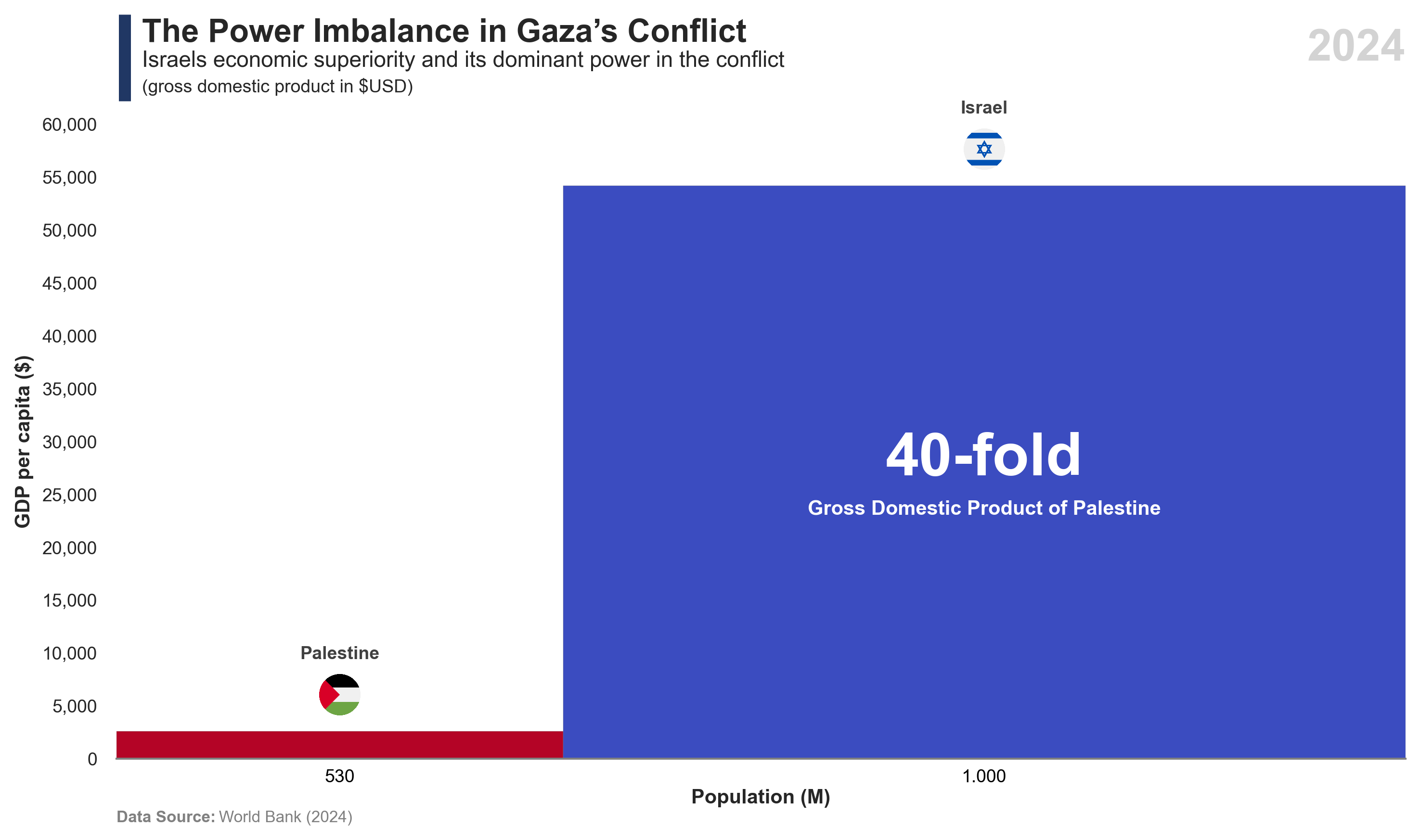
The graphic shows the disproportionate and asymmetrical nature of the Gaza conflict, contrasting Israel’s military and economic strengths with Gaza’s more limited resources and vulnerable population.
Code
# Libraries# =====================================================================import osfrom io import BytesIOimport requestsimport wbgapi as wbimport pandas as pdimport numpy as npimport seaborn as snsimport matplotlib.pyplot as pltimport matplotlib.image as mpimgimport matplotlib.ticker as tickerfrom matplotlib.offsetbox import OffsetImage, AnnotationBbox# Data Extraction (Countries)# =====================================================================# Crear el DataFramedata = {'year': ['2024', '2024'],'iso3': ['PSE', 'ISR'],'country': ['Palestine', 'Israel'],'ngdpdpc': [2.592, 54.176],'lp': [5.3, 10] }df = pd.DataFrame(data)df['ngdpd'] = df['ngdpdpc'] * df['lp']# Data Manipulation# =====================================================================# Add calculated fieldsdf['lp_percent'] = df['lp'] / df['lp'].sum()df['ngdpd_percent'] = df['ngdpd'] / df['ngdpd'].sum()df['gap'] = df['ngdpd_percent'] - df['lp_percent']# Ordenar por gapdf = df.sort_values(by='gap', ascending=True)# Calculate cumulative and left positionsdf['lp_cum'] = df['lp'].cumsum()df['lp_per'] = df['lp'] / df['lp'].sum()df['lp_cum_per'] = df['lp_cum'] / df['lp_cum'].max()df['left'] = df['lp_cum_per'] - df['lp_per']print(df)# Data Visualization# =====================================================================# Font and styleplt.rcParams.update({'font.family': 'sans-serif', 'font.sans-serif': ['Franklin Gothic'], 'font.size': 9})sns.set(style="white", palette="muted")# Create figurefig, ax = plt.subplots(figsize=(10, 6))# Create a palettepalette = sns.color_palette("coolwarm", as_cmap=True).reversed()gdp_min =-0.05gdp_max =0.05norm = plt.Normalize(gdp_min, gdp_max)colors = palette(norm(df['gap']))# Barplotbars = plt.bar( df['left'], df['ngdpdpc'], width=df['lp_per'], alpha=1, align='edge', edgecolor='grey', color=colors, linewidth=0.1)# Add title and subtitlefig.add_artist(plt.Line2D([0.095, 0.095], [0.87, 0.97], linewidth=6, color='#203764', solid_capstyle='butt'))plt.text(0.02, 1.13, f'The Power Imbalance in Gaza’s Conflict', fontsize=16, fontweight='bold', ha='left', transform=plt.gca().transAxes)plt.text(0.02, 1.09, f'Israel''s economic superiority and its dominant power in the conflict', fontsize=11, color='#262626', ha='left', transform=plt.gca().transAxes)plt.text(0.02, 1.05, f'(gross domestic product in $USD)', fontsize=9, color='#262626', ha='left', transform=plt.gca().transAxes)# Remove spinesax = plt.gca()ax.spines['top'].set_visible(False)ax.spines['right'].set_visible(False)ax.spines['bottom'].set(color='gray', linewidth=1)ax.spines['left'].set_linewidth(False)# Configurationplt.xlim(0, df['lp_cum_per'].max())ax.set_xticks([])plt.ylim(0, 60)ax.yaxis.set_major_locator(ticker.MultipleLocator(5))plt.ylabel('GDP per capita ($)', fontsize=10, fontweight='bold')plt.xlabel('Population (M)', fontsize=10, fontweight='bold', labelpad=15)plt.tick_params(axis='y', labelsize=9)plt.gca().yaxis.set_major_formatter(ticker.FuncFormatter(lambda x, _: f'{round(x*1000, 1):,.0f}'))# Define flagsflag_urls = {'PSE': 'https://raw.githubusercontent.com/matahombres/CSS-Country-Flags-Rounded/master/flags/PS.png','ISR': 'https://raw.githubusercontent.com/matahombres/CSS-Country-Flags-Rounded/master/flags/IL.png'}# Load flags onceflags = {country: mpimg.imread(BytesIO(requests.get(url).content)) for country, url in flag_urls.items()}# For each bar, add the corresponding flag and country namefor bar, iso3 inzip(bars, df['iso3']):if iso3 in flags: img = flags[iso3] imagebox = OffsetImage(img, zoom=0.04) x = bar.get_x() + bar.get_width() /2 offset =1.5 text_offset =5# Positioning logicif bar.get_height() >=0: y_flag = bar.get_height() + offset box_align = (0.5, 0) text_y = y_flag + text_offset va_text ='bottom'else: y_flag = bar.get_height() - offset box_align = (0.5, 1) text_y = y_flag - text_offset va_text ='top'# Add flag ab = AnnotationBbox(imagebox, (x, y_flag), frameon=False, box_alignment=box_align) ax.add_artist(ab)# Add country name country_name = df.loc[df['iso3'] == iso3, 'country'].values[0] ax.text(x, text_y, country_name, ha='center', va=va_text, fontsize=9, fontweight='bold', color='#404040')# Add population population = df.loc[df['iso3'] == iso3, 'lp'].values[0] formatted_pop =f'{round(population*100, 1):,.0f}'.replace(',', '.') ax.text(x, -1, formatted_pop, ha='center', va='top', fontsize=9, color="#000000")# Add country nameif iso3 =='ISR': ax.text(x, text_y-35, "40-fold", ha='center', va=va_text, fontsize=30, fontweight='bold', color="#FFFFFF") ax.text(x, text_y-38, "Gross Domestic Product of Palestine", ha='center', va=va_text, fontsize=10, fontweight='bold', color="#FFFFFF")# Add Year labelplt.text(1, 1.15, f'{df['year'].max()}', transform=plt.gca().transAxes, fontsize=22, ha='right', va='top', fontweight='bold', color='#D3D3D3', bbox=dict(facecolor='white', edgecolor='none', boxstyle='square,pad=0.3'))# Add Data Sourceplt.text(0, -0.1, 'Data Source:', transform=plt.gca().transAxes, fontsize=8, fontweight='bold', color='gray')space =" "*23plt.text(0, -0.1, space +'World Bank (2024)', transform=plt.gca().transAxes, fontsize=8, color='gray')# Adjust layoutplt.tight_layout()# Save it...max_year = df['year'].max()download_folder = os.path.join(os.path.expanduser("~"), "Downloads")filename = os.path.join(download_folder, f"FIG_WB_Israel_Dominance_{max_year}.png")plt.savefig(filename, dpi=300, bbox_inches='tight')# Show :)plt.show()
Code
# Libraries# ================================================import pandas as pdimport matplotlib.pyplot as pltimport seaborn as snsimport requestsimport matplotlib.image as mpimgimport osfrom io import BytesIOfrom matplotlib.offsetbox import OffsetImage, AnnotationBbox# Data Extraction# ================================================# Crear el DataFramedata = {'year': ['2024', '2024'],'iso3': ['PSE', 'ISR'],'country': ['Palestine', 'Israel'],'killed': [65696, 1983]}df = pd.DataFrame(data)# Data Visualization# ================================================# Font and styleplt.rcParams.update({'font.family': 'sans-serif', 'font.sans-serif': ['Franklin Gothic'], 'font.size': 9})sns.set(style="white", palette="muted")# Create figurefig, ax = plt.subplots(figsize=(10, 4))# Barplotbars = sns.barplot( data=df, y='country', x='killed', hue='iso3', dodge=False, palette={'PSE': '#b30129', 'ISR': '#3d4dbd'}, orient='h', width=0.5, legend=False)# Add title and subtitlefig.add_artist(plt.Line2D([0.09, 0.09], [0.77, 0.91], linewidth=6, color='#203764', solid_capstyle='butt'))plt.text(0.02, 1.22, f'The Human Cost Of Israeli-Palestinian Conflict', fontsize=16, fontweight='bold', ha='left', transform=plt.gca().transAxes)plt.text(0.02, 1.14, f'Israeli & Palestinian deaths since October 2023', fontsize=11, color='#262626', ha='left', transform=plt.gca().transAxes)plt.text(0.02, 1.07, f'(number of fatalities)', fontsize=9, color='#262626', ha='left', transform=plt.gca().transAxes)# Axis labels and gridplt.xlabel('')plt.ylabel('')ticks = plt.xticks()[0]plt.xticks(ticks, [f'{tick:,.0f}'for tick in ticks], fontsize=9)plt.yticks(fontsize=9)plt.grid(axis='x', linestyle=':', color='gray', alpha=0.7, linewidth=0.5)# Remove spinesax = plt.gca()ax.spines['top'].set_visible(False)ax.spines['right'].set_visible(False)ax.spines['left'].set_linewidth(False)ax.spines['bottom'].set(color='gray', linewidth=1)# Add Year labelformatted_date ="2025-09"ax.text(1, 1.25, f'{formatted_date}', transform=ax.transAxes, fontsize=22, ha='right', va='top', fontweight='bold', color='#D3D3D3')# Add value label for each barfor container, iso3_list inzip(bars.containers, df['iso3']):for bar, iso3 inzip(container, [iso3_list]*len(container)): width = bar.get_width() label =f'{width:,.0f}'# Number after bar plt.text( width +3000, bar.get_y() + bar.get_height() /2, label, va='center', ha='left', fontsize=9 )# Middle bar textif iso3 =='PSE': plt.text( width /2, bar.get_y() + bar.get_height() *0.4,"33-fold", va='center', ha='center', fontsize=20, fontweight='bold', color='white' ) plt.text( width /2, bar.get_y() + bar.get_height() *0.75,"deaths of Israel", va='center', ha='center', fontsize=9, fontweight='bold', color='white' )# Define flagsflag_urls = {'PSE': 'https://raw.githubusercontent.com/matahombres/CSS-Country-Flags-Rounded/master/flags/PS.png','ISR': 'https://raw.githubusercontent.com/matahombres/CSS-Country-Flags-Rounded/master/flags/IL.png'}flags = {country: mpimg.imread(BytesIO(requests.get(url).content)) for country, url in flag_urls.items()}# Add flagsfor partner_iso, bar inzip(df['iso3'], bars.patches):if partner_iso in flags: img = flags[partner_iso] imagebox = OffsetImage(img, zoom=0.035) x = bar.get_width() y = bar.get_y() + bar.get_height()/2 ab = AnnotationBbox(imagebox, (x+500, y), frameon=False, box_alignment=(0,0.5), pad=0) ax.add_artist(ab)# Add Data Sourceplt.text(0, -0.2, 'Data Source:', transform=plt.gca().transAxes, fontsize=8, fontweight='bold', color='gray')space =" "*23plt.text(0, -0.2, space +'United Nations Office for the Coordination of Humanitarian Affairs (OCHA).', transform=plt.gca().transAxes, fontsize=8, color='gray')# Adjust layoutplt.tight_layout()# Save it...download_folder = os.path.join(os.path.expanduser("~"), "Downloads")filename = os.path.join(download_folder, f"FIG_OCHA_Gaza_Fatalities")plt.savefig(filename, dpi=300, bbox_inches='tight')# Show :)plt.show()