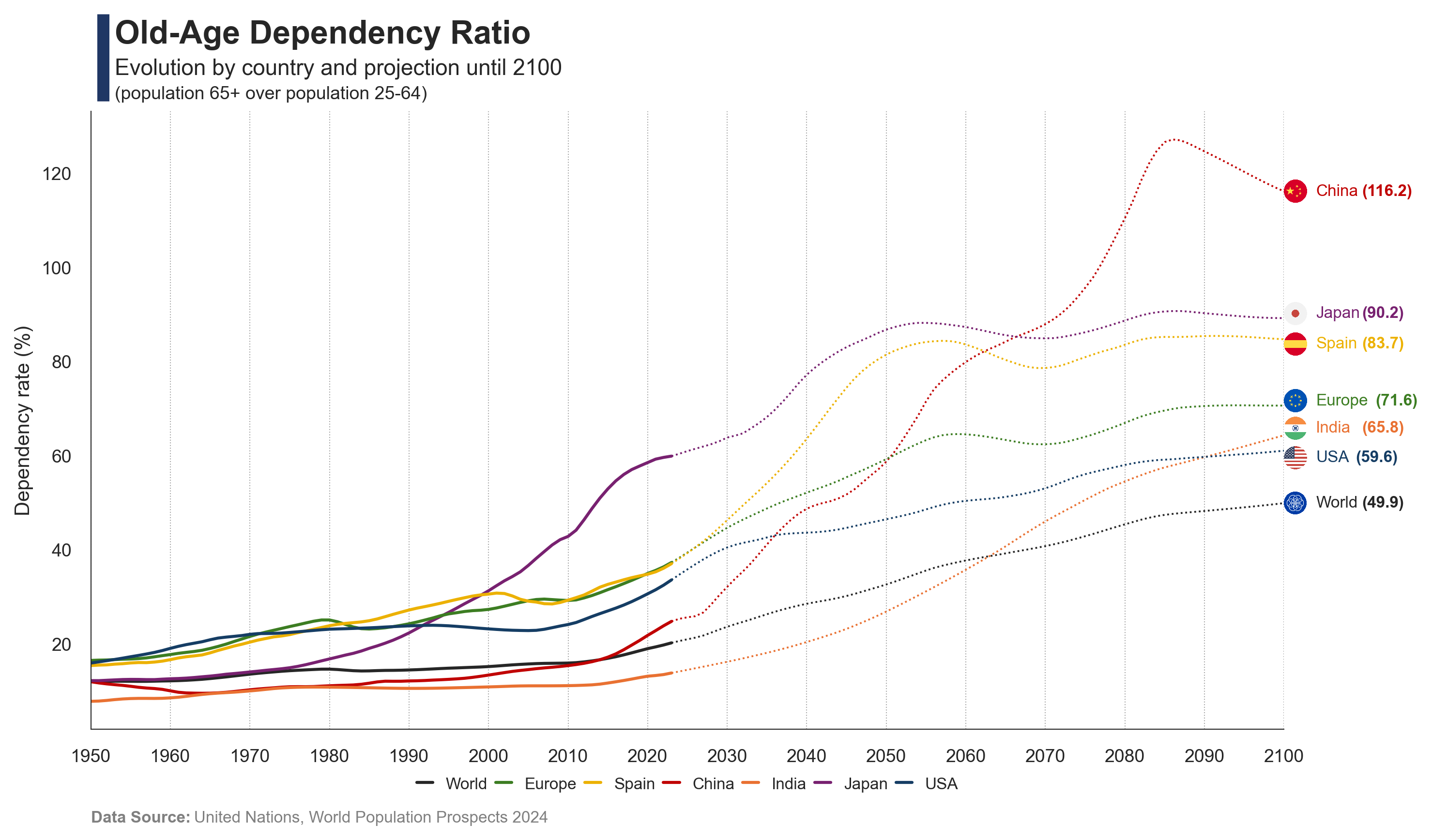
The aging population inverts the population pyramid and puts strong pressure on economies and their pension systems.
Published
Dec 9, 2026
Keywords
population
Summary
The old age dependency refers to the increasing ratio of elderly people to the working-age population. As life expectancy rises and birth rates fall, fewer workers must support more retirees. This puts pressure on pension systems, healthcare services, and economic growth, making it a major challange for many economies.
Code
# Libraries# ==============================import osimport pandas as pdimport seaborn as snsimport matplotlib.pyplot as pltimport matplotlib.image as mpimgimport requestsfrom matplotlib.offsetbox import OffsetImage, AnnotationBboxfrom io import BytesIO# Data Extraction# ==============================# Path filepath =r"https://github.com/guillemmaya92/Analytics/raw/refs/heads/master/Data/undata.parquet"# Dataframedf = pd.read_parquet(path)# Filter countriescountries = ["WLD", "EUR", "ESP", "CHN", "IND", "JPN", "USA"]df = df[df["iso3"].isin(countries)]# Select columns and rename dependencydf = df[["variant", "country", "iso3", "year", "dependency3"]]df = df.rename(columns={"dependency3": "dependency"})df['dependency'] = df['dependency'] *100# Separate estimates and predictionsdf_estimates = df[df["variant"] =="Estimates"]df_prediction = df[df["year"] >=2023]# Data Visualization# ==============================# Font and styleplt.rcParams.update({'font.family': 'sans-serif', 'font.sans-serif': ['Franklin Gothic'], 'font.size': 9})sns.set(style="white", palette="muted")# Palettecountries = {"WLD": {"name": "World", "color": "#262626"},"EUR": {"name": "Europe", "color": "#3C7D22"},"ESP": {"name": "Spain", "color": "#ECB100"},"CHN": {"name": "China", "color": "#C00000"},"IND": {"name": "India", "color": "#E97132"},"JPN": {"name": "Japan", "color": "#782170"},"USA": {"name": "USA", "color": "#153D64"}}colors = {code: info["color"] for code, info in countries.items()}# Create figurefig, ax = plt.subplots(figsize=(10, 6))# Estimates linesns.lineplot( data=df_estimates, x="year", y="dependency", hue="iso3", palette=colors, legend=False, ax=ax)# Prediction line (dashed)sns.lineplot( data=df_prediction, x="year", y="dependency", hue="iso3", palette=colors, linestyle='dotted', linewidth=0.9, legend=False, ax=ax)# Custom dashed style for predictionsn_prediction = df_prediction["iso3"].nunique()for line in ax.lines[-n_prediction:]: line.set_linestyle((0, (1, 1.5))) # Add title and subtitlefig.add_artist(plt.Line2D([0.08, 0.08], [0.87, 0.97], linewidth=6, color='#203764', solid_capstyle='butt'))plt.text(0.02, 1.11, f'Old-Age Dependency Ratio', fontsize=16, fontweight='bold', ha='left', transform=plt.gca().transAxes)plt.text(0.02, 1.06, f'Evolution by country and projection until 2100', fontsize=11, color='#262626', ha='left', transform=plt.gca().transAxes)plt.text(0.02, 1.02, f'(population 65+ over population 25-64)', fontsize=9, color='#262626', ha='left', transform=plt.gca().transAxes)# Axis x-axis limits and labelsax.set_xlim(1950, 2100)ax.set_xticks(range(1950, 2101, 10))ax.set_xticklabels([str(tick) for tick inrange(1950, 2101, 10)], fontsize=9)ax.set_xlabel('') # Set y-axis limits and labelsax.set_ylabel('Dependency rate (%)', fontsize=10)ax.tick_params(axis='y', labelsize=9)ax.grid(axis='y', linestyle=':', color='gray', alpha=0.7, linewidth=0.25)# Remove spines and legendax = plt.gca()ax.spines['top'].set_visible(False)ax.spines['right'].set_visible(False)ax.spines['bottom'].set_linewidth(0.5)ax.spines['left'].set_linewidth(0.5)# Add flagsflag_urls = {'ESP': 'https://raw.githubusercontent.com/matahombres/CSS-Country-Flags-Rounded/master/flags/ES.png','CHN': 'https://raw.githubusercontent.com/matahombres/CSS-Country-Flags-Rounded/master/flags/CN.png','IND': 'https://raw.githubusercontent.com/matahombres/CSS-Country-Flags-Rounded/master/flags/IN.png','JPN': 'https://raw.githubusercontent.com/matahombres/CSS-Country-Flags-Rounded/master/flags/JP.png','USA': 'https://raw.githubusercontent.com/matahombres/CSS-Country-Flags-Rounded/master/flags/US.png','EUR': 'https://raw.githubusercontent.com/guillemmaya92/circle_flags/refs/heads/gh-pages/flags/eu.png','WLD': 'https://raw.githubusercontent.com/guillemmaya92/circle_flags/refs/heads/gh-pages/flags/xx.png'}flags = {country: mpimg.imread(BytesIO(requests.get(url).content)) for country, url in flag_urls.items()}for iso3 in df_prediction['iso3'].unique():if iso3 in flags: last_row = df_prediction[df_prediction['iso3'] == iso3].iloc[-1] x = last_row['year'] y = last_row['dependency']# Adjust vertical position to avoid overlapif iso3 =='IND': y +=1.5elif iso3 =='USA': y -=1.5elif iso3 =='EUR': y +=1elif iso3 =='ESP': y -=1elif iso3 =='JPN': y +=1# Add flag image img = flags[iso3] imagebox = OffsetImage(img, zoom=0.0225) ab = AnnotationBbox(imagebox, (x, y), frameon=False, box_alignment=(0,0.5), pad=0) ax.add_artist(ab)# Add country name and valueif iso3 in countries: ax.text( x +4, y, countries[iso3]["name"], va="center", ha="left", fontsize=8, color=countries[iso3]["color"] )# Specific offset for certain countriesif iso3 =="USA": offset =2elif iso3 =="EUR": offset =1.5else: offset =0.8# Add bold value with adjusted position ax.text( x +4+len(countries[iso3]["name"]) + offset, y,f"({y:.1f})", va="center", ha="left", fontsize=8, color=countries[iso3]["color"], fontweight="bold" )# Custom Legendfor code, info in countries.items(): ax.plot([], [], color=info["color"], label=info["name"], linestyle='-')ax.legend( loc='lower center', bbox_to_anchor=(0.5, -0.12), ncol=len(countries), fontsize=8, frameon=False, handlelength=1, handleheight=1, borderpad=0.2, columnspacing=0.5)# Add Data Sourceplt.text(0, -0.15, 'Data Source:', transform=plt.gca().transAxes, fontsize=8, fontweight='bold', color='gray')space =" "*23plt.text(0, -0.15, space +'United Nations, World Population Prospects 2024', transform=plt.gca().transAxes, fontsize=8, color='gray')# Adjust layoutplt.tight_layout()# Save it...download_folder = os.path.join(os.path.expanduser("~"), "Downloads")filename = os.path.join(download_folder, f"FIG_UN_Old_Age_Dependency_Rate")plt.savefig(filename, dpi=300, bbox_inches='tight')# Show :)plt.show()